The network for creativity
Join 1.25M professional creatives like you
Connect with clients, get discovered, and run your business 100% commission-free
Creatives on Contra have earned over $150M and we are just getting started
Back to feedPost

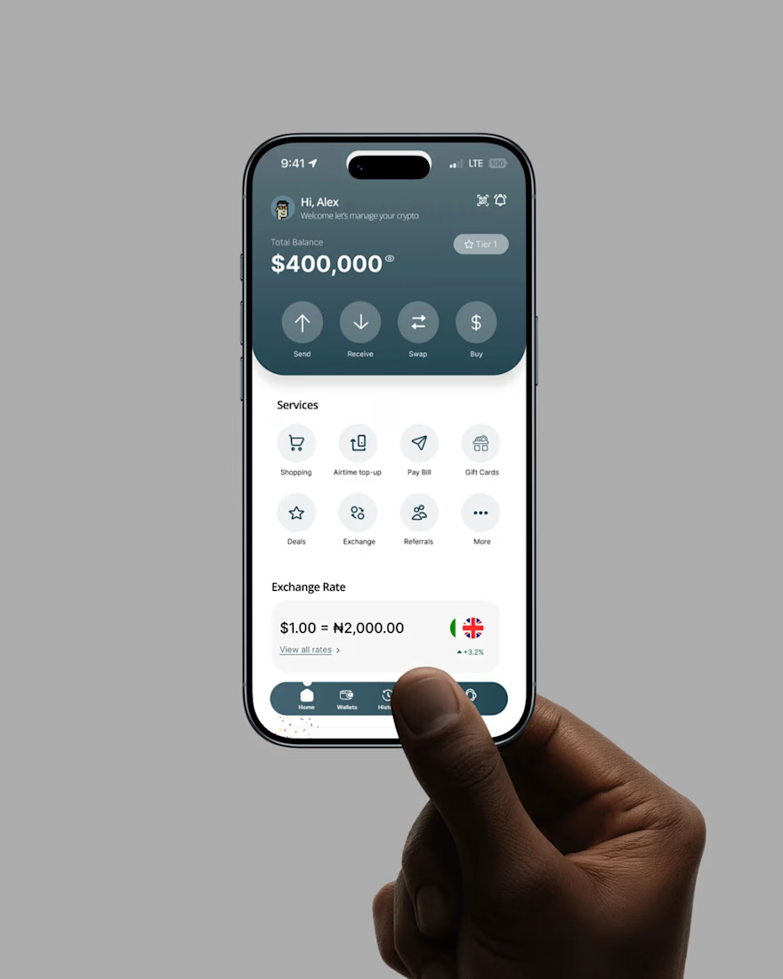
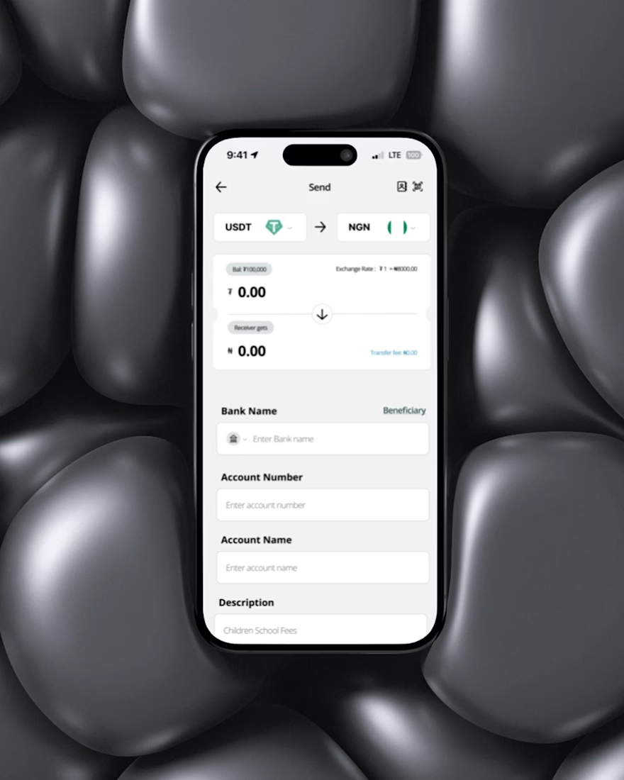
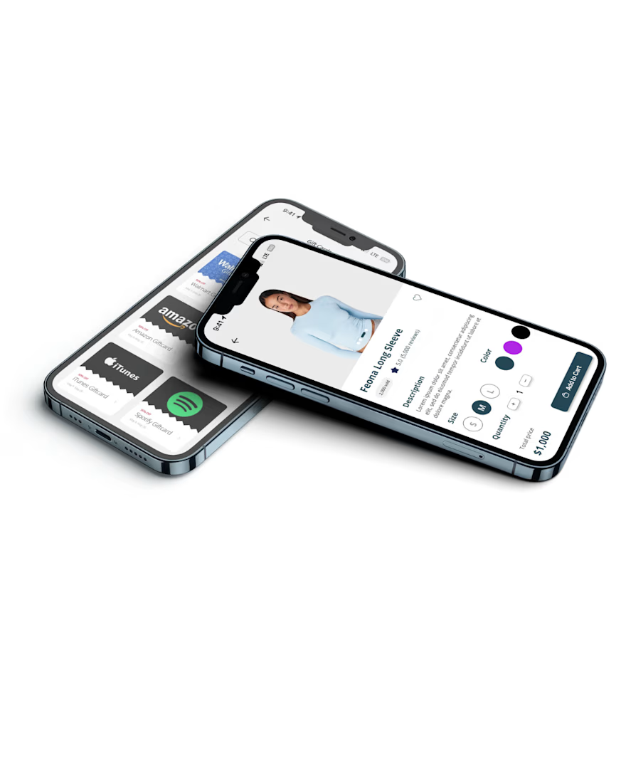
Managing money across crypto and fiat shouldn’t feel confusing — but it often does.
While designing Help2Pay, I focused on reducing friction and building trust. By simplifying flows and improving navigation, wallet errors dropped from 15% to 3% and misclicks from 25% to 5%.
Despite slow feedback cycles, I kept progress moving through clear, asynchronous collaboration.
In the end, the goal was simple: make complex transactions feel effortless — and it worked
Hey guys , you can also View Full Case Study:

Great work
The network for creativity
Join 1.25M professional creatives like you
Connect with clients, get discovered, and run your business 100% commission-free
Creatives on Contra have earned over $150M and we are just getting started





Related posts

I built growth into the letter.
Meet nuvopay, a payments app for Gen Z and young professionals.
The brief: secure, modern, friendly. Never a stiff bank.
The idea: three rising bars that form a bold "N". Growth and forward motion in one mark. No padlocks, no shields, no coins.
The wordmark is lowercase Poppins SemiBold, round and easy, so it feels like an app and not an institution.
Navy for trust. Teal for growth. Clean white space for calm.
Which do you notice first, the bars or the N?
#logodesign #brandidentity #fintech #branding #graphicdesigner #logodesigner #designportfolio #nuvopay

The choice to skip traditional security icons like shields or padlocks is a smart move for a Gen Z audience. It signals that the app relies on modern, invisible security rather than looking like a nervous bank.

Smart Money — Digital Wallet Landing Page
Smart money. One balance, every currency.
This is the hero section for smart., a digital wallet. People can hold dollars, euros and pounds in one balance, pay with physical or virtual cards, and send money to friends in seconds.
What's in the shot :
• A dark hero with a ribbed, fluted glass background lit in lime and green
• A big, bold "Smart money." headline with a short line of supporting copy
• Two app screens shown next to the headline: the home dashboard (balance, quick actions, Send again) and the Cards screen with a virtual card and monthly card spend
• Social proof under the buttons: 4.9 stars, loved by 180,000+ people
• A pill navigation bar, and a lime "Get the app" button as the main action


Here is what I can build, crypto wallet very smooth and easy to operate, and that's what you will receive, depends on your style, it's all about choice, it comes with Admin dashboard