The network for creativity
Join 1.25M professional creatives like you
Connect with clients, get discovered, and run your business 100% commission-free
Creatives on Contra have earned over $150M and we are just getting started
Back to feedPost

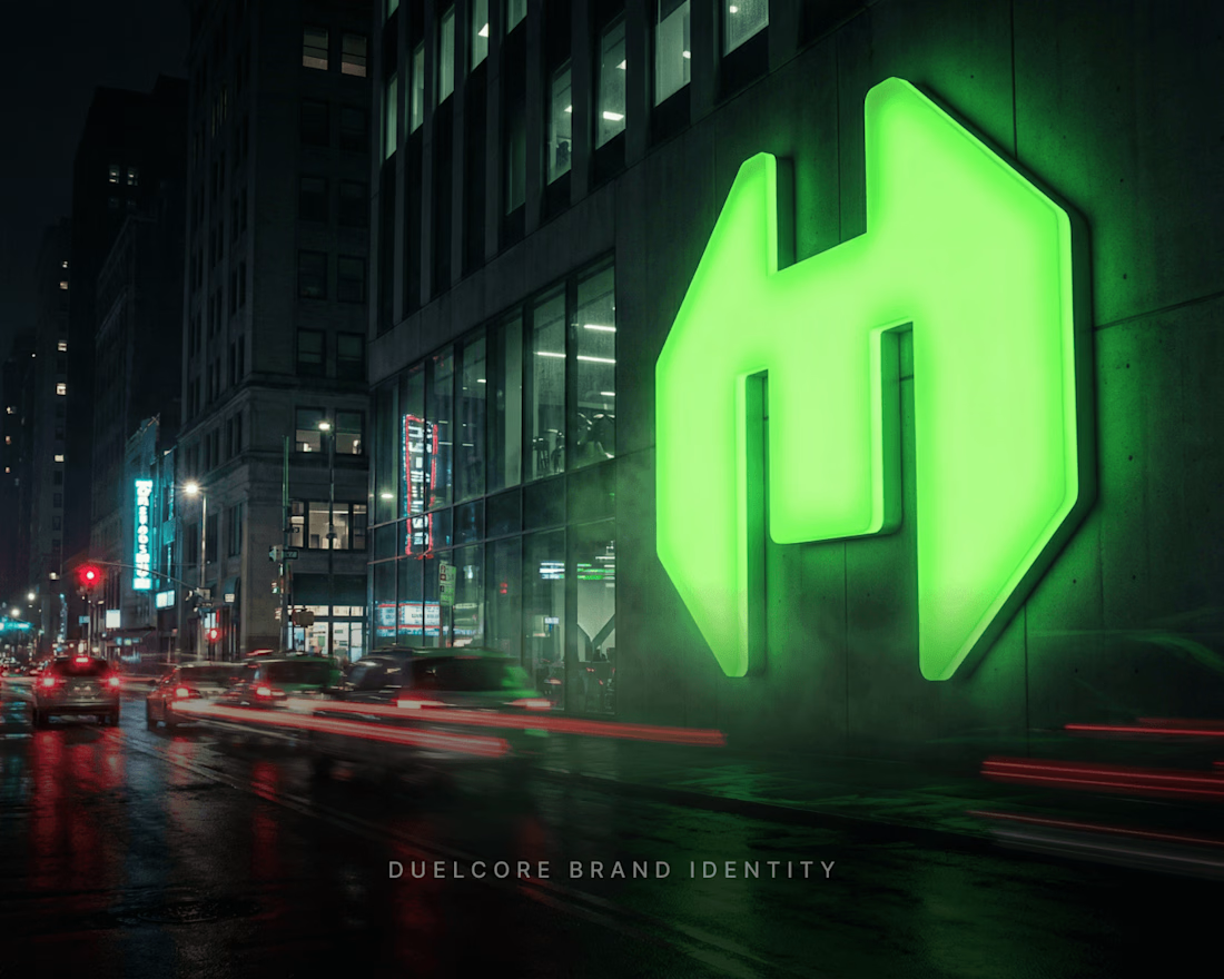
New brand identity for DuelCore. Went with a sharp, angular mark and a single loud neon green against dark, cinematic environments — trying to make it feel powerful without tipping into generic "gaming brand" territory.
Two things I'm genuinely unsure about: does the green feel intentional or overused across the shots? And does the mark itself read clearly at a glance, or does it need more contrast?
Real critique welcome — that's actually useful to me right now.
#BrandIdentity #LogoDesign #BrandDesign #DesignFeedback #GraphicDesign #ContraCommunity


The network for creativity
Join 1.25M professional creatives like you
Connect with clients, get discovered, and run your business 100% commission-free
Creatives on Contra have earned over $150M and we are just getting started


Challenges
View all


Related posts

Trimax - Construction Company Brand Identity Design


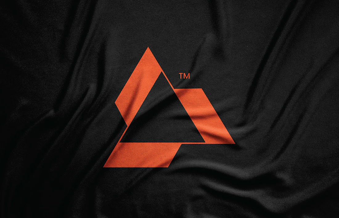
The orange geometric mark has strong contrast against the black texture, and that restrained palette should carry beautifully across the identity system.

Creative Direction for Innerceuticals


The pivot from the real product bottle into that geometric particle animation is a smooth way to move from proof to brand world. Was Innerceuticals specifically asking for that split, ground it in the actual product first then get conceptual after, or did that pairing come together in the edit?

I'm working on a store concept mixing art supplies, gifts and tech. I presented two moodboards: one inspired by traditional art supply stores, and another cleaner, modern direction inspired by Japanese gift and tech stores. They chose option 2.
I presented four logo ideas. These two are my favorites and the ones the client liked most.
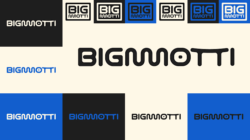
1_ Based on the second moodboard, with a more neutral and slightly futuristic feel. My favorite detail is the boxed version: its vertical weight balances with the I and O, making it feel tidy and visually appealing.
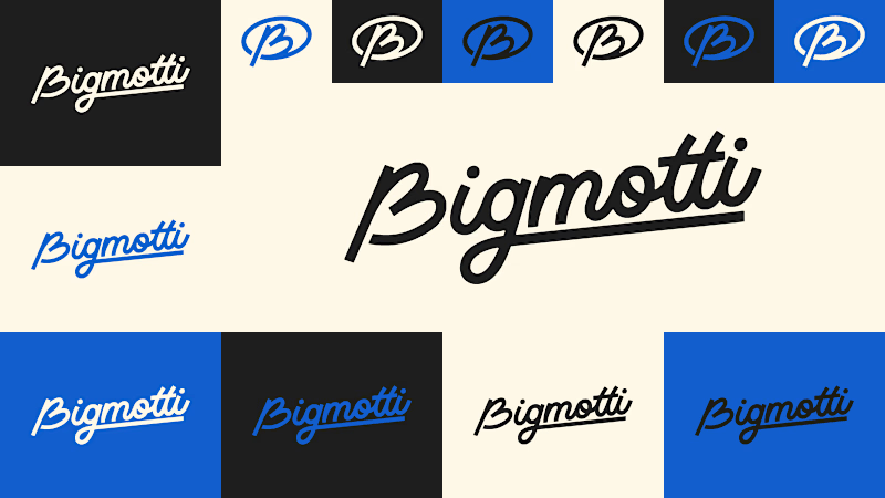
2_ Inspired by traditional art supply stores, but with a modern, clean style. Handwritten lettering adds a human touch and keeps it timeless.
Which one is your favorite and why?
Which one do you think the client chose?
1 voted
14%
6 voted
86%
7 votes
Closed
I'll guess they picked #1, the boxed Bigmotti reads cleaner next to a gift-and-tech assortment than the handwritten route. That vertical weight balance on the I and O is the kind of detail that's invisible until someone points it out, was there a runner-up logo the client seriously debated before landing on this one?