The network for creativity
Join 1.25M professional creatives like you
Connect with clients, get discovered, and run your business 100% commission-free
Creatives on Contra have earned over $150M and we are just getting started
Back to feedPost

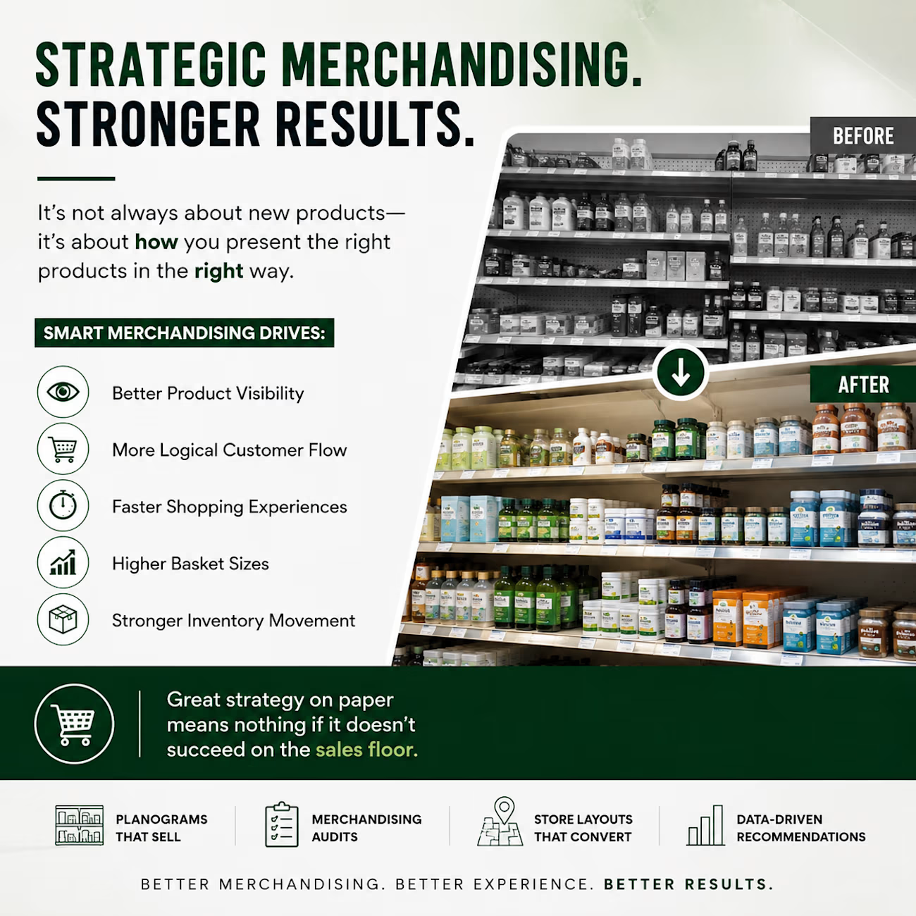
One of the biggest mistakes I see in retail is assuming poor sales automatically mean you need new products.
Often, the problem is execution.
I’ve seen stores where top-selling products were hidden, high-margin items were separated from complementary products, and shelves were organized in ways that made shopping harder than it needed to be.
Small merchandising improvements can create measurable results:
• Better product visibility
• More logical customer flow
• Faster shopping experiences
• Higher basket sizes
• Stronger inventory movement
Good retail execution isn’t just about making a store look nice—it’s about making every square foot work harder.
Whether I’m developing planograms, merchandising guidelines, or store layouts, my goal is always the same: create an experience that’s better for both the customer and the business.
The best retail strategies don’t stop at the spreadsheet—they succeed on the sales floor.
What’s one merchandising decision you’ve seen that made a noticeable difference in a store?
The network for creativity
Join 1.25M professional creatives like you
Connect with clients, get discovered, and run your business 100% commission-free
Creatives on Contra have earned over $150M and we are just getting started





Related posts

E-commerce isn't just about listing products—it’s about creating a premium visual ritual.





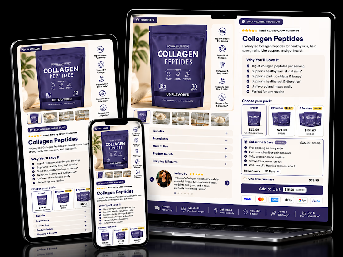

The pack-size tiers sitting right next to Subscribe & Save is the right order. Anyone already comparing 1, 2 or 3-pack is primed to pick a cadence too, so showing both choices together nudges toward the higher-LTV option without it feeling like an upsell.

Nice work!

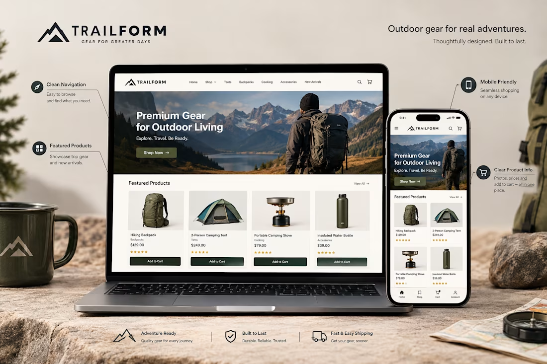
A Shopify store might look great on a computer but feel completely different on a phone.
That's why mobile optimization matters.
When reviewing a store's mobile experience, I pay attention to things like:
→ Easy to use navigation
→ Readable product descriptions
→ Clear product images
→ Buttons that are easy to tap
→ Proper spacing between sections
→ Product pages that fit the screen
→ A smooth path from browsing to checkout
The goal isn't just to make the desktop design smaller.
It's to make the store comfortable and easy to use on a mobile device.
Because customers should be able to browse products, understand what they're buying, and take the next step without unnecessary frustration.
A good mobile experience is an important part of good Shopify design.
Have you ever left an online store because it was difficult to use on your phone?

Absolutely. A smooth mobile experience can make the difference between a customer buying and leaving.