The network for creativity
Join 1.25M professional creatives like you
Connect with clients, get discovered, and run your business 100% commission-free
Creatives on Contra have earned over $150M and we are just getting started
Back to feedPost

Elevate your brand’s physical presence with a professional touch! 📈✨
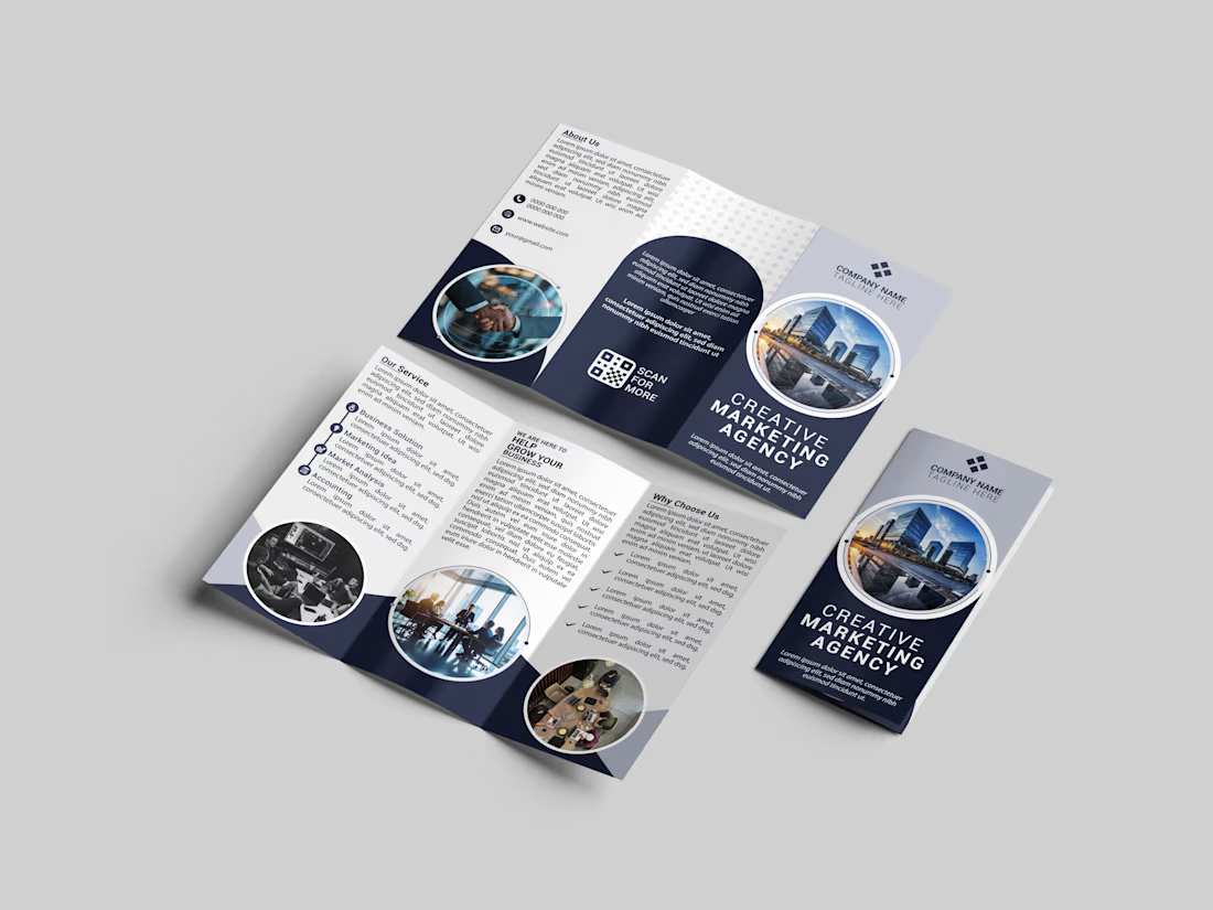
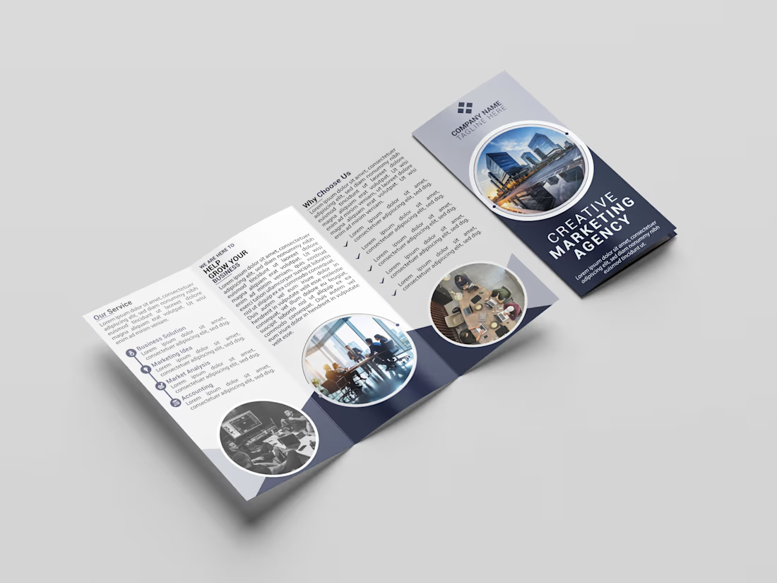
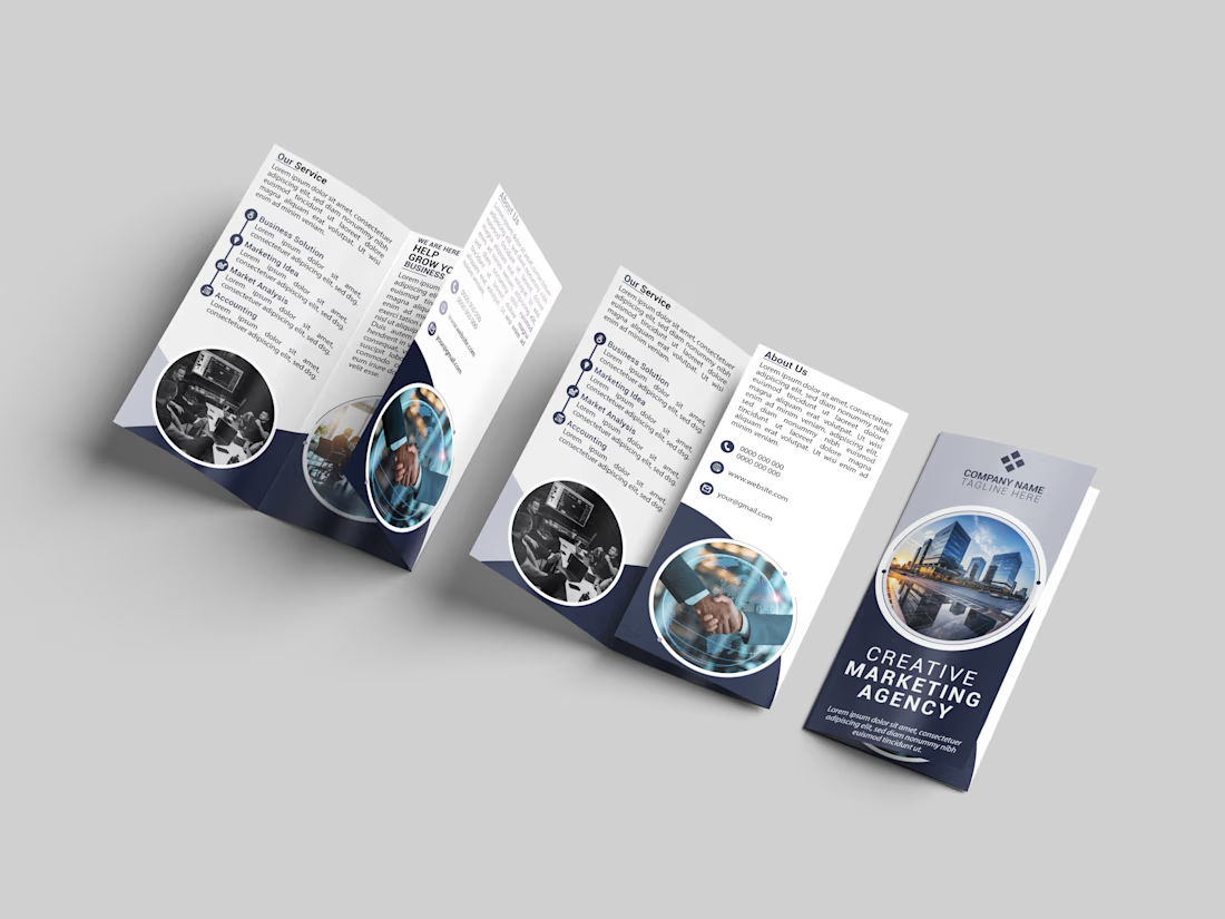
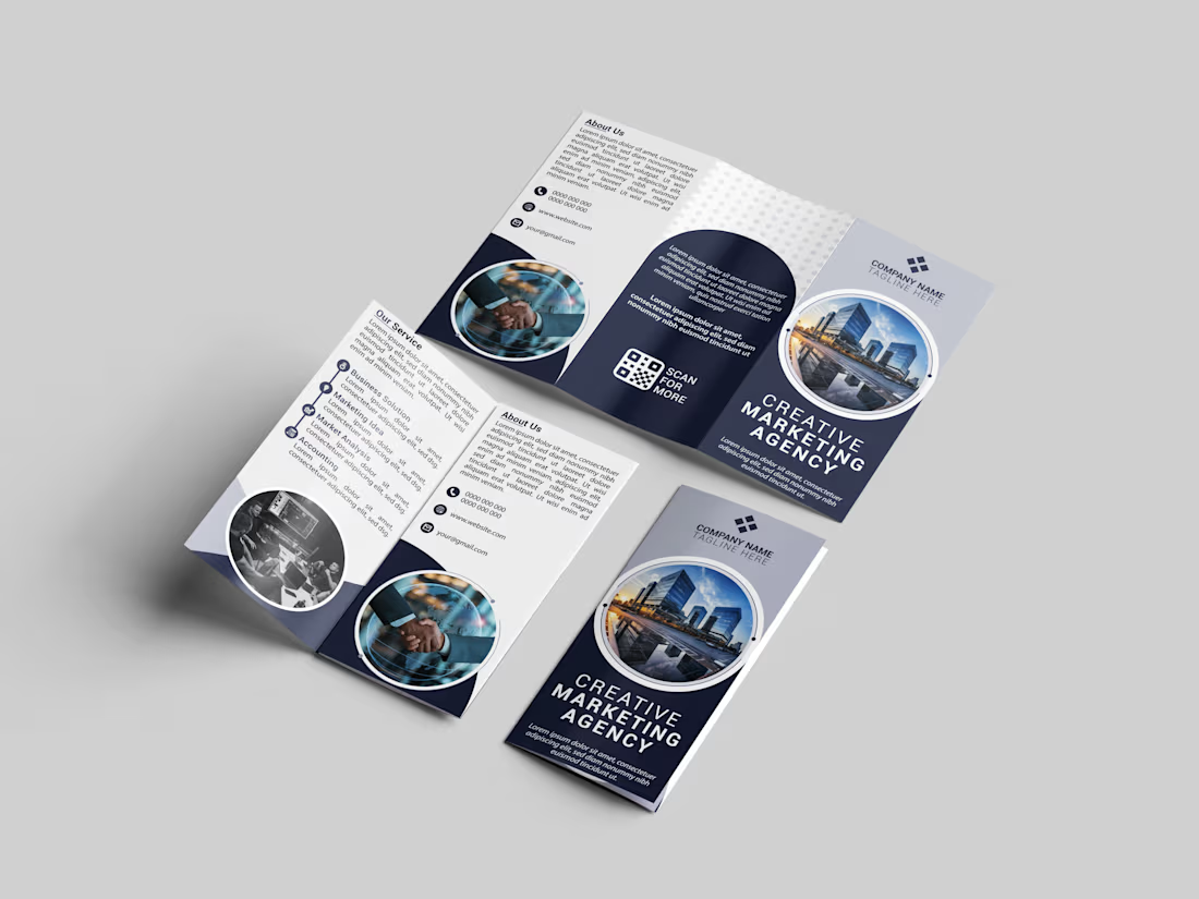
I recently completed this Tri-Fold Brochure Design for a Creative Marketing Agency. The goal was to balance a clean, corporate aesthetic with a modern layout that effectively communicates the brand's services and vision.
Highlights of the design:
Clean & Minimalist Layout
Professional Color Palette (Navy & Slate)
Strategic use of White Space
High-impact Visual Elements
Need a custom brochure or marketing materials for your business? Let’s collaborate and bring your ideas to life! DM for inquiries. 📩
The network for creativity
Join 1.25M professional creatives like you
Connect with clients, get discovered, and run your business 100% commission-free
Creatives on Contra have earned over $150M and we are just getting started





Related posts

Hearth & Hollow is a personal concept for a small, invitation only family retreat in the English countryside.
The goal was a tri fold brochure that feels warm, quiet and premium. I kept every panel to a single idea, with generous space, one elegant serif voice and soft ivory, sage and blush tones. Natural, unposed photography carries the mood, so the words can stay few.
Restraint over decoration, so each page can breathe.
Which panel would you open first, the sage or the blush? I'd love to hear what draws your eye.
brochuredesignprintdesigneditorialdesignGraphic DesignPrint DesignTypographyAdobe IllustratorAdobe PhotoshopCanva


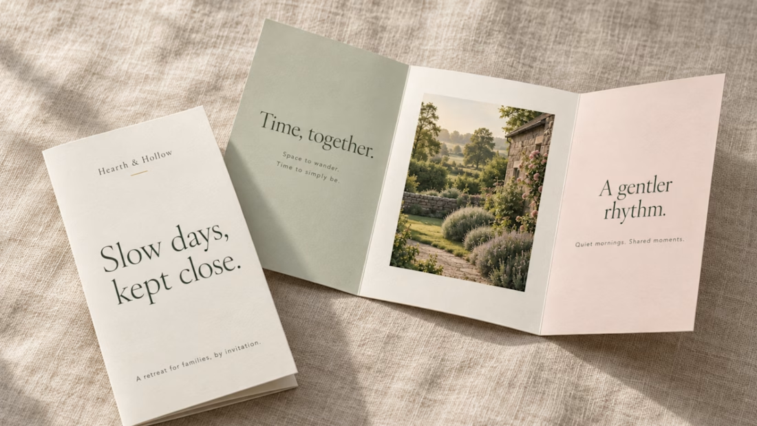
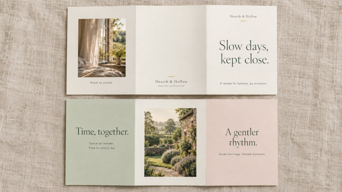

I'd open on the sage. It sets the calm baseline, and the blush feels like a better closing note once the reader has settled in. Is the ivory stock uncoated? That texture would carry a lot of the quiet in print.

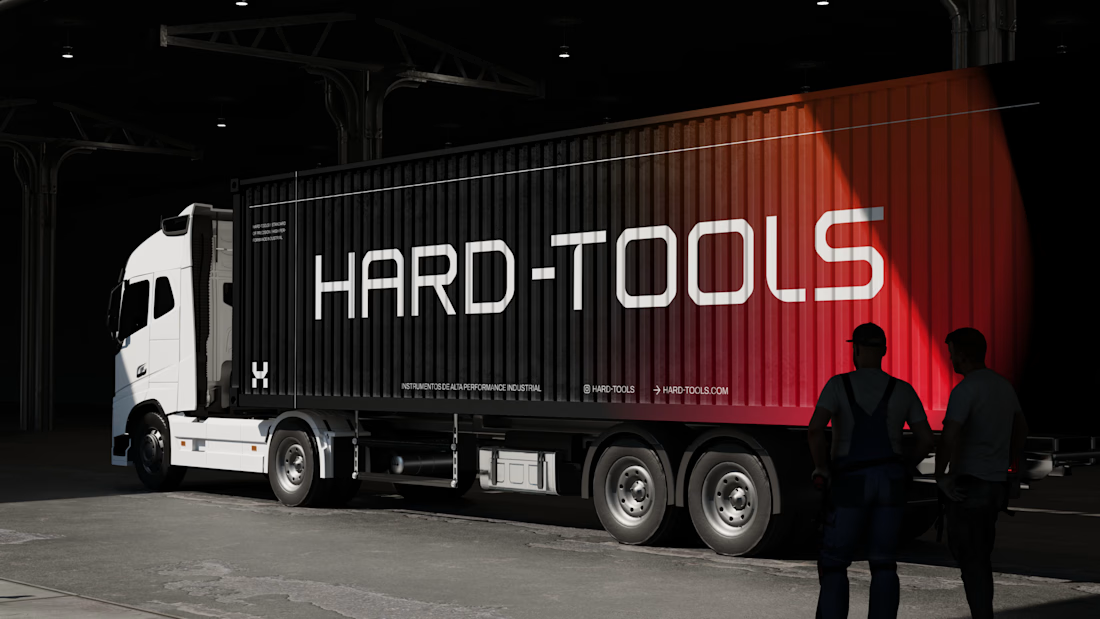
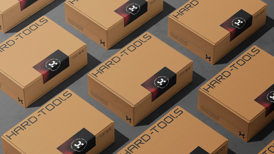
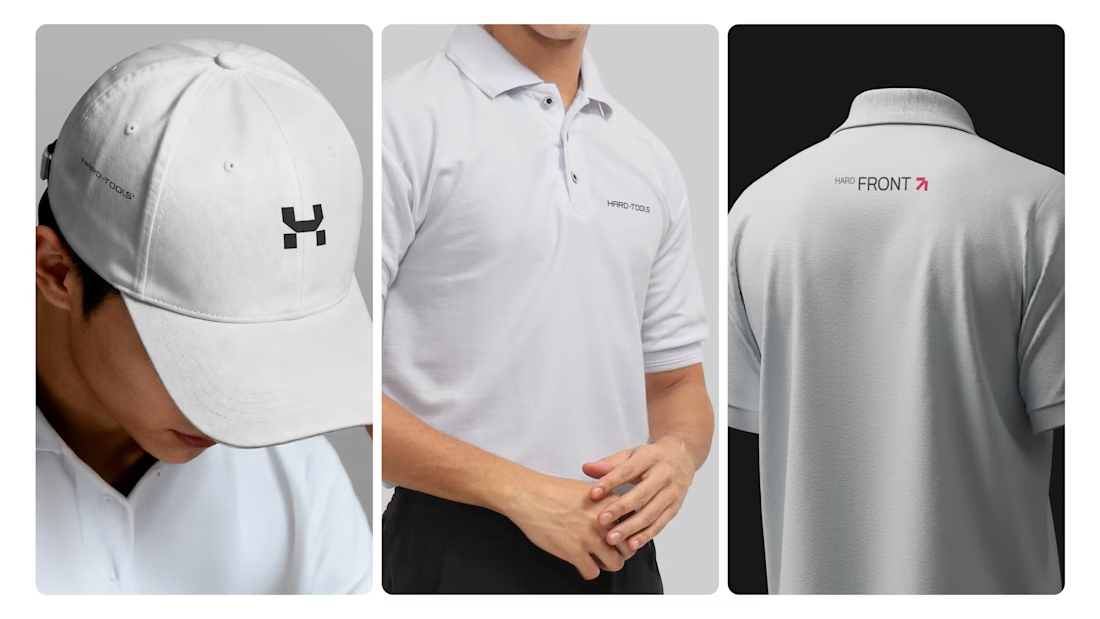
Hard-Tools needed to strengthen its brand presence and turn its communication into a clearer, more consistent, and more professional expression of the business.
The project started with a central question: how can a tools and equipment brand communicate strength, reliability, and expertise without falling into the generic visual language of the category?
The strategy focused on three main objectives:
01 — Strengthen perceived value
Build a visual communication system that conveys solidity, quality, and authority, bringing the brand’s perceived professionalism closer to the level it aims to occupy in the market.
02 — Create consistency across communication
Develop a visual language that could work across different touchpoints — campaigns, commercial materials, social media, and promotional assets — while maintaining recognition and coherence.
03 — Turn products into brand communication
Rather than simply showcasing tools and products, the visual approach was designed to communicate the attributes behind the brand: performance, precision, durability, and reliability.
Based on this strategic direction, I developed the creative and visual direction and designed the communication materials, working across composition, hierarchy, typography, image treatment, identity application, and commercial layouts.


TOP!!

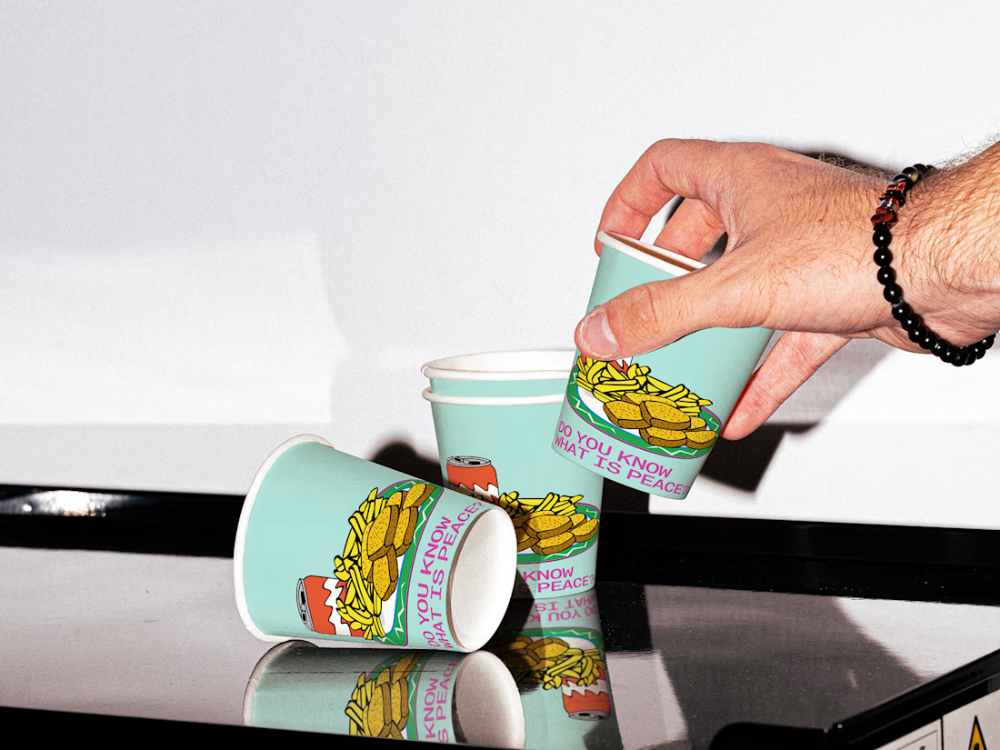
Coffee Paper Cup Design
A branded paper cup concept created as a physical extension of a coffee brand's visual identity.
The design uses typography, spacing and a focused graphic system to create a distinctive takeaway cup without adding unnecessary visual noise.
The objective was to make the packaging feel like part of the brand — not simply a logo printed on a cup.
Design focus:
• Packaging Design
• Coffee Branding
• Brand Identity
• Typography
• Print Design
• Visual Identity
Designed by WaxyWeb.
foodpackagingfoodbrandidentitycoffeecupdesignBrand DesignGraphic DesignVisual DesignAdobe IllustratorAdobe PhotoshopFigma

Well Done