The network for creativity
Join 1.25M professional creatives like you
Connect with clients, get discovered, and run your business 100% commission-free
Creatives on Contra have earned over $150M and we are just getting started
Back to feedPost
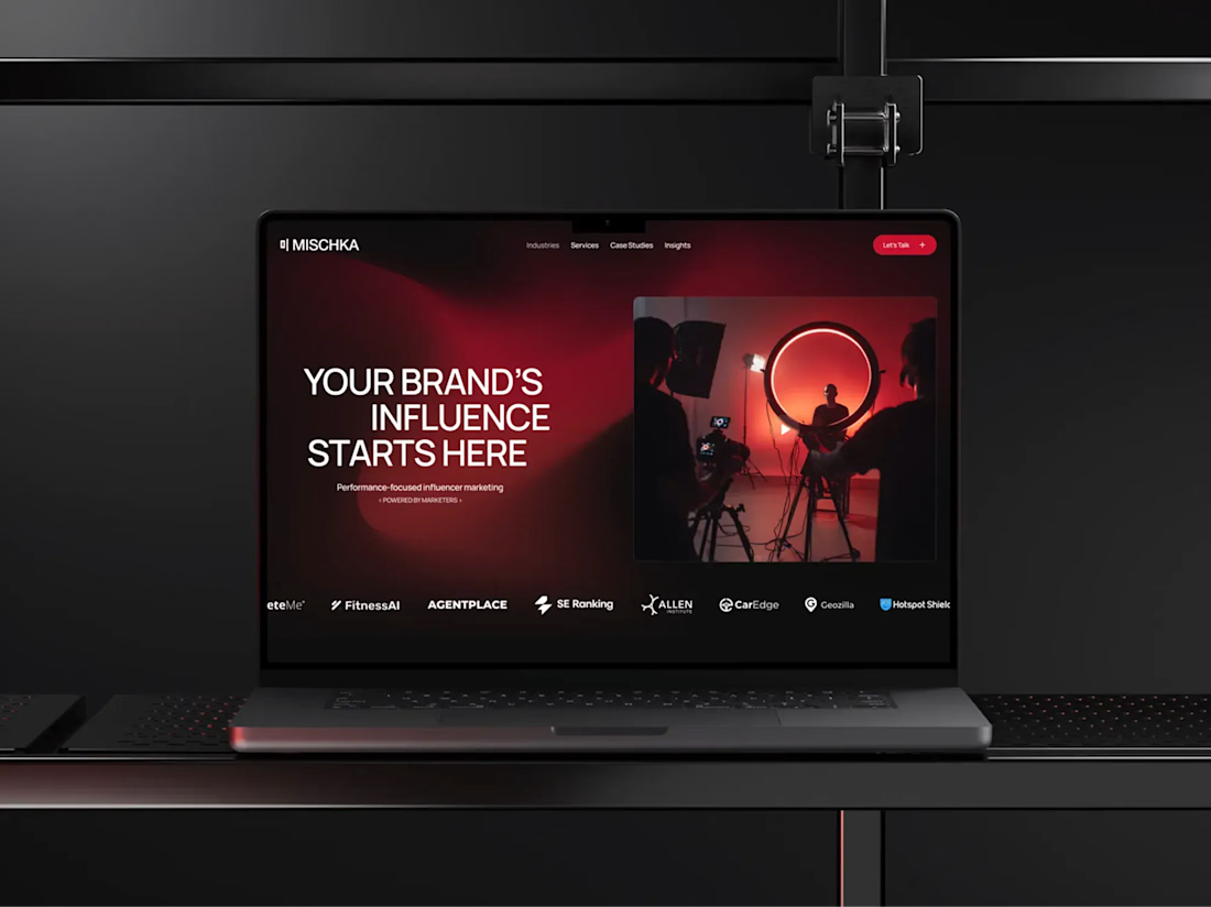
Mischka already had a bold identity. The website had to live up to it.
MISCHKA is an award-winning, performance-first influencer marketing agency working with cybersecurity and technology brands. The team came with a clear point of view, so this was never simply about giving them a more polished online presence.
It was about building a website that could carry the same confidence and energy as the agency itself. The project went far beyond technical implementation.
We spent a lot of time on the site structure and UX, as well as developing the visual language for the interface. The gradients, in particular, became one of the most recognizable parts of its digital identity. They aren’t just there for atmosphere - they connect sections, frame key content, and give the whole experience its rhythm.
Behind the visuals, we built a client-friendly CMS around the way the team publishes its work. MISCHKA can add and update case studies and insights without rebuilding pages or relying on a developer for every change.
My role covered Webflow development, responsive behavior, interactions, and CMS architecture. I was also directly involved in shaping the UX structure and wireframes, and created a number of visual elements used throughout the interface - including custom graphics, gradient treatments, and other identity-led details.
The result is a website that feels unmistakably MISCHKA on the surface while remaining practical and scalable behind it. It’s also one of those projects I still enjoy opening in a new tab, just to watch the whole experience move. A lot of care went into every part of it, and I think that comes through.
After launch, the team shared their experience in a verified Clutch review: “They really know Webflow inside out.”
A live result I’m proud of and a happy client at the end of it - that’s exactly how I want a project to close.
Thank you, Yuliya Gorenko, for your trust and for the opportunity to work on this project. I really enjoyed the collaboration and am proud of what we created together!
Explore the project:
Live website: https://www.mischka.agency/
Client review: https://clutch.co/go-to-review/82f12ed1-54c6-4072-ad3e-ca176f90de66/466955
If your company has a strong brand but its website still feels like the weaker version of it, send me the link. I’d love to hear what needs to change!



Nice work 💯


Thanks!

crazy🙌
Thank you!

The visual identity and gradient framing look top notch! How long did the CMS architecture and UX wireframing phase take for this project?
Thanks, Muhammad! The CMS architecture and UX wireframing took around two weeks in total. Much of that time went into optimizing the content blocks and adding custom logic, so the client could control as much of the site as possible directly through the CMS.
Thanks for sharing this Serhii. The custom logic for client control is always what eats up the most time 😅

This is really cool mahn

The CMS decision is the part that ages best here — a bold identity is easy to nail for launch day, the real test is whether the team can publish a new case study six months later without it drifting off-system. Building that constraint in up front is what actually protects the gradient language.
Thank you, Aligwe! That was exactly the goal - every visual element needed to feel purposeful rather than added just for decoration.


Cool work !
Thanks!


the site actually keeps up with the identity, nice
Thank you!

Cool work !
Appreciate it!

Thank you so much!

Amazing 😍
Thanks!

This is a good example of a website actually carrying the brand instead of just displaying it. The gradients, motion, and structure all feel intentional, and the CMS setup is a nice touch too.
Thank you, Sonaire! That balance was exactly the goal - plenty of character on the front end, while still being easy for the team to manage behind the scenes.

osm
The network for creativity
Join 1.25M professional creatives like you
Connect with clients, get discovered, and run your business 100% commission-free
Creatives on Contra have earned over $150M and we are just getting started











Related posts



Your web sections always have such strong art direction. Great to see the brand carried right into the layout.


Hiring: UX / Product Designer (remote, ongoing)
I run Novatur Design, a product design studio based in Malta. We work with startups through to enterprise clients such as The Daily Mail, across a range of industries from EV to Crypto, Fintech to IoT.
I’m looking for an all-round UX / product designer who can take a problem from user flows through to polished hi-fi UI. Figma, auto layout and design systems should be second nature.
This is ongoing contractor work on a monthly basis, not a one-off project. If it works well on both sides, there’s potential for it to go full time.
Remote, so you don’t need to be in Malta. Individual designers only, no agencies please.
If you’re interested, the application takes about 6 minutes:
https://tally.so/r/yXZ2dB
Ralph

Love the variety of industries you work with. Sounds like an amazing opportunity for the right designer.


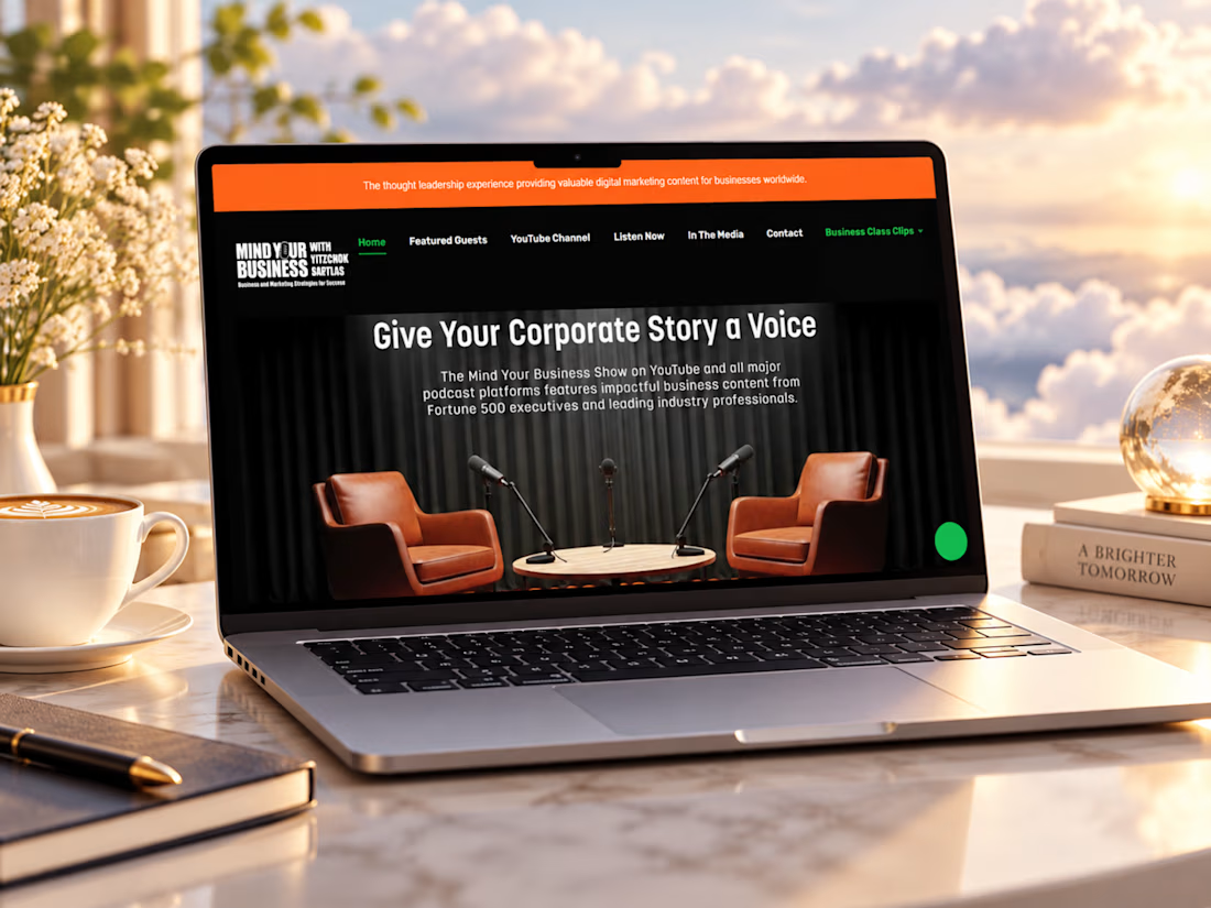
Just completed this Webflow website project for Mind Your Business Radio
The goal was to turn a growing library of business interviews, guest stories, and media content into a clean, easy-to-explore experience.
I focused on strong episode discovery, clear guest presentation, responsive layouts, podcast and video integration, and a structure that makes it easy for listeners to find valuable conversations while giving potential guests and partners a clear way to connect.
I’d love to hear your thoughts, does the website feel like a platform you’d actually enjoy browsing and listening through?
#Webflow #WebDesign #PodcastWebsite #UIDesign #UXDesign #WebDevelopment #MediaWebsite #ResponsiveDesign #WebsiteDesigner #PortfolioProject #Contra

Beautiful work. The details really make this stand out.