The network for creativity
Join 1.25M professional creatives like you
Connect with clients, get discovered, and run your business 100% commission-free
Creatives on Contra have earned over $150M and we are just getting started
Back to feedPost

Güero y María — Mexican Hot Sauce & Spice Bomb Kits
Client project · Shopify · Food & Beverage / DTC · Conversion-focused
The brief
Güero y María is a family-run Mexican food brand — Allen and Cecilia, building from market stands across Central Washington since 2008, now producing hot sauce, chili crisp and Spice Bomb dinner kits by hand in Quincy, WA.
Hot sauce is one of the hardest categories to sell online. It’s a commodity on every supermarket shelf, the bottle is cheap enough that shipping eats the margin, and a $13 order is a weak unit economic to build a store on. The brand’s real asset wasn’t the sauce — it was the Bomb Kits: a $19.99 product that turns three pounds of meat into birria or pozole in three steps. Higher value, genuinely differentiated, and almost impossible to explain in a product grid.
So we built the store around the kit, and let the sauces sell underneath it.
What we built
A hero that’s an illustration, not a product shot. The Güero y María characters at their street cart, hand-drawn, filling the right half of the screen — with “Find your new favorite · Bold hot sauces & 3-step dinner kits” and a Spanish welcome, Bienvenidos a nuestra tiendita. Every competitor in this category opens with a photographed bottle on a dark background. The illustration does the differentiating work before a single word is read, and it carries the brand’s actual story: a market stand, not a factory.
The three-step mechanic, straight after the fold. Add your protein → Drop the bomb → Cook & serve, as three photographed cards in a real slow cooker, with the no-prep claims spelled out underneath. This is the single most important section on the site. The Bomb Kit is a concept purchase, and a customer who doesn’t understand it in five seconds will never add it to cart. Putting it above the products converts the explanation into a sales pitch.
Kits merchandised before sauces. “Shop the familia — Mexican Dinner, Made Easy” leads with the Bomb Kit carousel at $19.99 with one-tap add-to-cart, and the hot sauces follow at $13. The order is the strategy: lead with the highest-value, hardest-to-copy product, then let the sauces ride along as add-ons rather than as the main event.
Chili crisp with its own appetite pitch. “Crunchy. Savory. Addictive.” — a dedicated section with both jar sizes, framed by use (“spoon it over tacos, eggs, noodles, rice”). Use cases do more for a condiment than ingredient lists.
Family story as the trust mechanism. “Born in the market. Built for the table.” — the origin stated plainly: since 2008, made by hand, real chiles, family-run facility, named town. In small-batch food this is the entire credibility argument, and it’s what justifies buying a $13 bottle online instead of a $4 one at the store.
A comparison table that names the real competitor. Güero y María versus “other hot sauces”: real Mexican chiles with no shortcuts, family-owned small-batch, bold heat that doesn’t quit halfway, built for tacos and eggs and everything. Blunt, and it closes the only objection that matters in this category — why not the supermarket bottle.
Merch and capture to close. A graphic tee section in turquoise for the customers who’ve become fans, then a 10%-off first-order capture in deep crimson with wavy dividers, and a full-service footer: every collection, shipping and refund policy, real address and phone, social. The announcement marquee has been running the same offer and the no-preservatives claim overhead the whole way down.
Art direction
Hand-drawn character illustration throughout, treated as the primary brand asset rather than as decoration — the same couple appears on the packaging, in the hero, and in the story section, so the site and the shelf are continuous. The palette is pulled from the labels: deep crimson, cream, marigold, turquoise, lime. Section edges are wavy rather than straight, which keeps a page full of hard product photography feeling handmade. Typography pairs an elegant serif against a rounded display face — the contrast holds the brand between “authentic family recipe” and “fun weeknight dinner”, which is exactly where it sells.
Build
Shopify, custom sections throughout — announcement marquee, illustrated hero with dual CTAs, three-step explainer, multiple product carousels with add-to-cart on the card, chili crisp block, story section, comparison table, merch carousel, email capture and footer. Collection-driven and merchant-editable so the team adds drops, bundles and seasonal kits without a developer.


The network for creativity
Join 1.25M professional creatives like you
Connect with clients, get discovered, and run your business 100% commission-free
Creatives on Contra have earned over $150M and we are just getting started



Related posts


The little green dot moving through the grid is so satisfying

The movement flow so naturally, it feels effortless to watch.

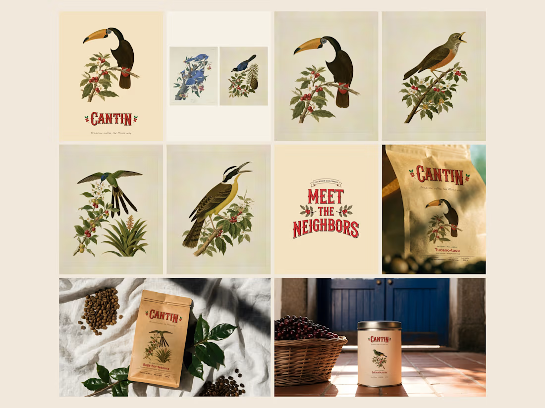
CANTIN | You know our coffee. Meet the neighbors.
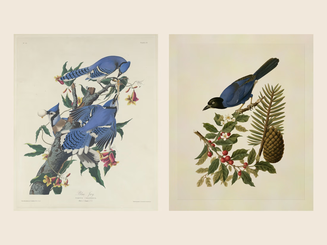
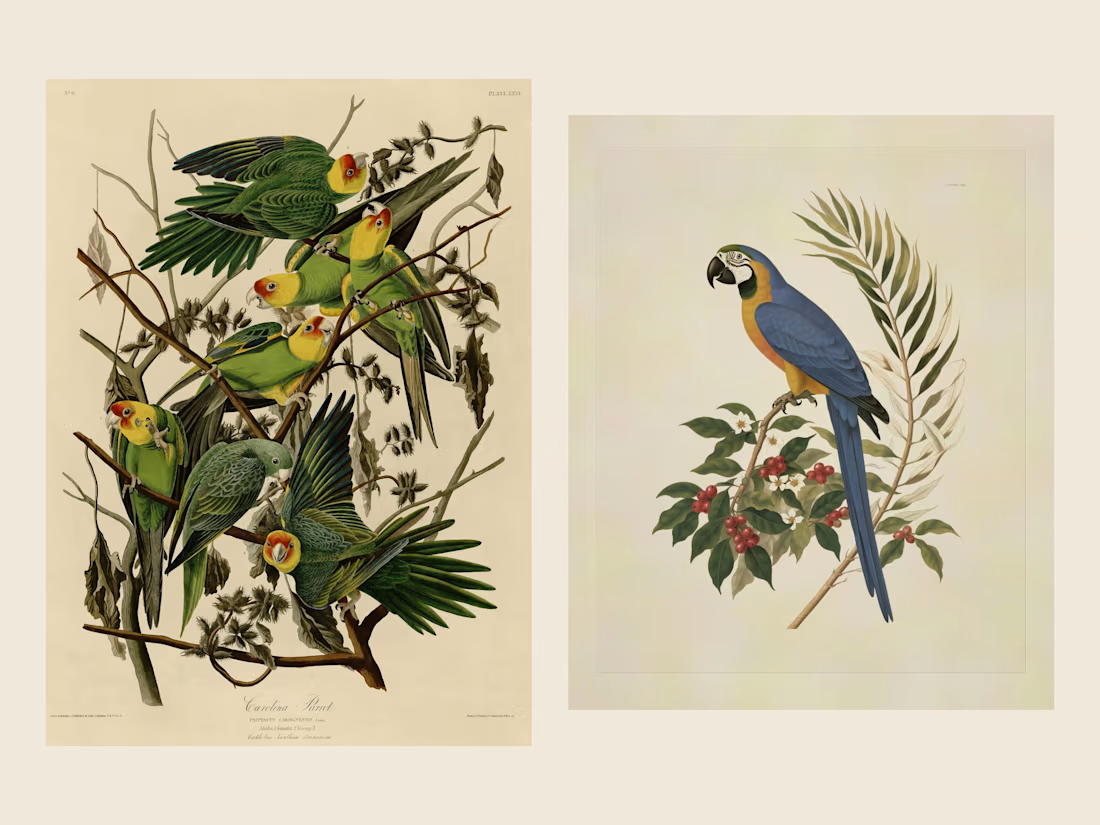
I found John James Audubon's The Birds of America (1827–1838) on Wikimedia Commons and in the National Gallery of Art's open collection, hand-coloured engravings where every bird is drawn life-size on the plant it lives on. I cropped seven public-domain plates, without captions or plate numbers, and trained a Recraft V4 Style on them that I called Audubon Aves do Brasil. Audubon never painted Brazil, so I used his way of drawing on Brazilian birds that live around our coffee farms. To tie it together I created CANTIN, an invented Brazilian coffee brand with the campaign line "You know our coffee. Now meet the neighbors." That brand is the twist, since his plates now sell a 2026 coffee on the poster, the campaign seal, the labels, the tins and the kraft bags.

How the neighbors were made, in 30 seconds.