The network for creativity
Join 1.25M professional creatives like you
Connect with clients, get discovered, and run your business 100% commission-free
Creatives on Contra have earned over $150M and we are just getting started
Back to feedPost

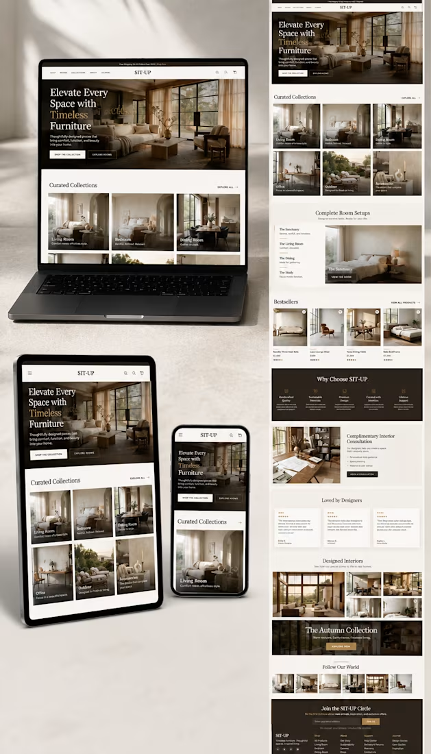
Just wrapped up a luxury furniture website concept for SIT-UP.
The goal was to create a premium shopping experience that feels as elegant as the furniture itself—combining warm neutral tones, editorial-inspired layouts, immersive lifestyle imagery, and a clean, conversion-focused user experience.
Designed with responsive viewing in mind, ensuring the experience is seamless across desktop, tablet, and mobile.
Always exploring ways to blend aesthetics with performance in eCommerce design.
What section catches your eye first?
#WebDesign #ShopifyDesigner #EcommerceDesign #UIDesign #UXDesign #FurnitureDesign #Contra #DesignInPublic #LuxuryBrand #ResponsiveDesign


The network for creativity
Join 1.25M professional creatives like you
Connect with clients, get discovered, and run your business 100% commission-free
Creatives on Contra have earned over $150M and we are just getting started










Related posts


Startfrom 2.0 is live. It's our template library: finished websites designed at Apollo Studio, available as a Framer project, an Astro theme or a Next.js app.
Each template page shows what you get and runs the live demo in the page. Some templates are free.


Keeping content separate from layout would make the Astro and Next.js versions easier to customise. Do they share a content schema, or does each template have its own setup?

Which gummy brand would make you stop scrolling?
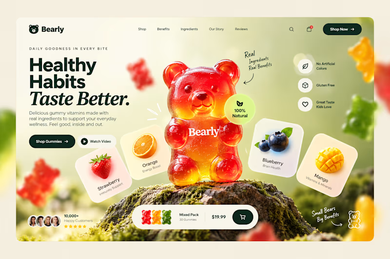
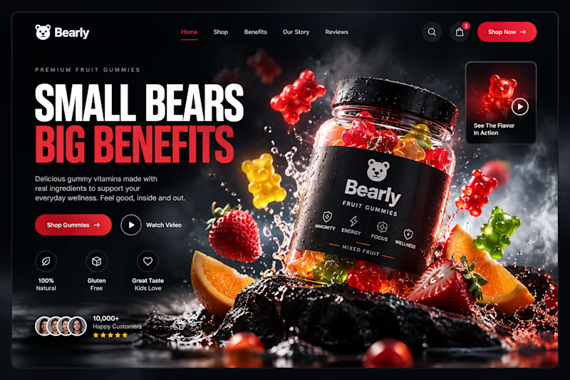
Two different directions for Bearly, a gummy candy brand concept.
One is bright, playful, and fruit-inspired. The other is bold, dark, and premium.
Same product, two completely different visual experiences.
Which one would you choose? Vote below! 👇
#BrandIdentity #WebDesign #UIUX #EcommerceDesign #Figma #DesignInspiration #ABTesting

9 voted
75%
3 voted
25%
12 votes
Closed

I will always love it playful cant lie


Proud to be an Official Framer Expert Agency for 2026!
Explore our work:
https://artonest.design/
https://www.framer.com/@artonest-design-studio/