The network for creativity
Join 1.25M professional creatives like you
Connect with clients, get discovered, and run your business 100% commission-free
Creatives on Contra have earned over $150M and we are just getting started
Back to feedPost

My paid Framer templates got no results for 2 months. Then I built 16 free ones in a month. Here’s the data.
Before this experiment, I had two paid templates sitting on the Marketplace for two months with no results.
So I tried a different approach: build 16 free templates in about a month and see whether Framer referrals could make it worthwhile.
Marketplace stats for October 1–30:
9,362 unique visitors
~14,300 views
488 remixes
12 conversions reported by Framer
Several templates have already reached the top 50 in their categories.
What did that actually earn?
The templates are free, so the money comes from Framer referrals.
Dub shows $503.04 in total commissions, including $284.69 for October, currently pending. The total also includes September.
Three annual plan purchases contributed roughly $341. The rest is a smaller stream of payments. My rough estimate is around $100/month from monthly referrals for now, depending on how long those customers stay.
What surprised me:
The three templates behind those annual purchases are all very simple. Each has a distinctive WebGL/Three.js gallery or visual effect, but the rest is straightforward and quick to customize before launch. My working hypothesis: one memorable feature helps attract attention, while an easy path to publishing helps people actually use it.
Competitive niches still brought in money. Some of the templates that earned commissions are in crowded categories. I wouldn’t rule out a niche just because it already has lots of templates.
The audience geography was better than I expected. By my estimate, roughly 60% of installs came from countries with relatively high purchasing power. That surprised me for free templates, although geography alone doesn’t prove purchase intent.
Views, remixes, rankings, and revenue tell different stories. Muscat generated 5 conversions with fewer views than Lavanda, which generated 2. Niche had 47 remixes and no conversions this month.
It’s still a small experiment. The templates launched at different times, and this doesn’t prove free always beats paid. But after two months of no results with paid templates, it finally gave me some real usage and revenue to learn from.
All the templates are free to browse and remix:
https://www.framer.com/@oleksandr-demydov/
Other creators: have you seen better results from elaborate templates, or simple ones people can customize and launch quickly?

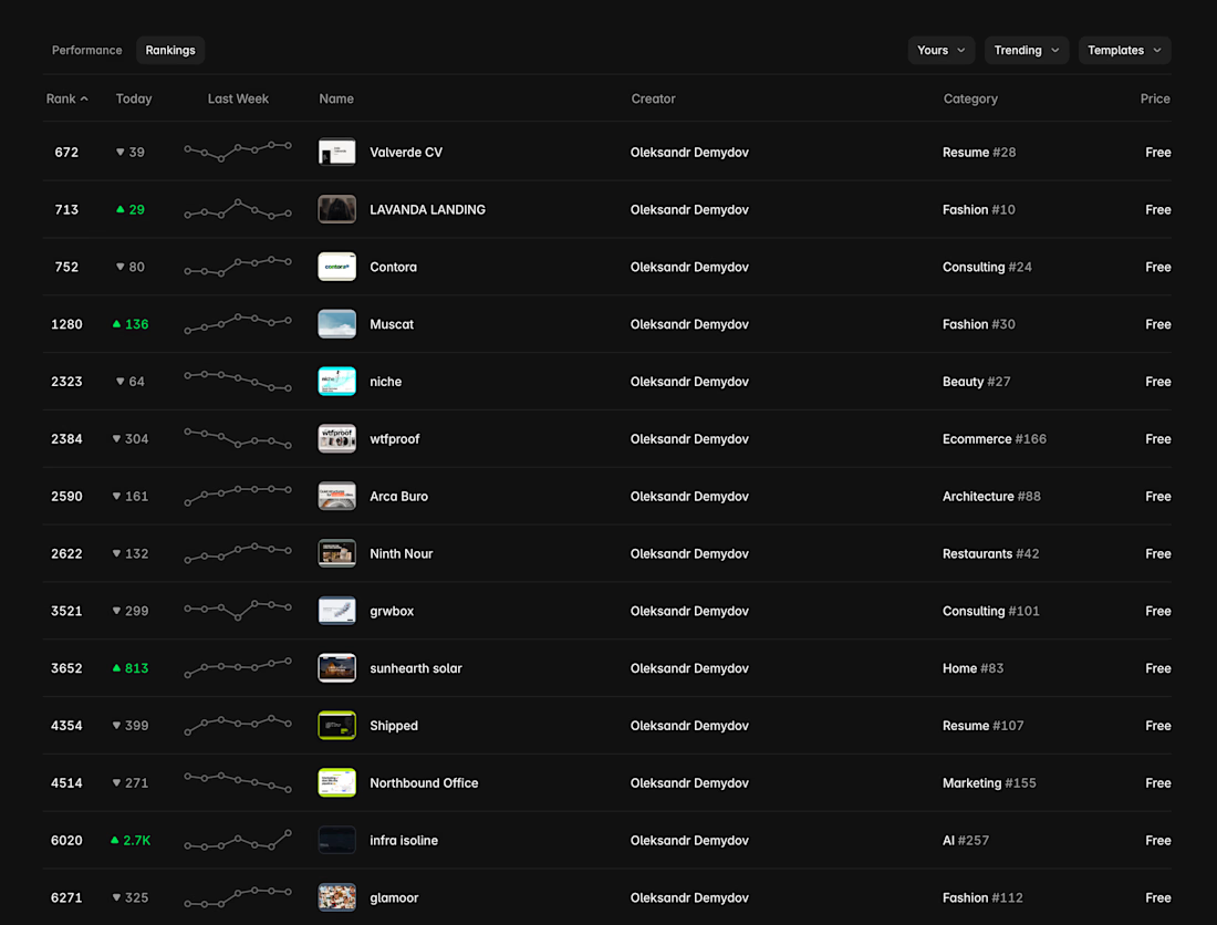

Muscat getting 5 conversions with fewer views than Lavanda is a useful data point.
The network for creativity
Join 1.25M professional creatives like you
Connect with clients, get discovered, and run your business 100% commission-free
Creatives on Contra have earned over $150M and we are just getting started
Related posts

Not every website needs more elements.
Sometimes, it needs better decisions.
A thoughtful layout.
A strong typographic hierarchy.
The right images.
Consistent spacing.
A clear navigation.
And enough room for the design to breathe.
These details might seem small, but together they shape how people experience a website.
That's one thing I appreciate about working with Framer: the opportunity to explore layouts, interactions, and visual details while keeping the experience intentional.
For me, good web design isn't about adding more.
It's about knowing what to keep, what to remove, and what deserves attention.
Less noise. More meaning. Better experiences.
What's one small design detail that immediately makes a website feel premium to you?

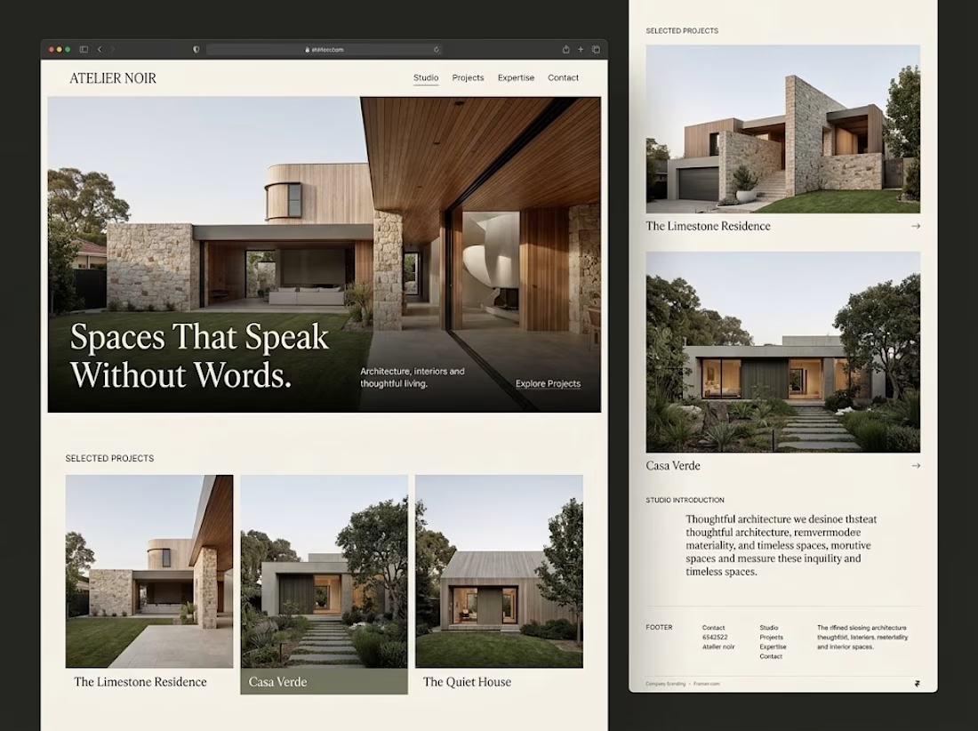

Generous whitespace for me. The serif headline over the photo on your Atelier Noir layout is a good example.

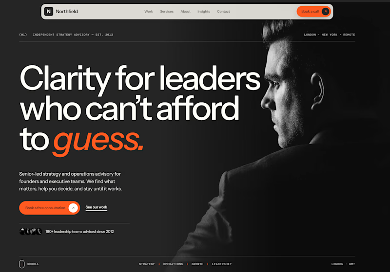
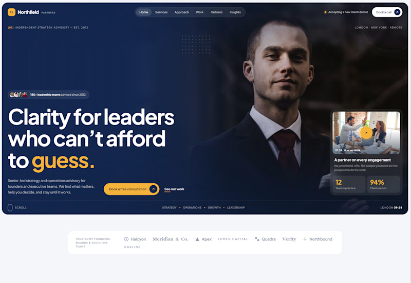
Exploring two different hero directions for a new project.
Same message, two completely different visual approaches.
Which one makes a stronger first impression?
A or B? Curious to hear your thoughts!
36 voted
90%
4 voted
10%
40 votes
Closed

Both are strong. I lean towards the dark version, because the orange accent on the italic "guess." pops and the profile portrait gives it a more editorial, confident feel. The navy one reads a bit more corporate, which could suit a more conservative audience. Nice exploration!

Tamp, a Framer template for coffee shops and cafés.