The network for creativity
Join 1.25M professional creatives like you
Connect with clients, get discovered, and run your business 100% commission-free
Creatives on Contra have earned over $150M and we are just getting started
Back to feedPost

FLIGHT BOOKING UI
Project Overview
A mobile flight-booking experience designed to make discovering, comparing, and booking flights feel simpler and more intuitive. The concept focuses on reducing friction throughout the booking journey while keeping important travel information clear and accessible.
The Problem
Booking a flight can quickly become overwhelming. Users often have to navigate through complex search forms, compare multiple flight options, review scattered travel details, and complete lengthy payment processes.
The goal was to create a more streamlined experience where users could find a flight, understand the details, and complete their booking with less friction.
Target Audience
The experience is designed for:
Frequent travelers looking for a faster booking process
Business travelers who value speed and clarity
Young travelers comparing affordable flight options
Users booking one-way, round-trip, or multiple-trip journeys
The Goal
The primary goal was to design a flight-booking experience that feels simple, visual, and effortless, while making important information such as destinations, departure times, prices, and booking details easy to understand.
The Solution
I designed a streamlined flight-booking experience centered around clarity and simplicity.
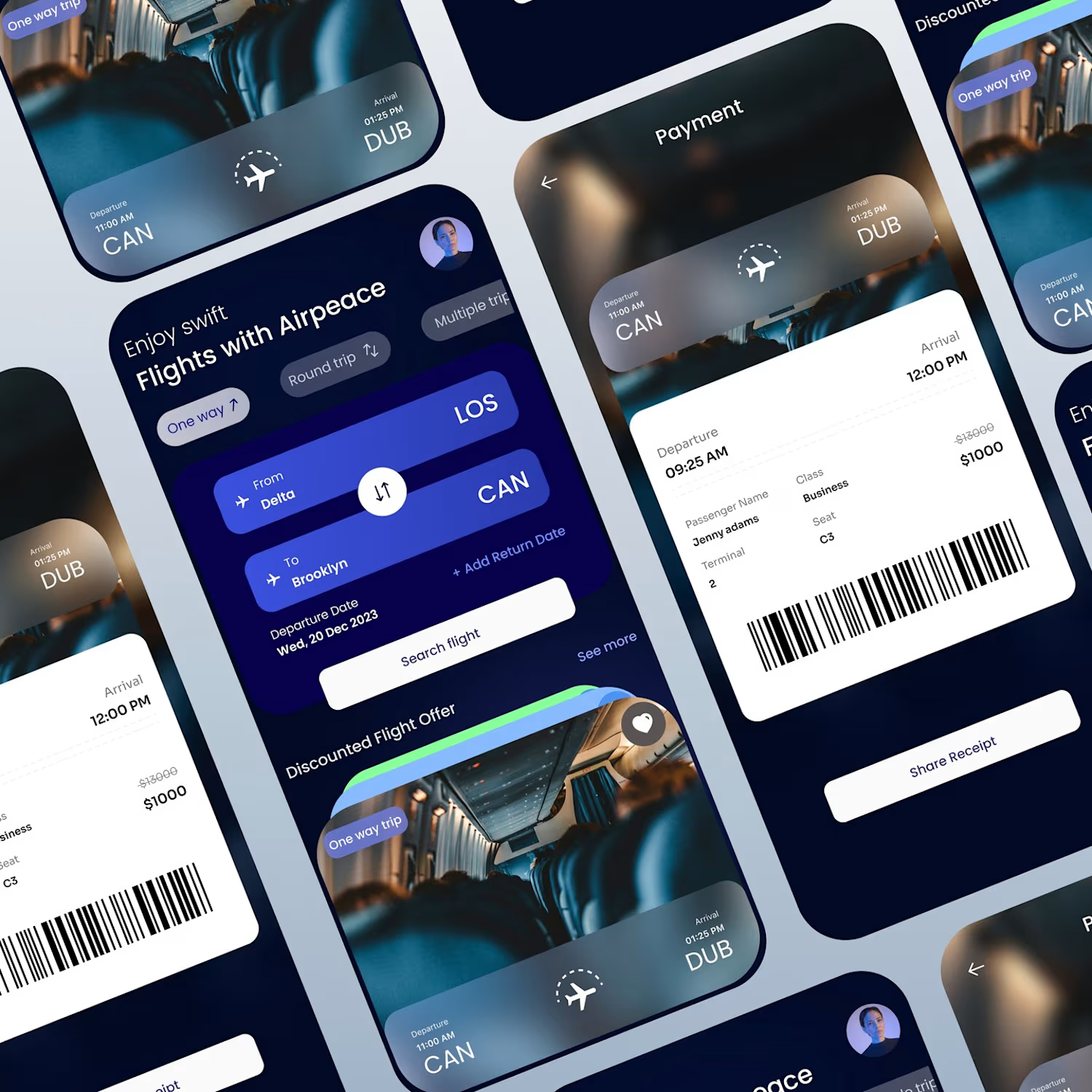
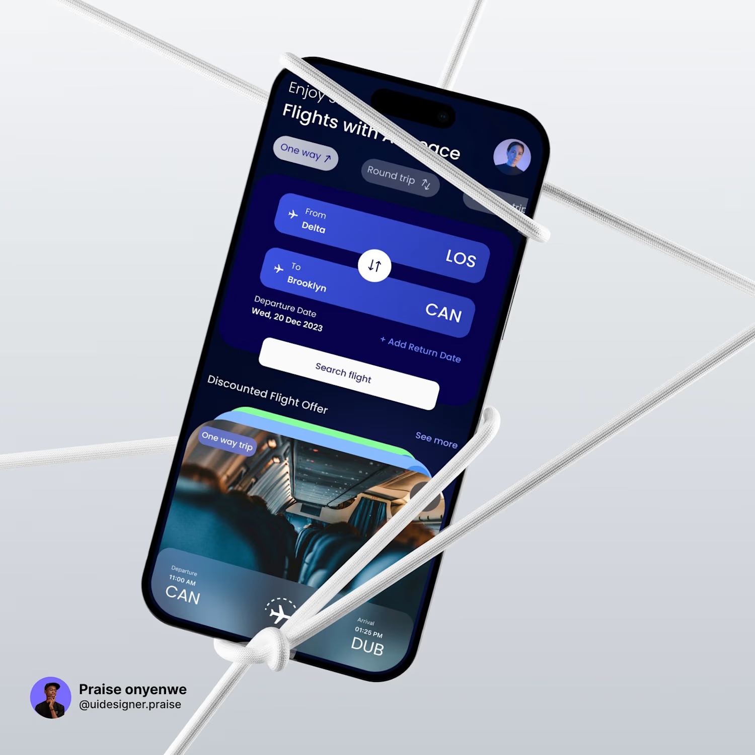
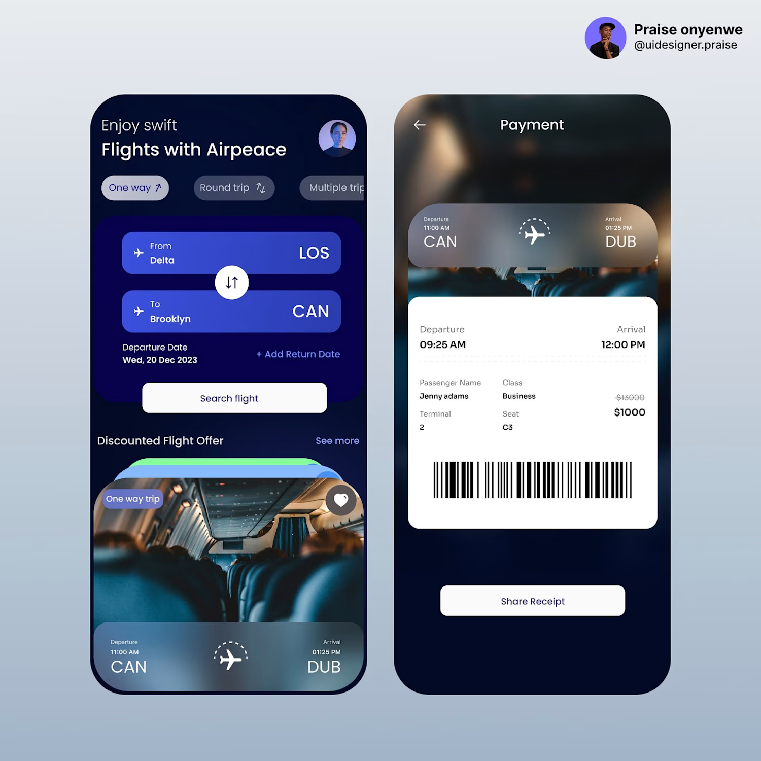
The interface brings flight search, discounted offers, trip information, payment, and booking details into a cohesive flow. Instead of overwhelming users with information, the experience uses clear visual hierarchy and card-based layouts to make each decision easier.
My Approach
I focused on three key areas:
1. Simplify the search experience
The flight search interface prioritizes the information users need first — origin, destination, trip type, and travel dates.
2. Make flight options easier to scan
Flight offers are presented using visual cards that combine imagery, route information, departure and arrival times, and pricing in a single glanceable component.
3. Reduce friction at checkout
The payment and confirmation screens were designed to clearly communicate what the user is purchasing, including passenger information, class, seat, terminal, price, and booking reference details.

The network for creativity
Join 1.25M professional creatives like you
Connect with clients, get discovered, and run your business 100% commission-free
Creatives on Contra have earned over $150M and we are just getting started

Challenges
View all


Related posts

A little interactive experiment for Verdant 🌱
Writing unique code for animations makes iterating on reactive micro-interactions so much smoother. It completely transforms how a brand narrative feels in the browser.


Great job


Love this concept 🧡


New case study!
Artist portfolio website design and Webflow development for Teri Sanders, a New York-based artist.

The way the editorial grid lets Teri’s work lead while the oversized name anchors the page feels beautifully restrained. Nice balance of art direction and a usable Webflow portfolio structure.