The network for creativity
Join 1.25M professional creatives like you
Connect with clients, get discovered, and run your business 100% commission-free
Creatives on Contra have earned over $150M and we are just getting started
Back to feedPost


The network for creativity
Join 1.25M professional creatives like you
Connect with clients, get discovered, and run your business 100% commission-free
Creatives on Contra have earned over $150M and we are just getting started

Challenges
View all


Related posts

Brand Expressions for Munch


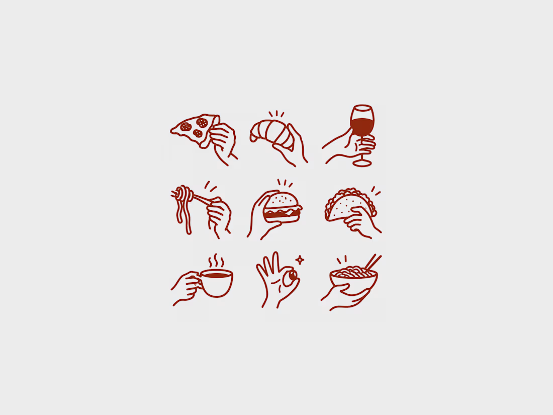
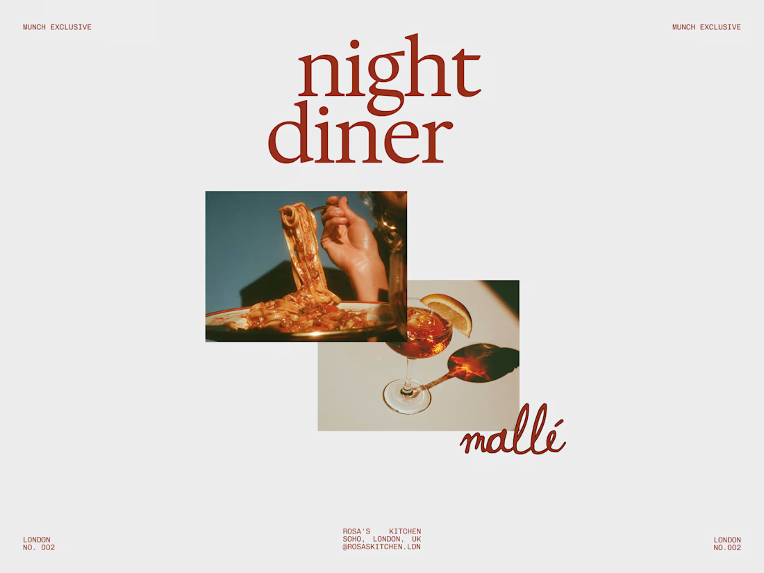
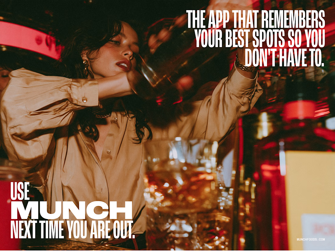
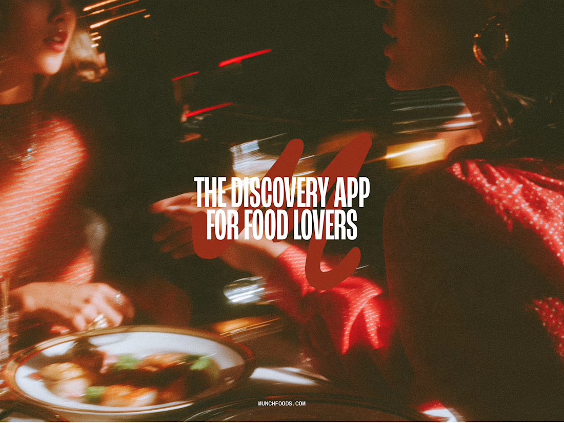

The hand-drawn gesture icons paired with that retro diner script give it real personality, feels less like a generic food app and more like something with a point of view.

Barra Norte Café — Rebranding & Conversion-Focused Social Media Redesign
Description:
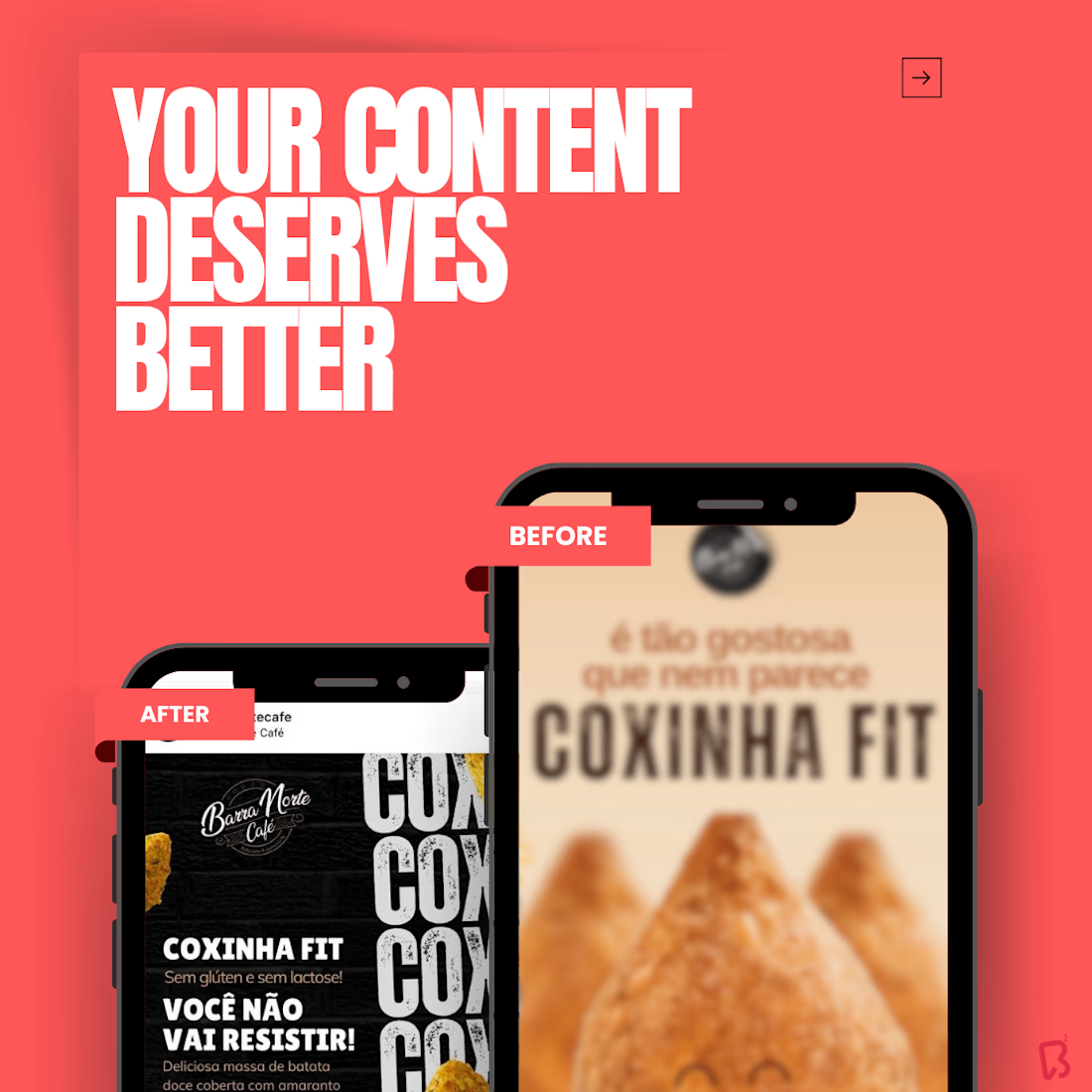
A strategic rebranding project created for Barra Norte Café to modernize its customer communication and elevate the visual presentation of its products on social media. The goal was to move away from outdated, heavy, and visually cluttered product posts, replacing them with a cleaner, more contemporary, and more conversion-oriented design language.
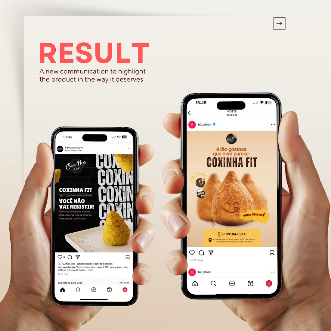
This redesign was developed to highlight the product with greater realism and appetite appeal, placing the featured item — in this case, the Coxinha Fit — at the center of the composition. The new visual direction combines modern typography, cleaner hierarchy, improved lighting, softer backgrounds, and stronger product focus, creating a more attractive and professional experience for the audience.
The project also included the creation of a promotional post for a discount coupon campaign, designed to communicate the offer clearly while maintaining a polished and appetizing visual identity. Rather than relying on ordinary product photos, the concept merged copy, typography, layout, and product presentation into a modern advertising piece that is easy to understand and visually impactful.
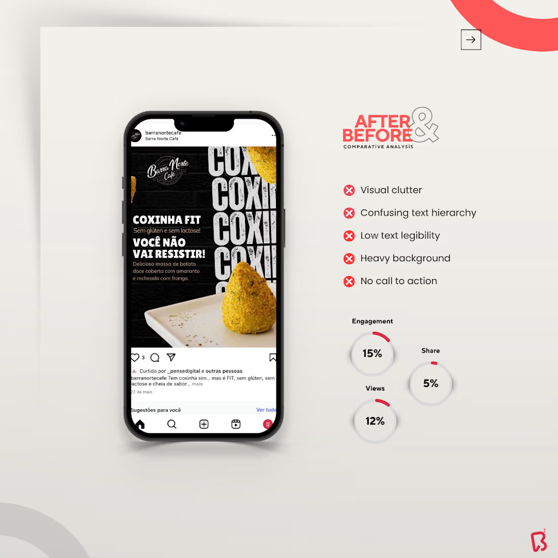
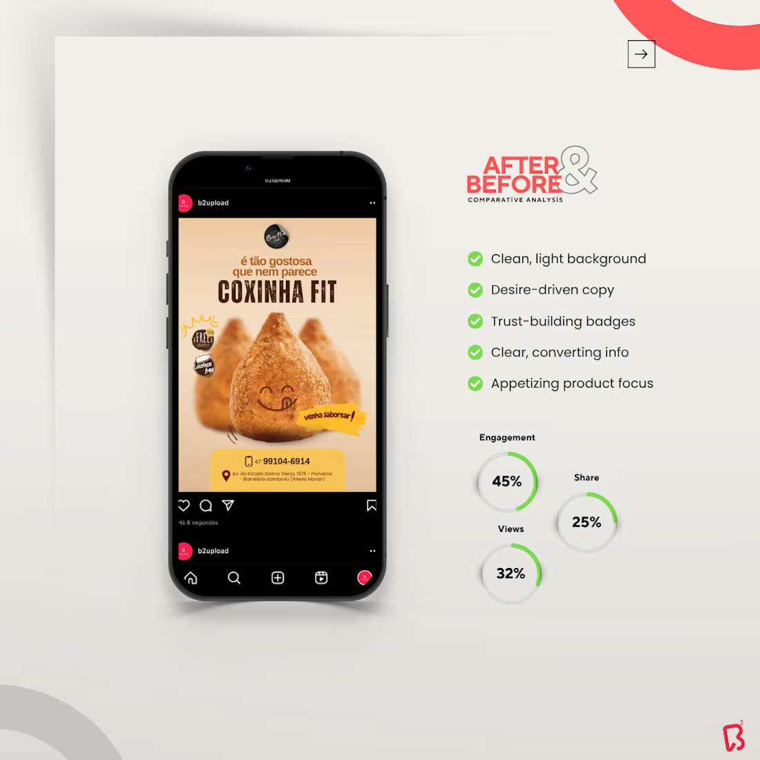
The comparative slides reinforce the value of the redesign by showing the difference between the old and new communication style. The “before” version reflects common issues such as visual overload, confusing text hierarchy, low readability, and weak call-to-action structure. The “after” version presents a much more refined composition, with a light and clean background, desire-driven copy, trust-building badges, clearer product information, and a more compelling focal point.
Across the full presentation, every element was designed to support clarity and conversion. The bold sans-serif typography brings a modern 2.0 feel, the warm and neutral color palette enhances appetite and comfort, and the centered product positioning creates immediate visual attraction. The result is a stronger brand presence, a more professional feed, and communication that helps the customer instantly understand the product while feeling more motivated to engage or purchase.
If you want to improve the way your business communicates and create posts that truly reflect the value of your brand, get in touch. I’ll be happy to prepare a custom quote for your project, with no obligation.