The network for creativity
Join 1.25M professional creatives like you
Connect with clients, get discovered, and run your business 100% commission-free
Creatives on Contra have earned over $150M and we are just getting started
Back to feedPost

Barra Norte Café — Rebranding & Conversion-Focused Social Media Redesign
Description:
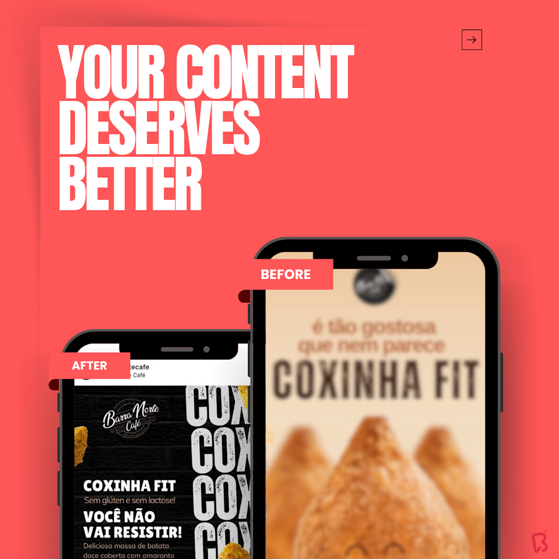
A strategic rebranding project created for Barra Norte Café to modernize its customer communication and elevate the visual presentation of its products on social media. The goal was to move away from outdated, heavy, and visually cluttered product posts, replacing them with a cleaner, more contemporary, and more conversion-oriented design language.
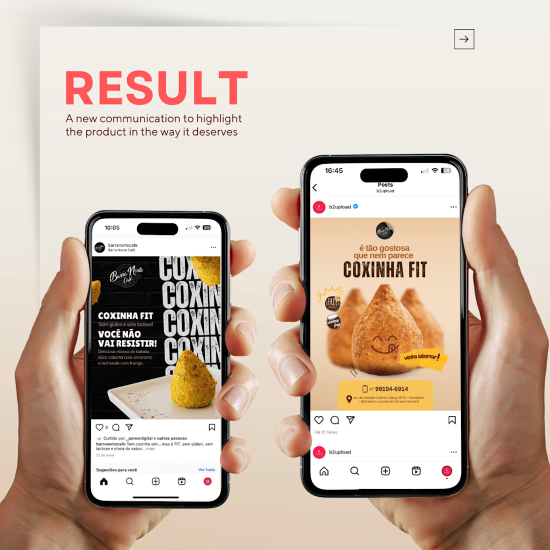
This redesign was developed to highlight the product with greater realism and appetite appeal, placing the featured item — in this case, the Coxinha Fit — at the center of the composition. The new visual direction combines modern typography, cleaner hierarchy, improved lighting, softer backgrounds, and stronger product focus, creating a more attractive and professional experience for the audience.
The project also included the creation of a promotional post for a discount coupon campaign, designed to communicate the offer clearly while maintaining a polished and appetizing visual identity. Rather than relying on ordinary product photos, the concept merged copy, typography, layout, and product presentation into a modern advertising piece that is easy to understand and visually impactful.
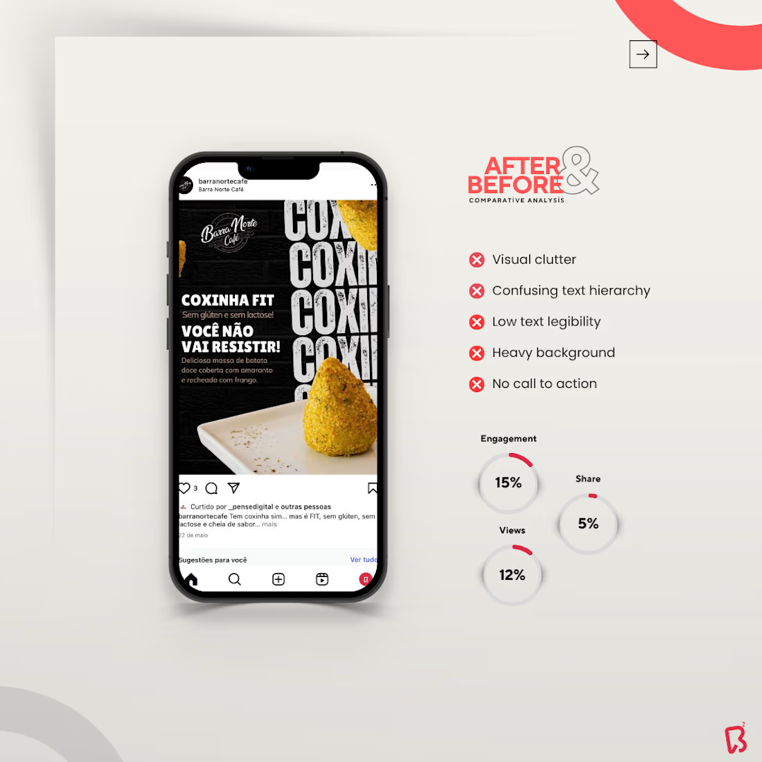
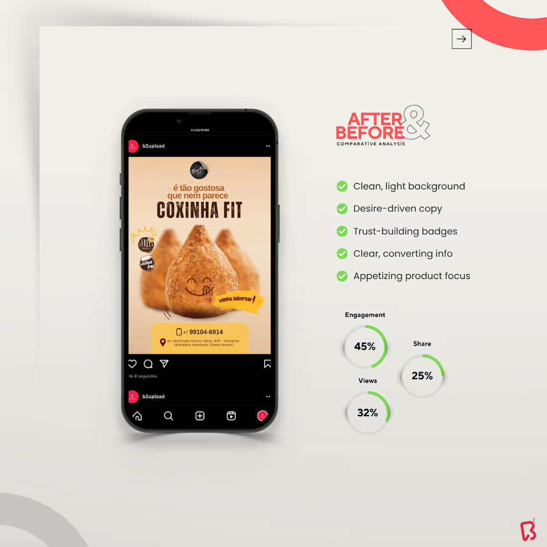
The comparative slides reinforce the value of the redesign by showing the difference between the old and new communication style. The “before” version reflects common issues such as visual overload, confusing text hierarchy, low readability, and weak call-to-action structure. The “after” version presents a much more refined composition, with a light and clean background, desire-driven copy, trust-building badges, clearer product information, and a more compelling focal point.
Across the full presentation, every element was designed to support clarity and conversion. The bold sans-serif typography brings a modern 2.0 feel, the warm and neutral color palette enhances appetite and comfort, and the centered product positioning creates immediate visual attraction. The result is a stronger brand presence, a more professional feed, and communication that helps the customer instantly understand the product while feeling more motivated to engage or purchase.
If you want to improve the way your business communicates and create posts that truly reflect the value of your brand, get in touch. I’ll be happy to prepare a custom quote for your project, with no obligation.


The network for creativity
Join 1.25M professional creatives like you
Connect with clients, get discovered, and run your business 100% commission-free
Creatives on Contra have earned over $150M and we are just getting started
Challenges
View all


Related posts

Wonder -- Visual Expressions


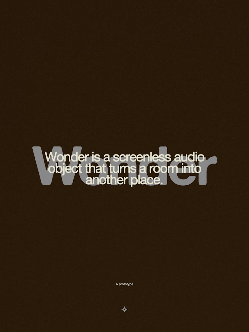
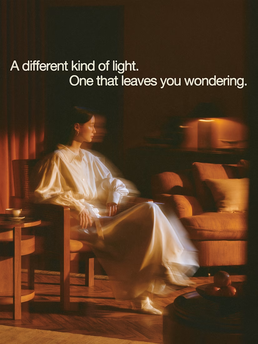


The restraint in the warm palette really lets the sound-object concept breathe—especially that shift from readable type to atmosphere.

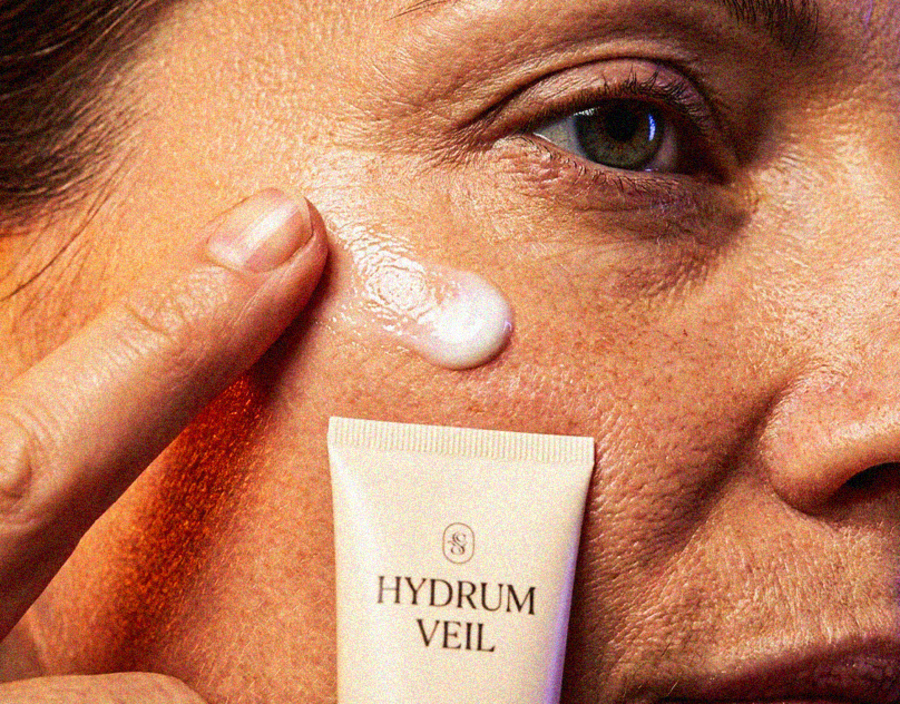
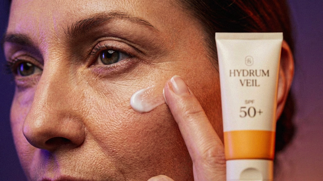
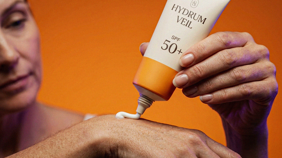
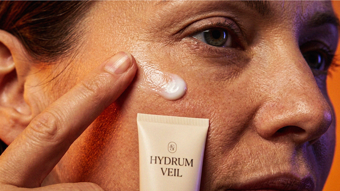
I Just Created HYDRUM VEIL 🔥
HYDRUM VEIL is a skincare brand built around a premium SPF 50+ sunscreen, developed as a complete brand identity, packaging design, and seasonal advertising campaign.
The project explores a question most seasonal beauty work gets wrong: how do you make a limited-edition campaign feel festive without making it feel cheap?
Instead of stacking decorative props, the campaign holds a strict visual system - vivid pumpkin orange, deep twilight violet, warm cream, and restrained black and lets a single product carry every frame.
Drop your replies in cmnts.....!!!!! 🙌
branddesignertastetestBrand DesignGraphic DesignPackaging DesignAdobe IllustratorAdobe PhotoshopClaude



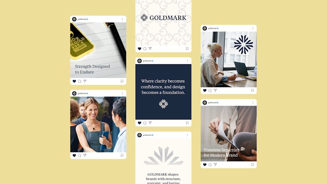
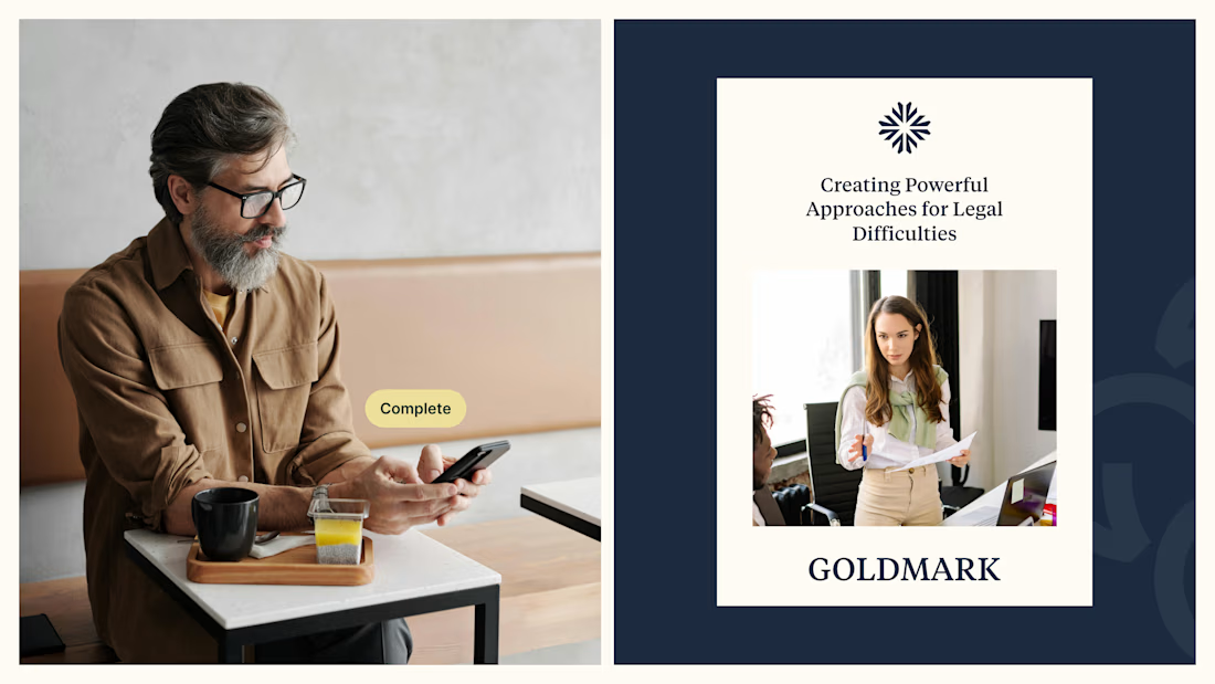
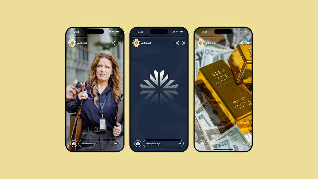
GOLDMARK - A refined identity for modern legal expertise. ✦
A complete branding exploration focused on building a visual language that feels premium, trustworthy, timeless, and confident.
The identity combines a distinctive symbol, elegant typography, and a deep navy + warm gold palette to create a sophisticated presence across digital and print applications.
Services: Brand Identity • Logo Design • Art Direction • Visual System
#BrandIdentity #BrandDesign #LogoDesign #VisualIdentity #Branding #GraphicDesign #ContraPortfolio