The network for creativity
Join 1.25M professional creatives like you
Connect with clients, get discovered, and run your business 100% commission-free
Creatives on Contra have earned over $150M and we are just getting started
Back to feedPost

A look at an editorial product display section I designed and built for CERYSSÉ, combining product storytelling with a more immersive editorial layout.
The network for creativity
Join 1.25M professional creatives like you
Connect with clients, get discovered, and run your business 100% commission-free
Creatives on Contra have earned over $150M and we are just getting started





Related posts

A bold personal portfolio combining editorial design, 3D elements and modern web development to create a distinctive digital experience and showcase my work as a web developer.



I love the buddy here

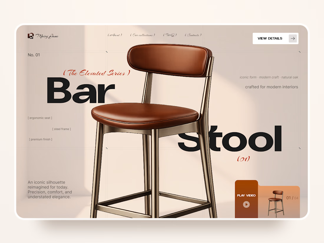
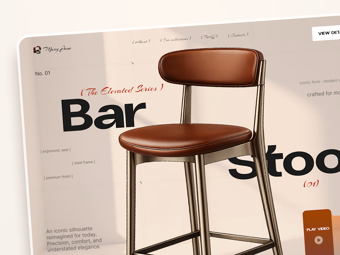
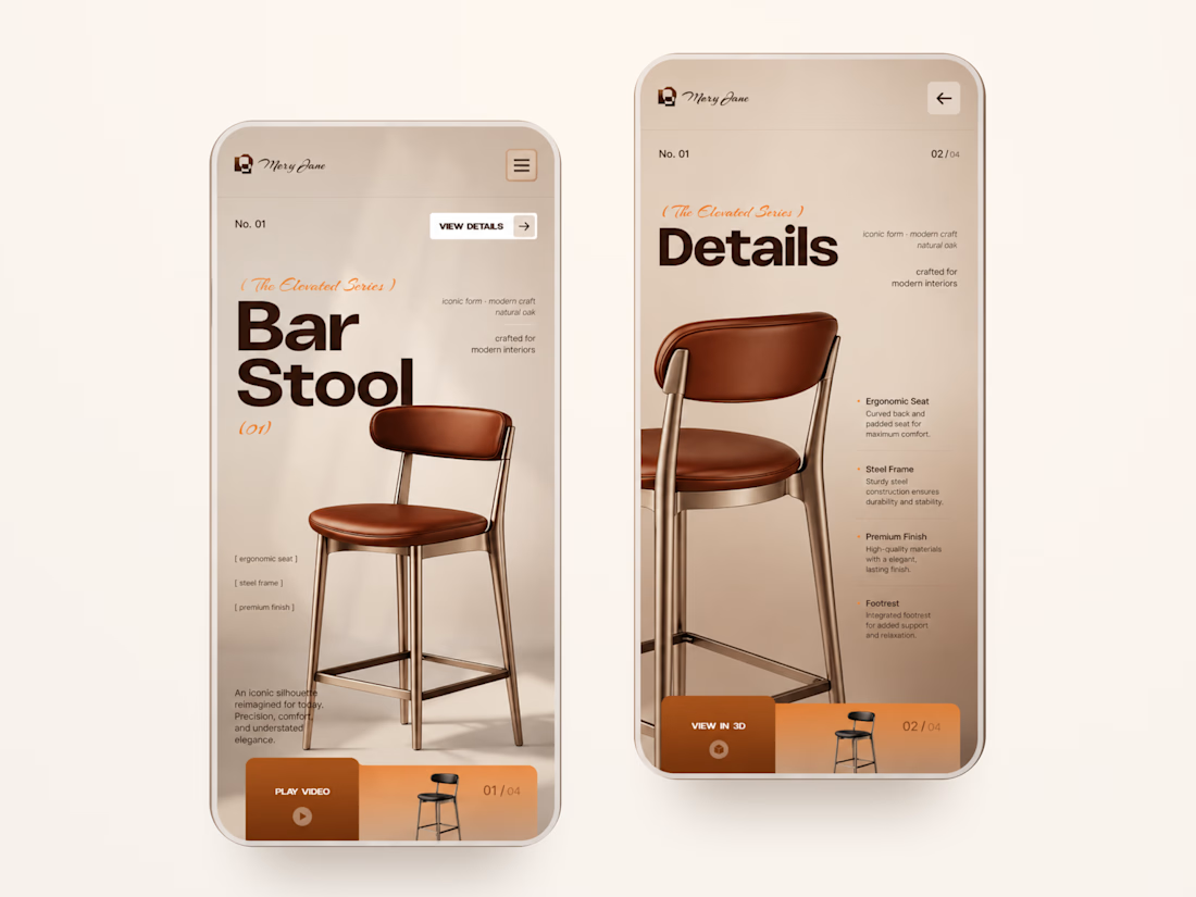
Mary Jane — Bar Stool Product Landing Page 🪑✨
A refined product landing page concept for a modern furniture brand, built around one statement piece
The design combines warm neutral tones, oversized typography, and editorial layouts to give the bar stool a premium, design-focused feel
Special attention was given to:
• Product-first composition
• Clean editorial typography
• Warm premium aesthetic
• Product details and features
• Video and 3D presentation
• Responsive mobile layout
The result is a simple, elegant experience that keeps the product at the center while giving the brand a distinctive visual character 🤎



Nice work

So if you did not know I am a huge musical fan and I watched Killing Carmen in Vienna last year, a brand new musical reinterpretation of the Carmen opera by Volksoper.
However, after purchasing the official play brochure, I was quite disappointed. So as any logical person would do, by using the publicly available resources from their website, I decided to redesign the brochure.
My goal was to create a design that reflected the multilingual, dynamic, and contemporary spirit of the production which turns the informational brochure into a visual keepsake (which is the whole point of purchasing the brochures if you ask me!)
Be brutally honest with me which would you prefer to buy at the theater?
2 voted
40%
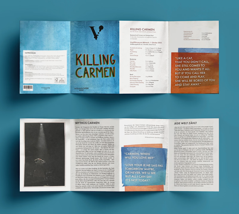
3 voted
60%
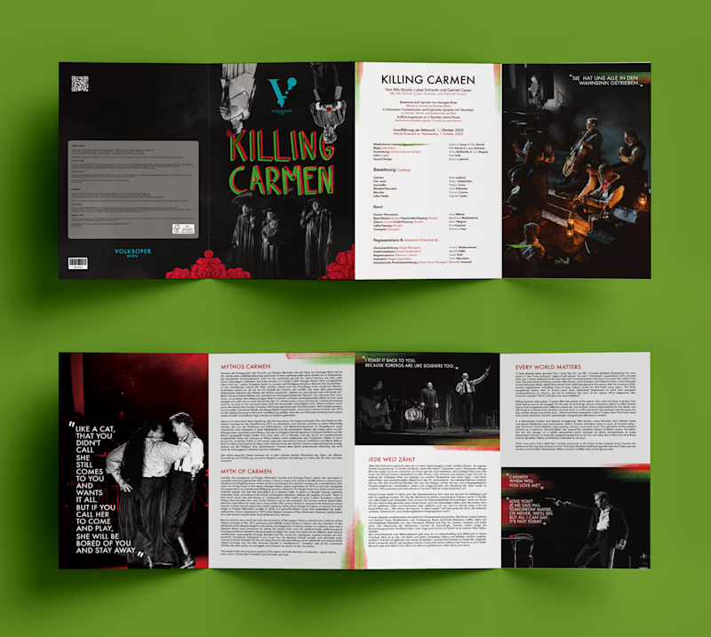
5 votes
Closed

Re-Make for me. The dark, moody spreads suit the show far better than the pastel original.