The network for creativity
Join 1.25M professional creatives like you
Connect with clients, get discovered, and run your business 100% commission-free
Creatives on Contra have earned over $150M and we are just getting started
Back to feedPost

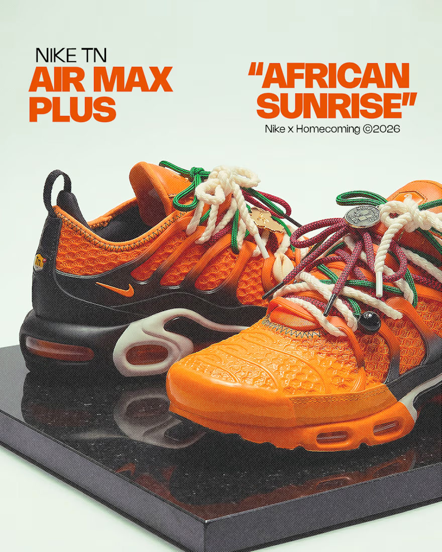
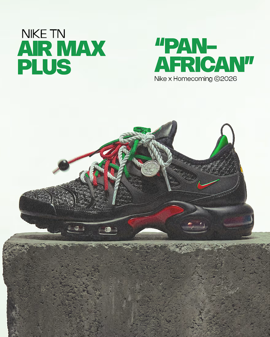
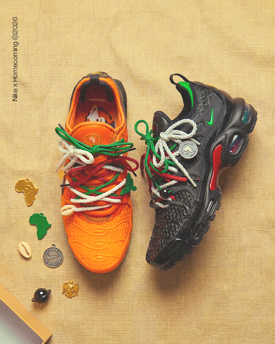
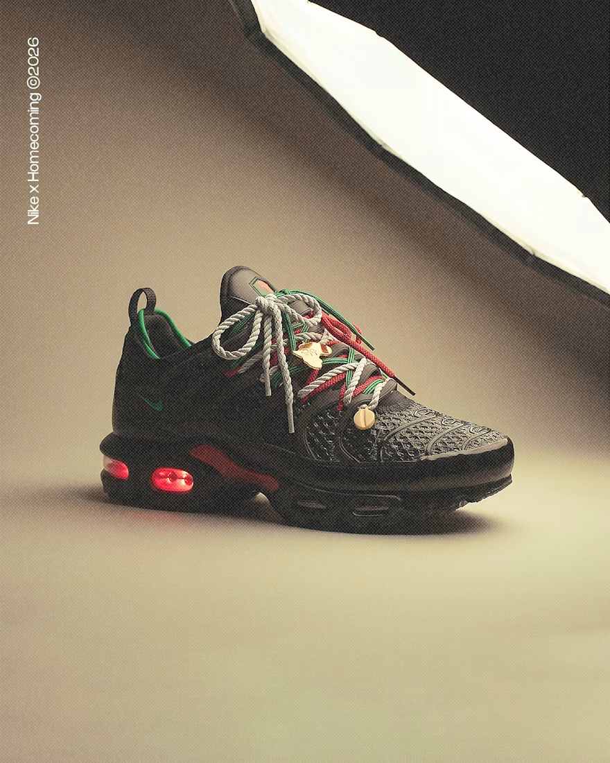
I just dropped a self-initiated campaign for the most important sneaker collab of 2026.
Nike x Homecoming. The first Nike shoe ever designed by an African woman. Grace Ladoja MBE, Lagos, history.
I didn't wait for a brief. I built the full campaign world myself. Product close-ups, Lagos street lifestyle, festival energy, night shots, charm details. Two colourways. Twenty frames.
No studio. No photographer. No client budget.
Just a senior creative who knew this moment deserved a proper campaign behind it.
This is what I do. I find the cultural weight in a product and build a visual world around it. Brand identity, art direction, campaign concepting. If your brand has a moment like this coming and needs a creative who gets it from the inside out, I'm available for projects.
Based in Lagos. Working globally.
Portfolio: behance.net/temilolbenjami
#ArtDirection #BrandIdentity #CreativeDirection #Nike #Lagos #Homecoming #AfricanCreatives
The network for creativity
Join 1.25M professional creatives like you
Connect with clients, get discovered, and run your business 100% commission-free
Creatives on Contra have earned over $150M and we are just getting started





Related posts

Jordan Reid - Sportswear Brand Identity


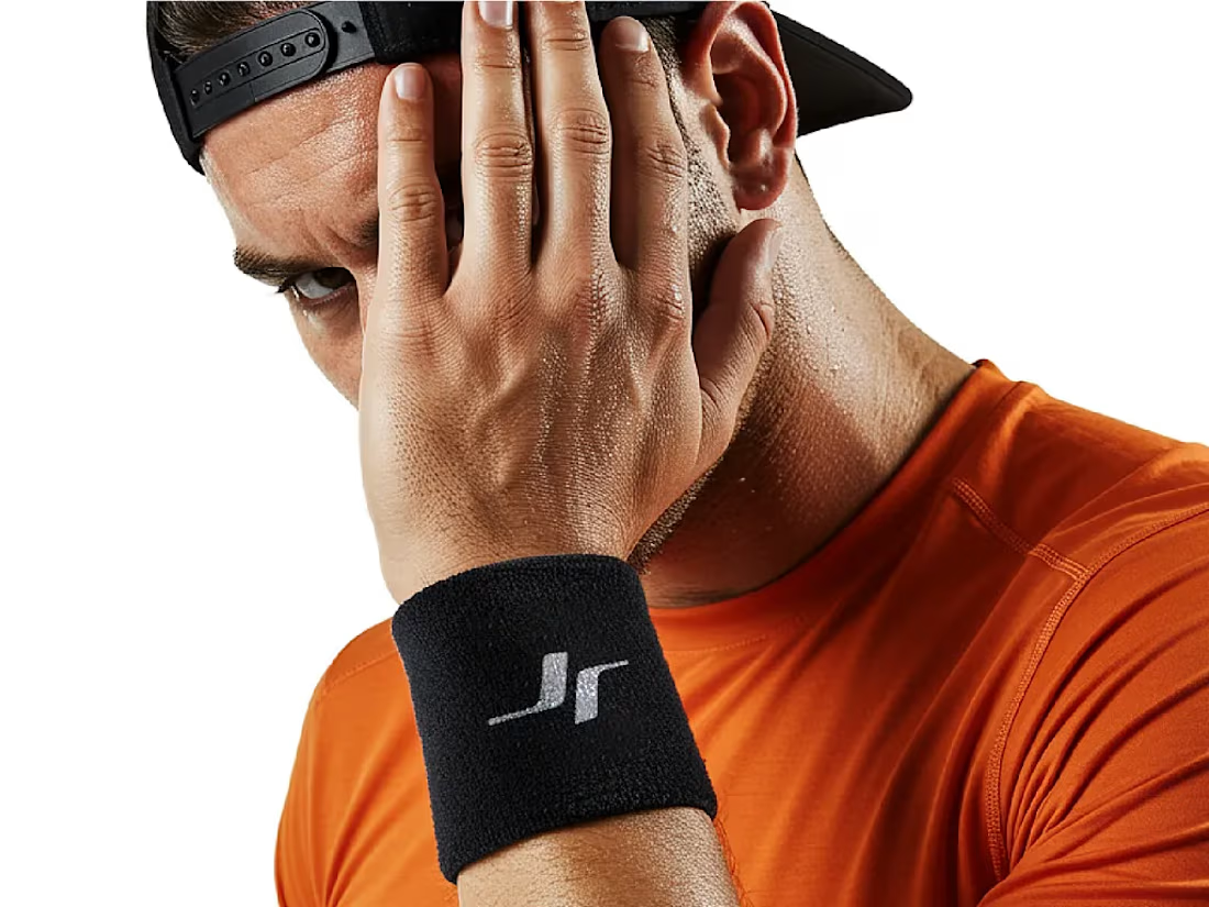
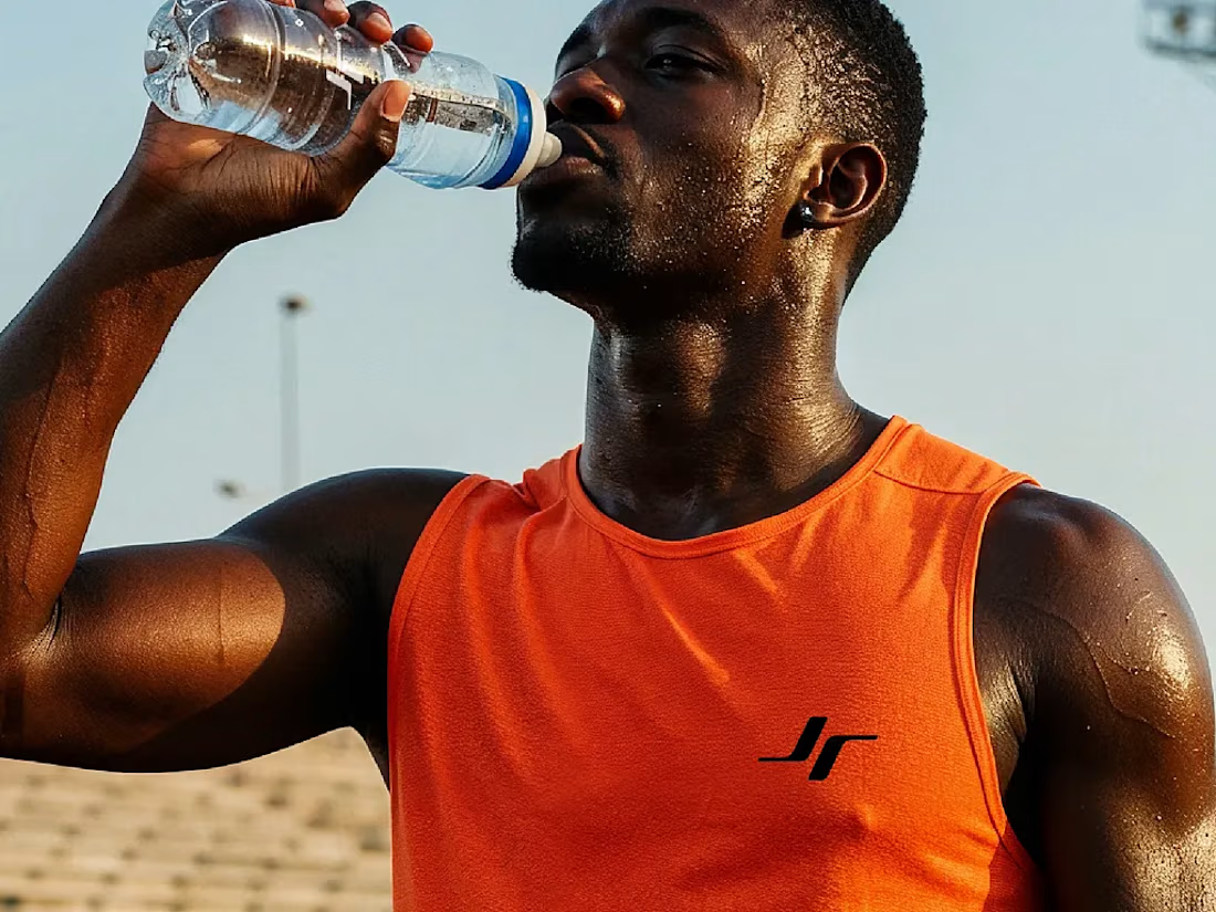
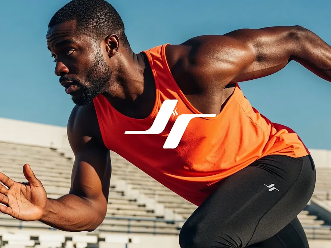


Like the logo direction

Before we move on to some client collaborations, a last post about the new LUCERRÁ digital experience to wrap it up.


Next intelligence. A brand you can feel.
Ice blue, deep black and refracted glass bring texture, depth and a sense of touch to an invisible technology. An identity designed to be recognised. And felt.
Brand identity and visual direction for Niwos, a platform that brings AI agents together as a digital workforce.
Five modules. One W. A simple idea at the heart of the identity: working as one.
I’ve really enjoyed working on this project with Muhammed. His trust in my design judgement and openness to new ideas gave me the creative freedom to explore fully.
Here’s hoping this is just the first chapter of an exciting journey with him and his team.

👍 nicely done