The network for creativity
Join 1.25M professional creatives like you
Connect with clients, get discovered, and run your business 100% commission-free
Creatives on Contra have earned over $150M and we are just getting started
Back to feedPost

CHECK THIS OUT

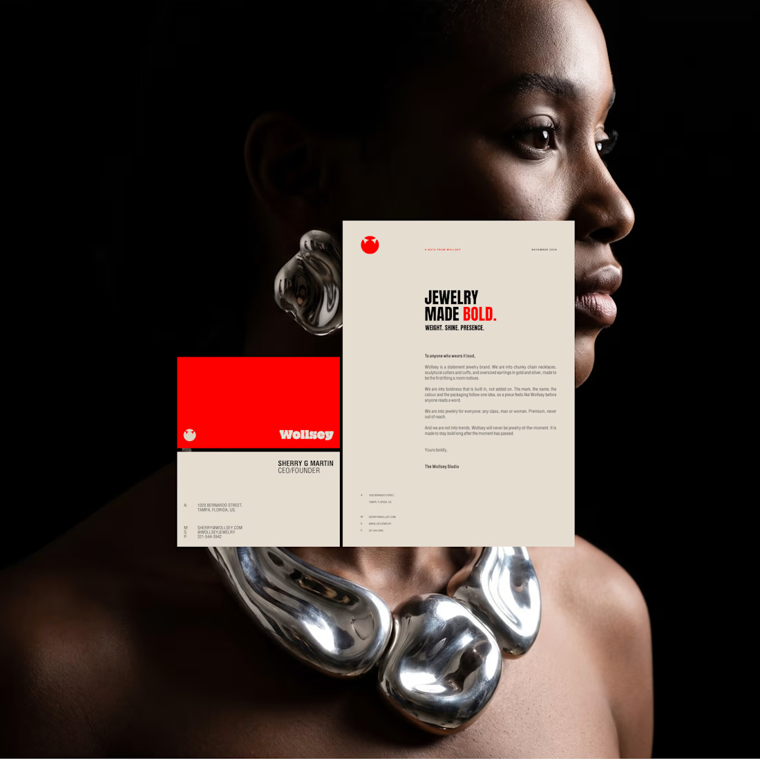
WOLLSEY JEWELRY BRANDING
Stationery Designs
Business Card and Letterhead
The identity centers on two interconnected principles; presence and permanence. The symbol takes the form of a solid, self-contained mark: a circular silhouette holding a crown-like negative space at its...
The network for creativity
Join 1.25M professional creatives like you
Connect with clients, get discovered, and run your business 100% commission-free
Creatives on Contra have earned over $150M and we are just getting started


Related posts


Check this out

Pinch is a skin that feels like a small stop-motion world. Everything moves at claymation frame rates about 8 to 12 frames a second, stepped and never smoothly eased and nothing is perfectly even because hand-made clay is not.
I grew up on Wallace and Gromit, Shaun the Sheep and...

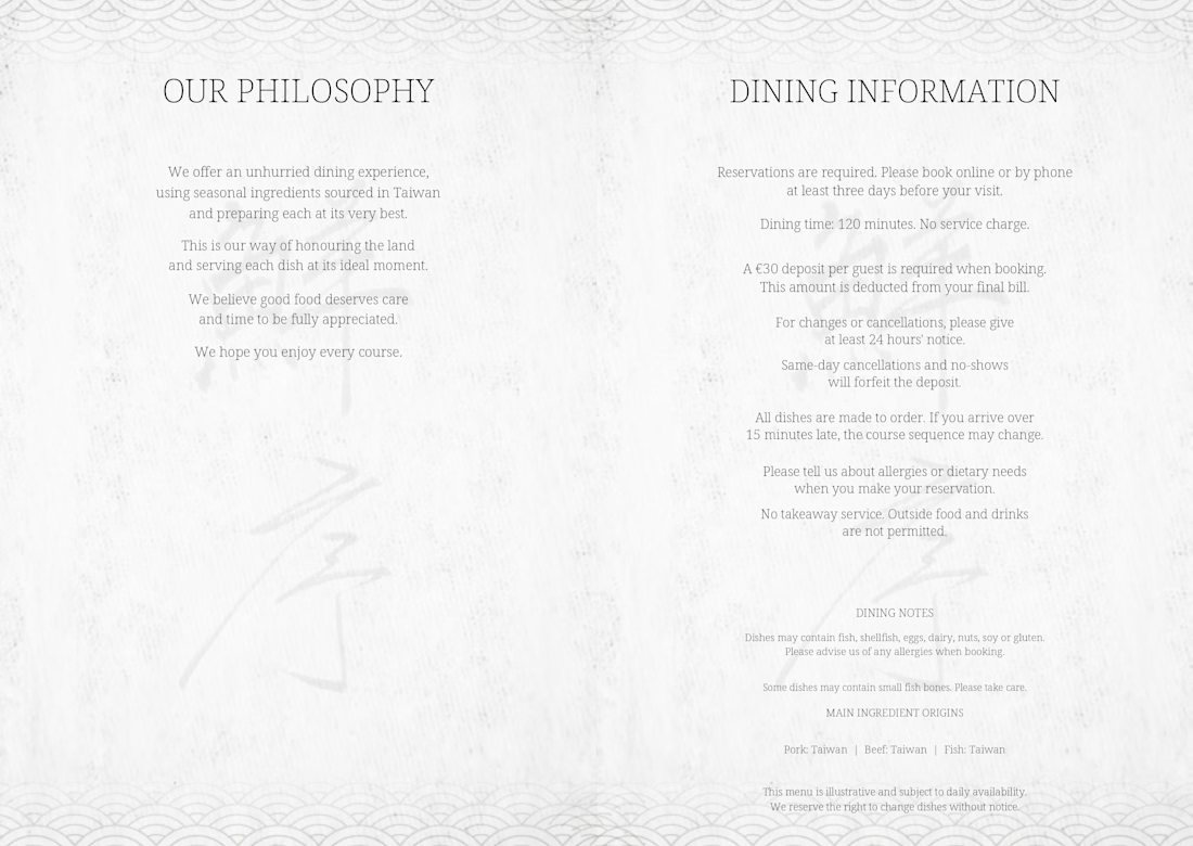
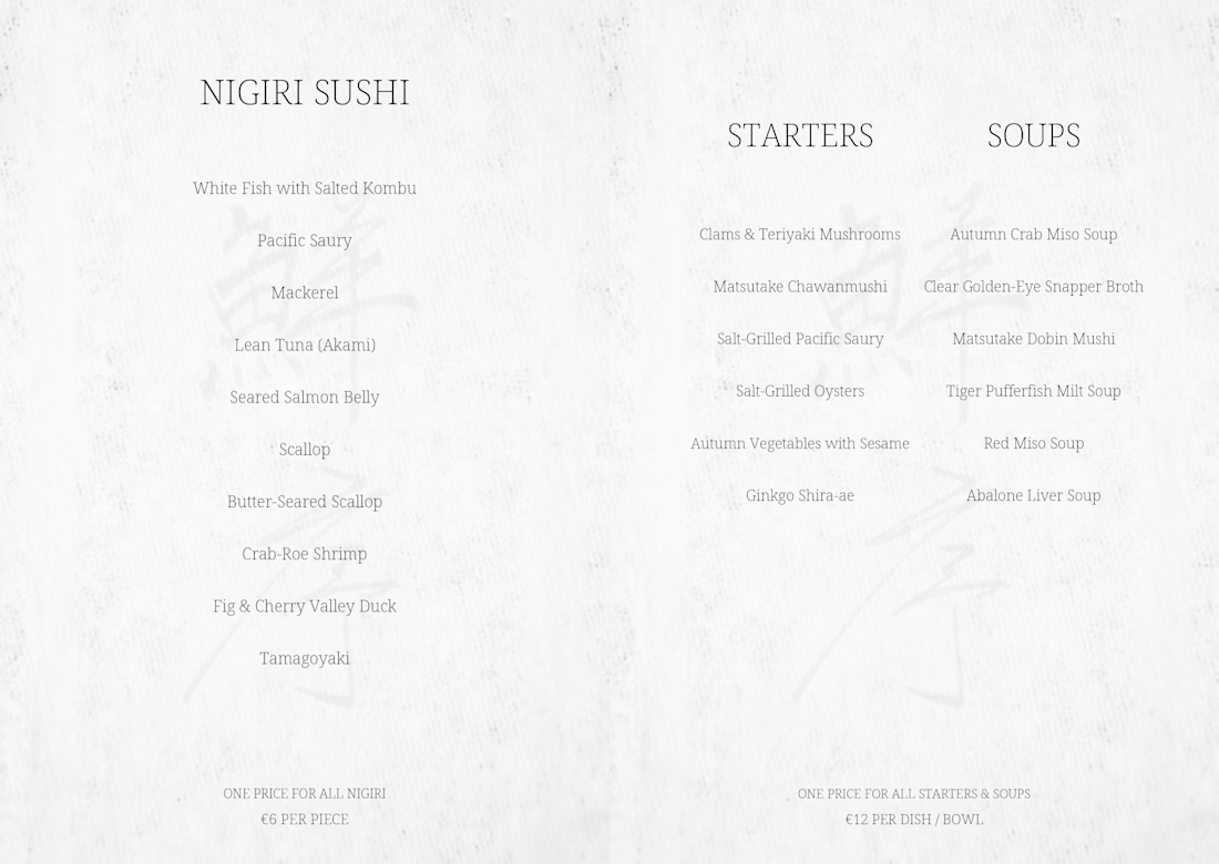
SENJO | Japanese Restaurant Menu Design
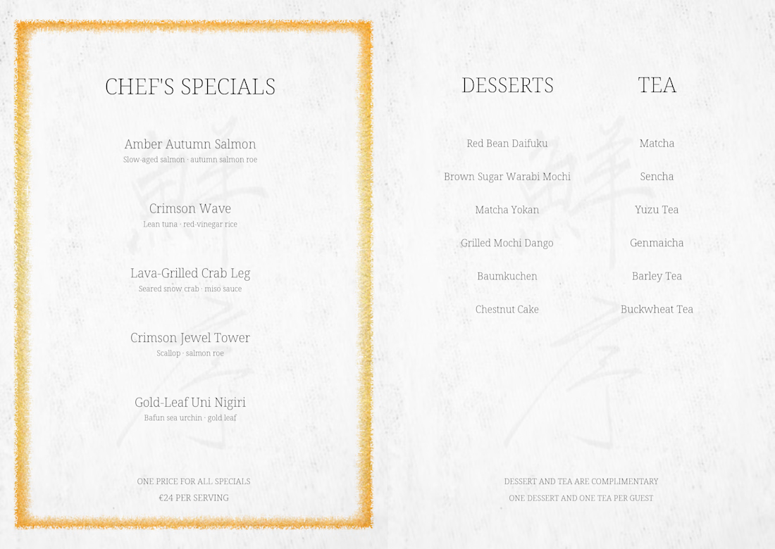
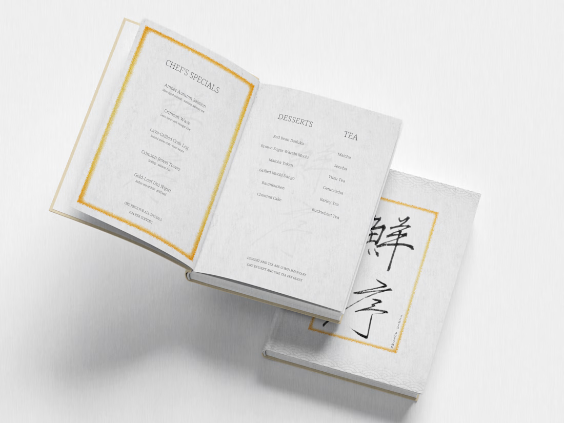
A personal menu design concept for a Japanese restaurant, featuring an A5 layout with traditional Japanese-inspired details.
The design combines expressive brush lettering, subtle gold accents, textured paper elements, and clean typography to create a refined dining experience.
The project includes the menu cover, English-language interior layouts, and a presentation mockup created in Adobe Photoshop.
Personal Concept Project.

Ziquan, the fine gold borders are a lovely touch on this menu

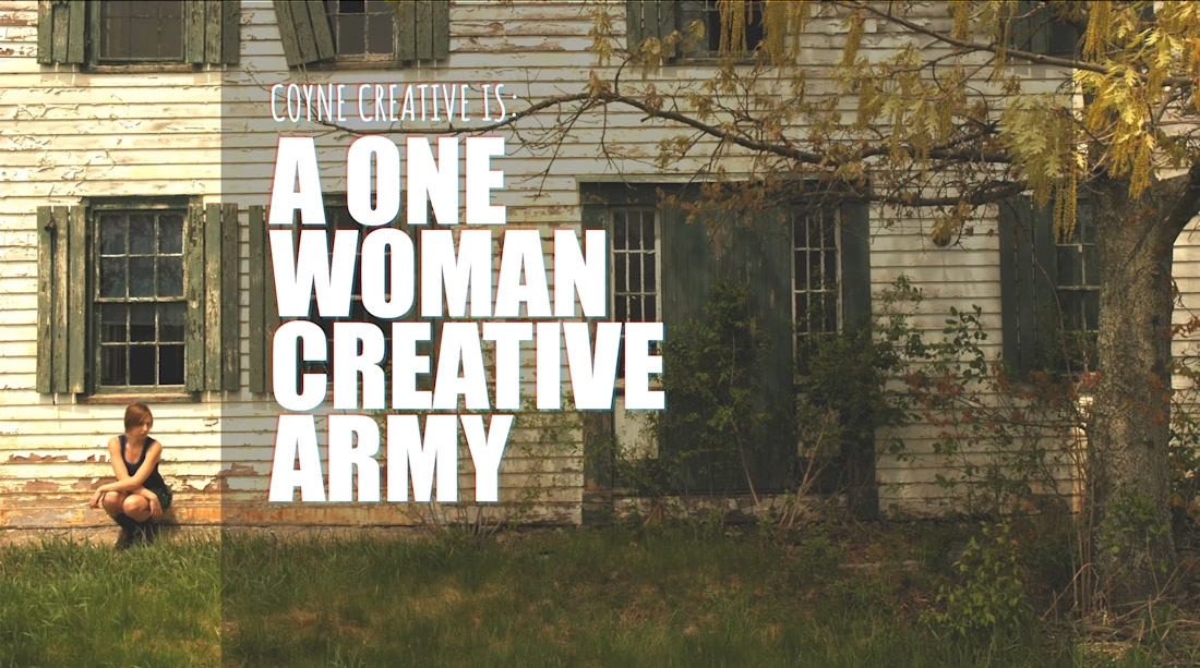
Hello folks I am new to the site.
In case you have not met me or seen my work,
check out my work:
https://www.coynecreative.com/
https://vimeo.com/coynecreative
Looking to pick up some side work and would love to help folks out!
UX | Design | Video