The network for creativity
Join 1.25M professional creatives like you
Connect with clients, get discovered, and run your business 100% commission-free
Creatives on Contra have earned over $150M and we are just getting started
Back to feedPost
Taste Test
Prompt:
{@sites based on everything you know about me create for me a portfolio with the websites I finished.
Get everything in place. Use the best plugin or skill to get the design stunning and same as a like. Ask me as many questions you need to get things out there.}
so after i gave this prompt to Codex Sol 5.6 ultra it suggest to me those 3 options
3 voted
50%

3 voted
50%

6 votes
Closed

Editorial Atelier all the way. It instantly grabbed my attention.


That kinetic Signal design is goated i liked it.

I already finished and chosen editorial atelier one and now here is the final result
https://koussay.online/

koussay.online
Koussay Zayani | Creative Developer & Brand Designer
Distinct identities and digital experiences, built from first mark to live product.
The network for creativity
Join 1.25M professional creatives like you
Connect with clients, get discovered, and run your business 100% commission-free
Creatives on Contra have earned over $150M and we are just getting started






Related posts

I just finished building a website for Tipstar - clean, fast, and made to bring customers from Google and WhatsApp.

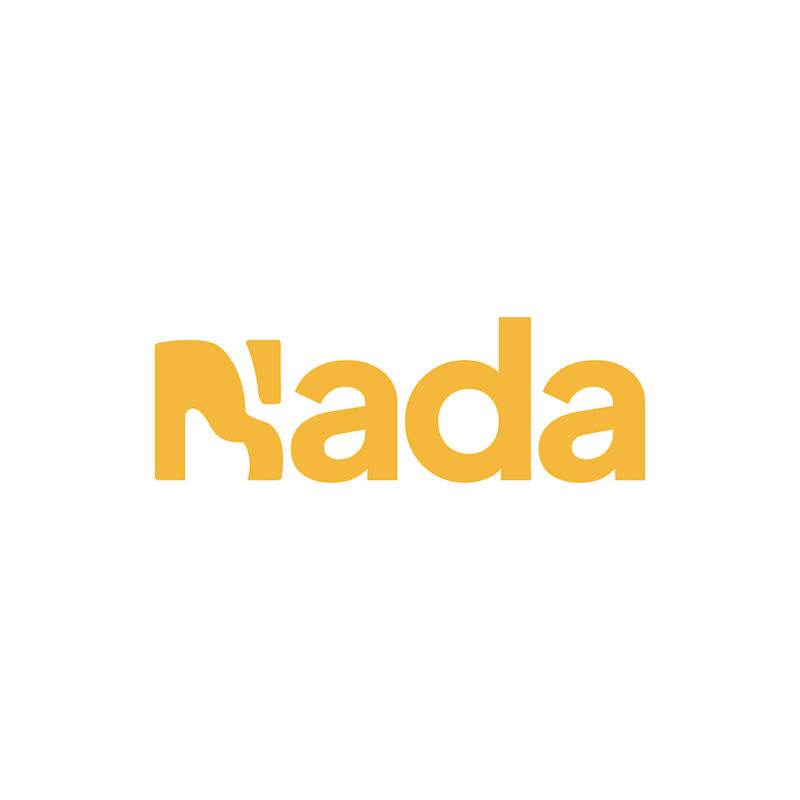
Challenge: Nada's old logo had a unique shape, but the "N" was hard to read and the design didn't connect to music.
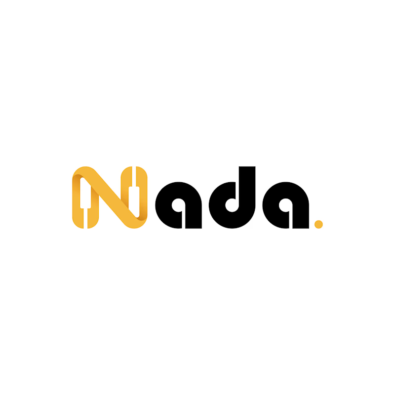
Solution: I redesigned the logo with a piano-built "N" monogram and letterforms that carry music notes. A golden dot closes the wordmark like a final note. The warm gold stays, now paired with black for a more premium look.
Result: A clearer, more memorable logo that tells the brand story at a glance. The client loved it.
1 vote
Ends in 13h

The piano keys forming the N is a smart fix, it solves the readability problem and the music link in one move. The golden dot as a final note is a lovely detail.

big client websites are mostly a subtraction job.
redesigned one for a global consulting firm. cut pages, cut menu items, one page per service that answers one question.
what's the last thing you cut from a site that made it better?

My vote is the five-step "Our process" section that almost every agency site has. Discover, define, design, develop, deliver. Nobody reads it, and the work already shows the process better.