The network for creativity
Join 1.25M professional creatives like you
Connect with clients, get discovered, and run your business 100% commission-free
Creatives on Contra have earned over $150M and we are just getting started
Back to feedPost

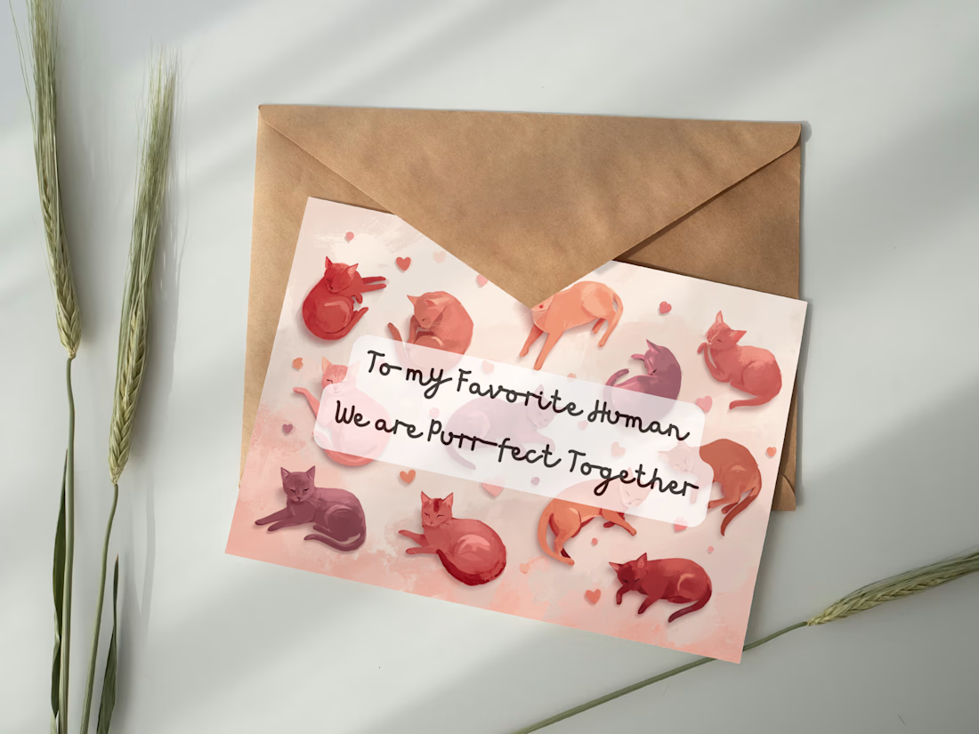
This design was created as part of a seasonal card concept focused on approachable, character-driven illustration. The visual direction emphasizes warmth and softness through color and composition, allowing the humor of the message to feel natural rather than forced. The project reflects my interest in combining illustration, typography, and emotional storytelling within small-scale product design.

The network for creativity
Join 1.25M professional creatives like you
Connect with clients, get discovered, and run your business 100% commission-free
Creatives on Contra have earned over $150M and we are just getting started

Challenges
View all


Related posts

The client said we could choose the season for one episode ourselves. We decided to create two versions... after that, their marketing department spent the whole day debating whether the fall version or the winter version was better.
We personally have a favorite, but we want to check in with the community. Please share your vote.

12 voted
71%
5 voted
29%
17 votes
Closed

Perfect

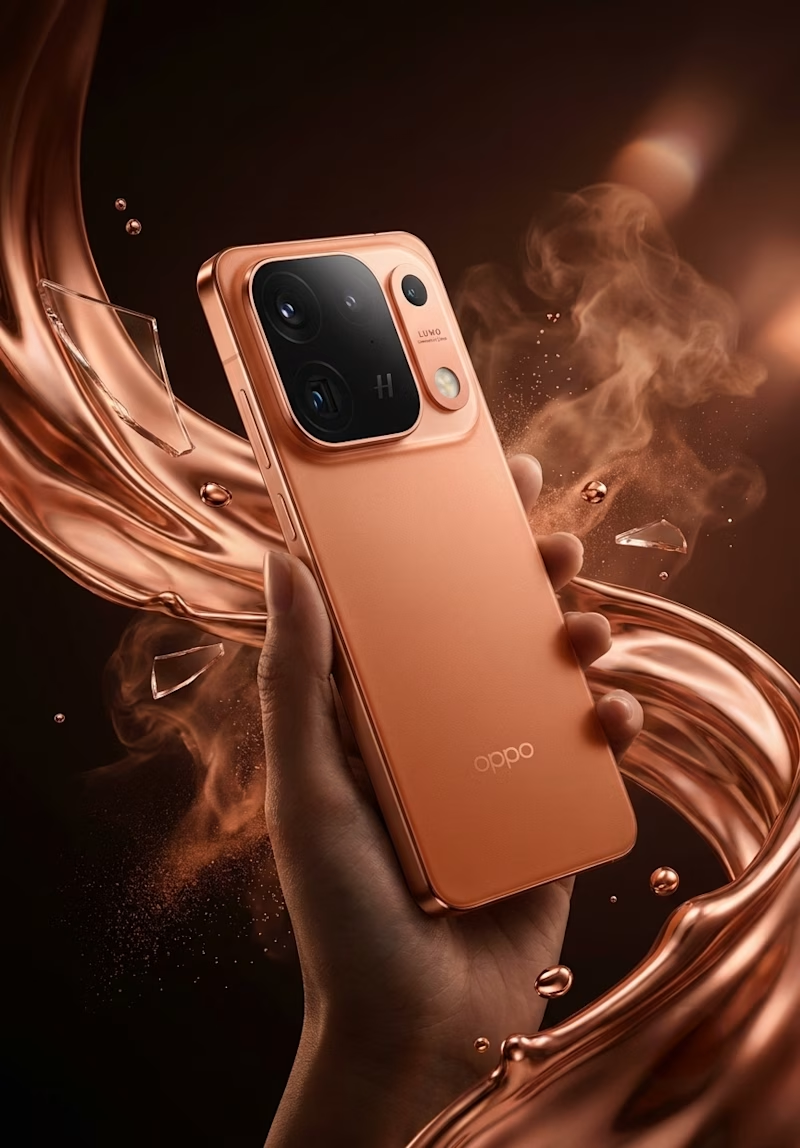
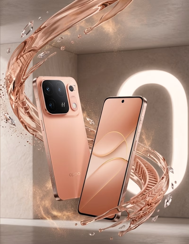
OPPO Find X10 Ultra
I started with a simple product image and wanted to see how far I could push it without losing what makes the phone feel real.
I worked on the visual direction, composition, lighting, reflections, color balance, depth, and fine details. I also used Adobe Illustrator to refine the graphic elements and bring the overall composition together.
The real challenge wasn’t adding more effects.
It was finding the right balance between technology and human creativity — keeping the phone authentic while giving the image a stronger personality.
Skills used:
Adobe Illustrator · Visual Composition · Art Direction · Lighting & Shadow · Color Correction · Retouching · Detail Enhancement · Creative Concept Development
7 voted
64%
4 voted
36%
11 votes
Closed

These are some Thumbnail samples based on fragrance reviews, vlogs, and informative content.







Nice work but I would suggest that you clean up the AI images in Canva or Photoshop before posting them next time