The network for creativity
Join 1.25M professional creatives like you
Connect with clients, get discovered, and run your business 100% commission-free
Creatives on Contra have earned over $150M and we are just getting started
Back to feedPost
Taste Test

OPPO Find X10 Ultra
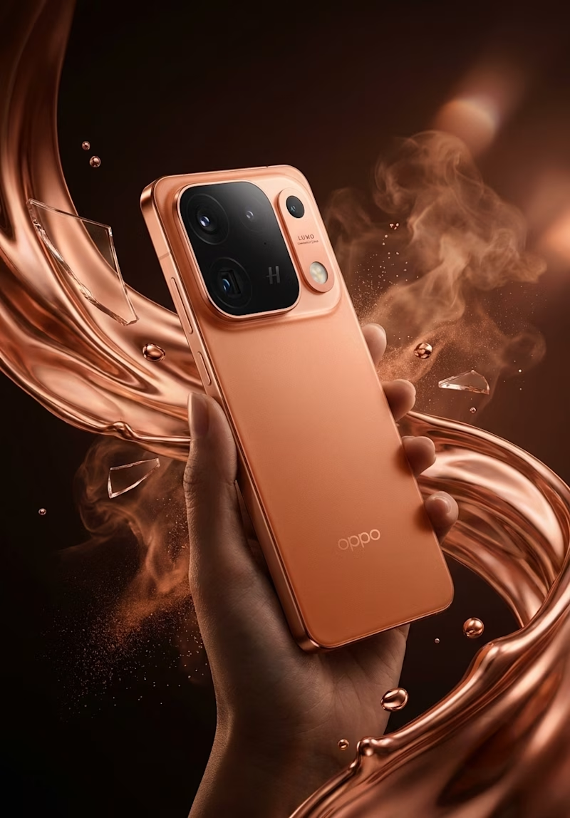
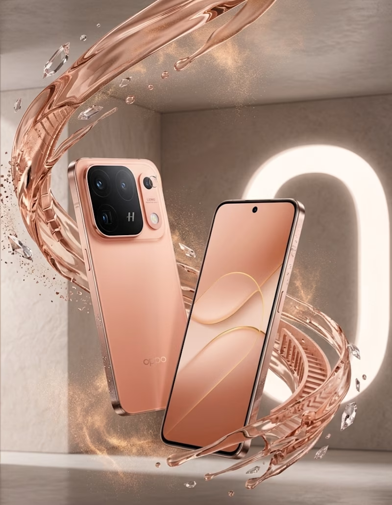
I started with a simple product image and wanted to see how far I could push it without losing what makes the phone feel real.
I worked on the visual direction, composition, lighting, reflections, color balance, depth, and fine details. I also used Adobe Illustrator to refine the graphic elements and bring the overall composition together.
The real challenge wasn’t adding more effects.
It was finding the right balance between technology and human creativity — keeping the phone authentic while giving the image a stronger personality.
Skills used:
Adobe Illustrator · Visual Composition · Art Direction · Lighting & Shadow · Color Correction · Retouching · Detail Enhancement · Creative Concept Development
7 voted
64%
4 voted
36%
11 votes
Closed


The network for creativity
Join 1.25M professional creatives like you
Connect with clients, get discovered, and run your business 100% commission-free
Creatives on Contra have earned over $150M and we are just getting started





Related posts


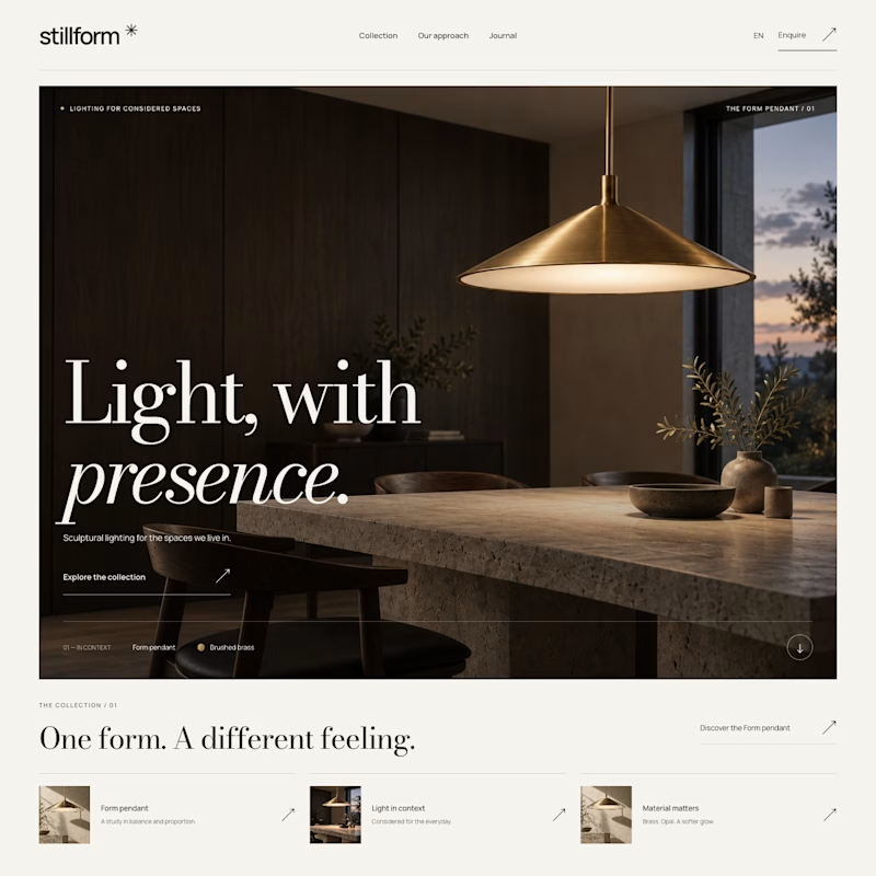
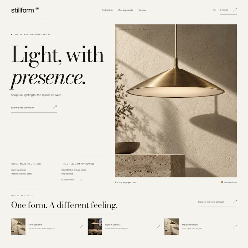

Atmospheric, and it was the photography that decided it. A lamp is a product you buy for what it does to a room, so seeing the warm glow pooling across a dark surface sells the feeling before the layout even registers. Sculptural is gorgeous but shows the object, Atmospheric shows the outcome.


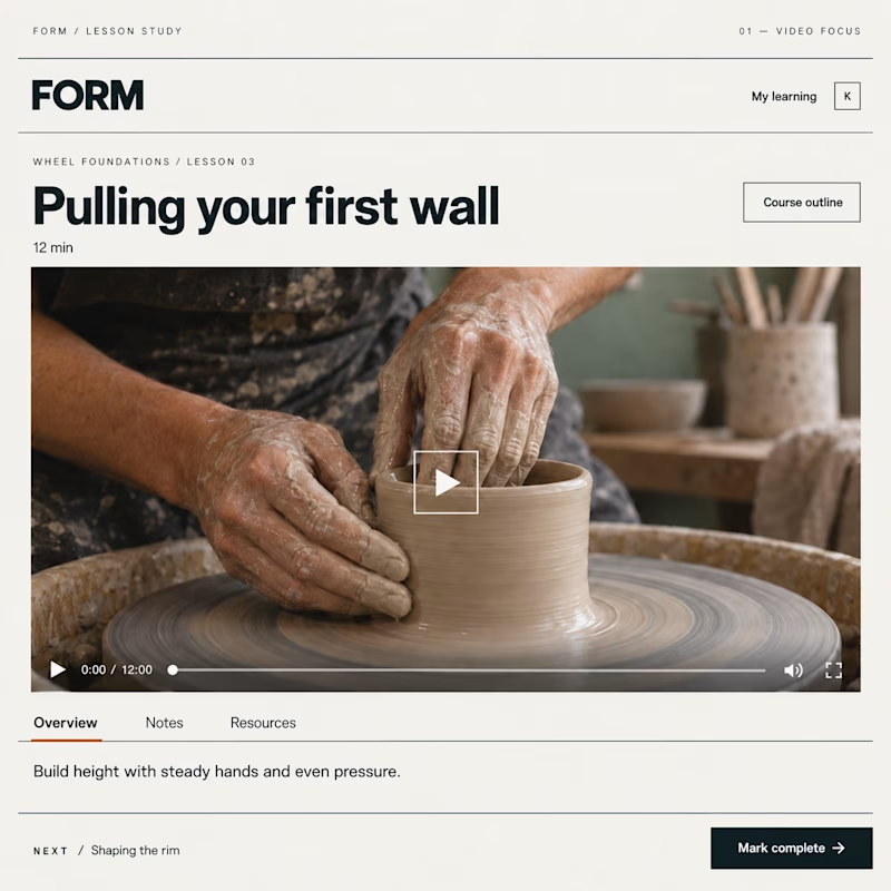
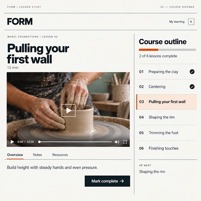
Which Kajabi lesson page would you rather learn in?
Same lesson. Two layouts: more room for the video, or the course outline always in view.
Vote below—what helps you stay focused?

19 voted
51%
18 voted
49%
37 votes
Closed

Course sidebar for me — when working through compliance training or technical documentation, seeing exactly where you are in the curriculum removes the mental overhead of 'how much is left?' The video focus layout makes more sense for story-driven content where you want the...

> this hit me. never thought about it like that - art that was made to make everyone same, now used to talk about finding yourself. super clever work.

What happens when propaganda designed to erase the self gets pointed at the self instead?
Soviet propaganda spent 70 years trying to erase the individual soul in favour of the collective machine. I pointed that exact visual language at the thing it was built to suppress.
I kept...
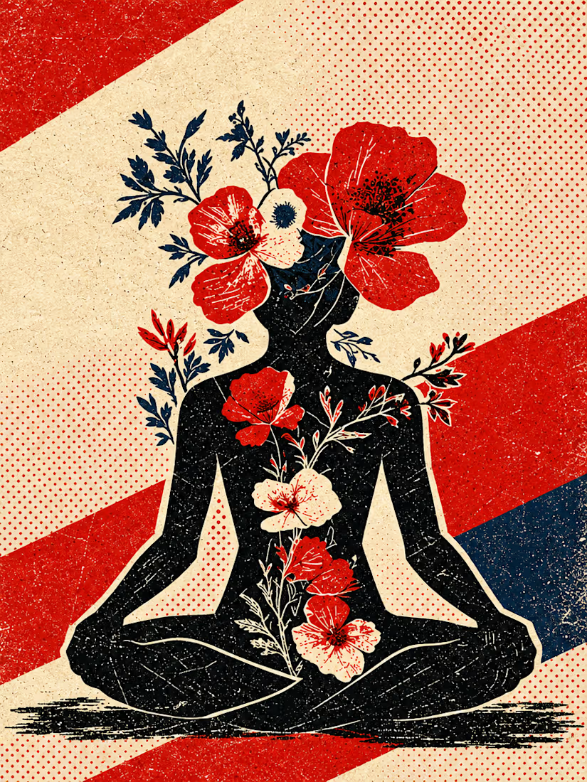


Art built to make everyone the same, now used to talk about finding yourself, is a brilliant flip and you described it better than the caption did. The halftone grain and that limited red, navy and cream palette carry the whole message. Sharp eye for sharing this.