The network for creativity
Join 1.25M professional creatives like you
Connect with clients, get discovered, and run your business 100% commission-free
Creatives on Contra have earned over $150M and we are just getting started
Back to feedPost
Taste Test

Same animation, two slightly different directions. The motion is almost the same, but I changed a few details and tried a little different color palette.
Which one works better for you? 1 or 2? Drop your pick in the comments 😉
5 votes
Ends in 1d


I’d go with 2. The color palette feels more polished with the motion.
The network for creativity
Join 1.25M professional creatives like you
Connect with clients, get discovered, and run your business 100% commission-free
Creatives on Contra have earned over $150M and we are just getting started
Trending
retrofuturism
Share your favorite designs from the past exploring the distant future. Or your own take on the aesthetic 🚀
halftone
Dots. Texture. Grain. Let's see your designs using the halftone technique.

Midjourney
Creatives are showing off what they're making with Midjourney.
colorgrade
Video editors sound off: How do you enhance the mood of your video in color grading?


Related posts

Check my profile and choose which do you think I design better in ?
4 voted
57%
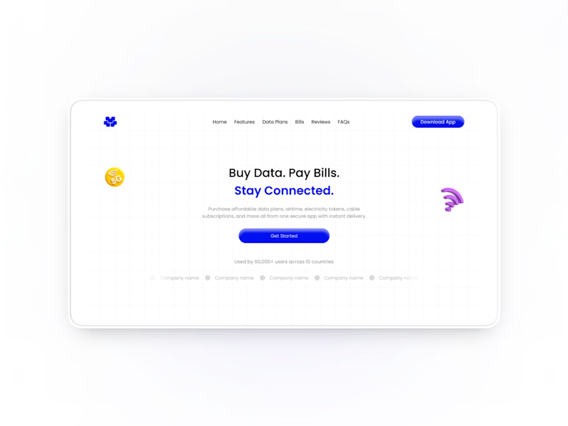
3 voted
43%
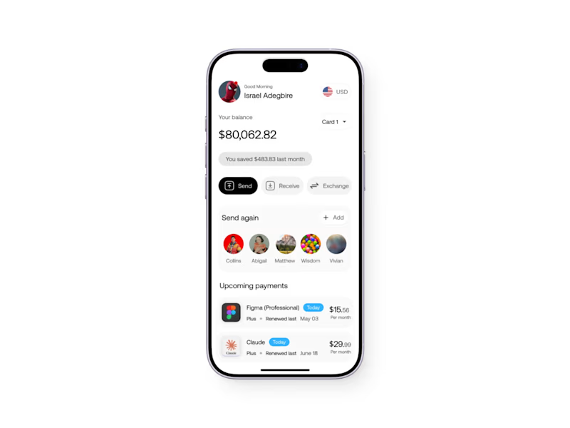
7 votes
Closed

Both are great, Isreal.
I prefer the Mobile app more

I’ve got 2 directions for this one. Which background would make you stop scrolling?
55 voted
61%
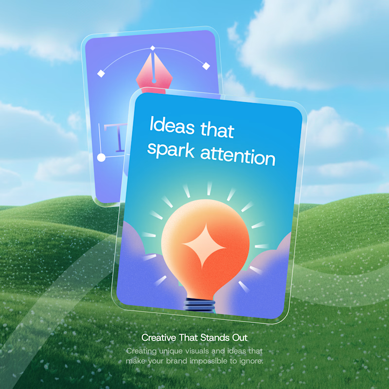
35 voted
39%
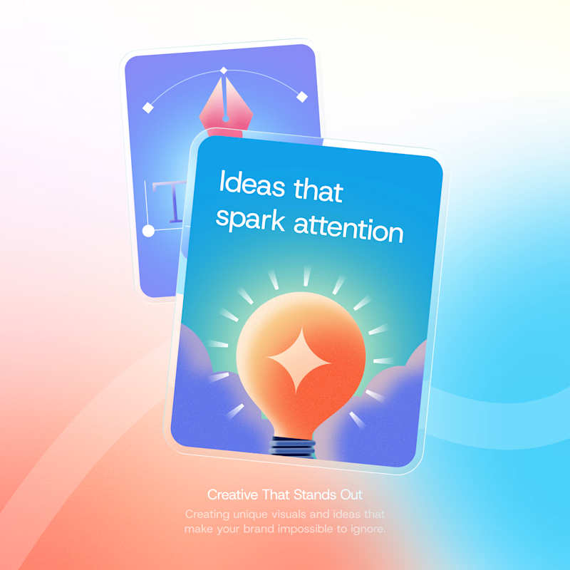
90 votes
Closed

ohh it's tough both

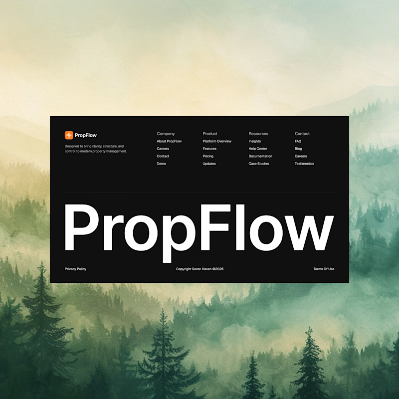
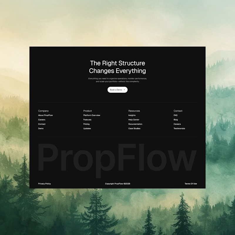
A small footer exploration.
Same content, two different approaches.
21 voted
51%
20 voted
49%
41 votes
Closed

B puts the focus more on the actual sections!