The network for creativity
Join 1.25M professional creatives like you
Connect with clients, get discovered, and run your business 100% commission-free
Creatives on Contra have earned over $150M and we are just getting started
Back to feedPost
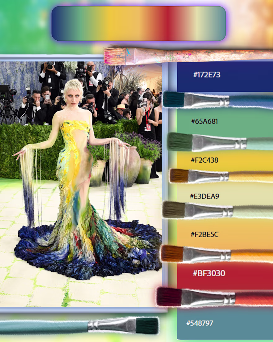
Color palette Analysis : The Living Masterpiece
Where fashion meets fine art: tonal contrast, painterly motion, and color that directs the moment with quiet precision.
[Deep / Grounding Tones🫐]
Cerulean Depth — #172E73 —
Crimson Undercurrent — #BF3030 —
Ocean Patina — #548797 —
[Warm / Radiant Tones✨]
Golden Impasto — #F2C438 —
Amber Stroke — #F2BE5C —
[Soft / Neutral Tones🌿]
Porcelain Mist — #E3DEA9 —
Verdant Veil — #65A681 —
The network for creativity
Join 1.25M professional creatives like you
Connect with clients, get discovered, and run your business 100% commission-free
Creatives on Contra have earned over $150M and we are just getting started
Related posts
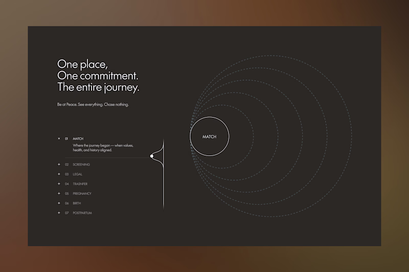
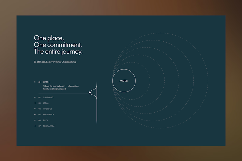
Exploring "How We Work" section
Which colour is best (both colours are the main colour guide)?
37 voted
54%
31 voted
46%
68 votes
Closed
Personally leaning towards the dark blue-green version.
The cooler tone feels more aligned with trust and clarity especially for a “How We Work” section. The Dark brown version has a strong cinematic mood, but the blue-green helps the structure and content breathe a bit more to me.
AREA is a fictional creative technology studio exploring how AI-native workflows can shape modern digital identity design.
I used Google Stitch to explore and refine the brand direction through typography studies, interaction concepts, motion systems, colour exploration, and in-place AI edits before rebuilding the final experience in Next.js with Framer Motion and deploying it on Vercel.
The final site focuses on cinematic pacing, editorial restraint, atmospheric motion, and immersive interaction design inspired by modern creative studio websites.
Live Site:
https://area-snowy.vercel.app
Stitch was strongest as a rapid creative direction and identity exploration tool. The in-place editing workflow made it easy to iteratively refine layouts, spacing, typography, and atmosphere while maintaining creative momentum.
The workflow became most powerful when paired with production tooling, using Stitch to establish the creative system first, then translating the final direction into code for deeper interaction and motion refinement.
Looks clean!
Social Media Campaign: Turning Passive Browsers into Buyers
The food delivery and beverage market is highly saturated, leading to low customer retention and high drop-off rates on digital ads. The goal was to develop a social media strategy and creative asset pipeline that transforms passive scrollers into hungry, high-converting buyers.
My Approach & Solutions
High-Conversion Content Strategy: Structured campaign flows based on performance marketing data to naturally highlight high-margin menu items and flash deals.
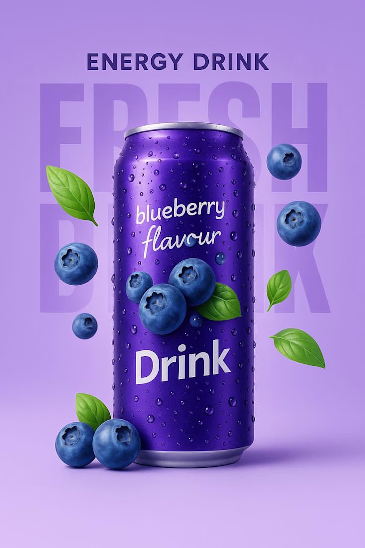
Psychology-Driven Visuals: Curated a vibrant, appetite-stimulating aesthetic paired with hyper-realistic product imagery. (See Create Such Image Using AI.jpg for an example of the scroll-stopping, high-saturation product assets generated for this campaign).
Scalable Brand Asset Kit: Developed a versatile digital advertising kit including custom templates and optimized layouts built for immediate deployment across Instagram, TikTok, and paid social channels.
Frictionless Social Commerce: Aligned social content directly with the brand's 3-click ordering system to minimize drop-offs between the "Click" and the "Checkout."
Results & Impact
⚡ 35% Faster Time-to-Purchase: Eliminated secondary messaging barriers, cutting down the customer journey from ad click to final order.
📈 Optimized Engagement Loops: Boosted initial user-testing loop engagement, projecting a significant increase in completed orders.
🎨 Ad-Ready Asset Deployment: Delivered a fully responsive library of visual assets optimized for maximum click-through rates (CTR) in performance marketing.
#SocialMediaManagement #ContentStrategy #PerformanceMarketing #SocialCommerce #DigitalMarketing #ContentCreation #AIArt #VisualStorytelling #Contra #FreelanceSocialManager #BrandIdentity #CreativeDirection
Great Work😍
Trending
Claude
Claude has entered the design space. How are you using Claude Design?
Contra University
Learn from expert creatives how to earn more using next-gen AI tools.
creativeaiflow
Creative AI workflows are evolving. What tools do you use, and what are their strengths and weaknesses?
portfolioreview
The best portfolios tell a story, not just show a grid. Share yours for feedback.
freelancerlife
Freelancer life is wins, pivots, and everything in between. What’s yours right now?