The network for creativity
Join 1.25M professional creatives like you
Connect with clients, get discovered, and run your business 100% commission-free
Creatives on Contra have earned over $150M and we are just getting started
Back to feedPost

nobody cares about your product
people care about themselves
that's why your headline should say what changes for them after they use it.
"ai-powered accounting workflow platform" tells me nothing.
"close your books in two days instead of two weeks" tells me whether to keep scrolling.
only one of these headlines gets read.
you tell me which one.
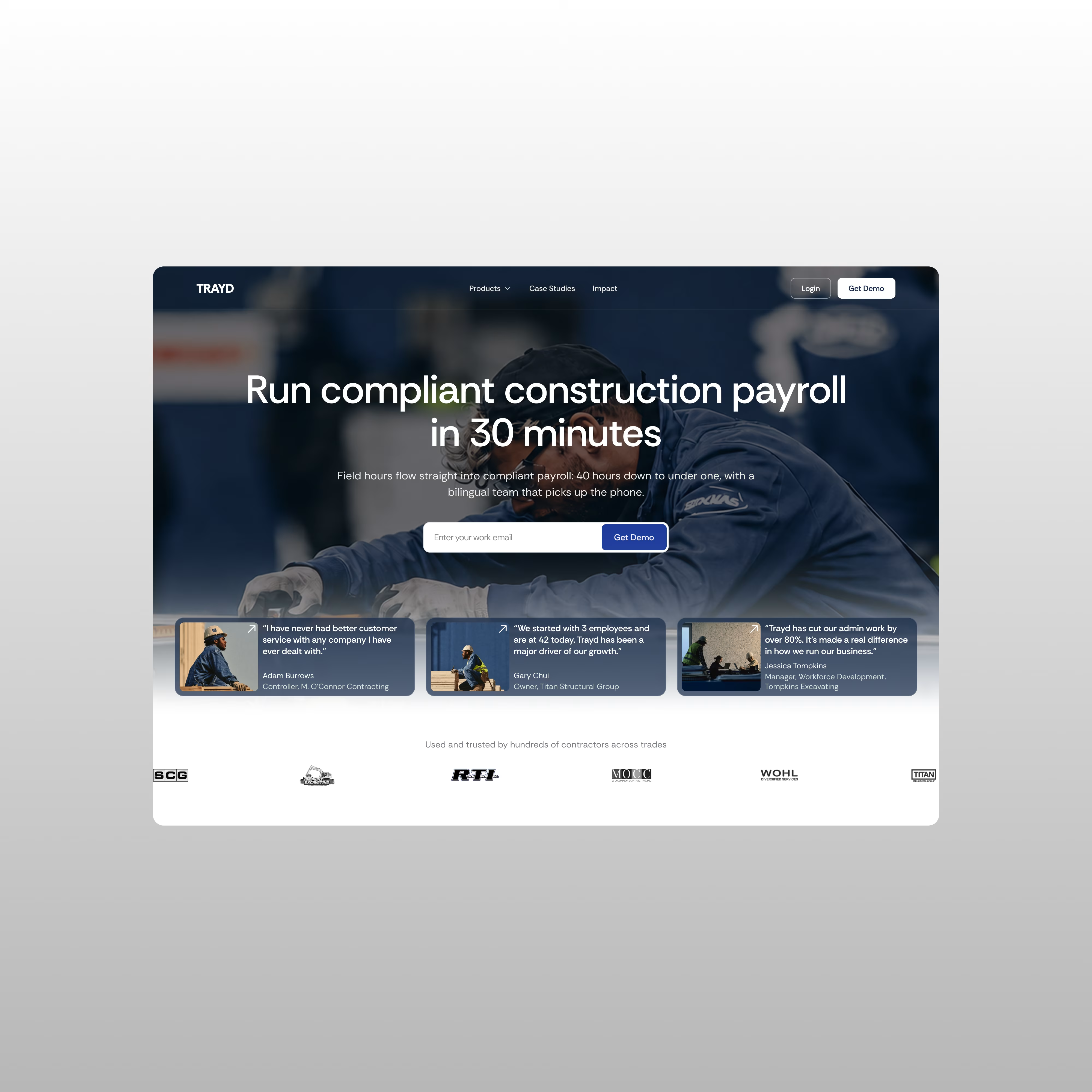
p.s. exploration for a potential client.
The network for creativity
Join 1.25M professional creatives like you
Connect with clients, get discovered, and run your business 100% commission-free
Creatives on Contra have earned over $150M and we are just getting started











Related posts

Title / Headline:
The Quiet Hours — Cultural Magazine Web Design & Brand Identity
Description
Overview:
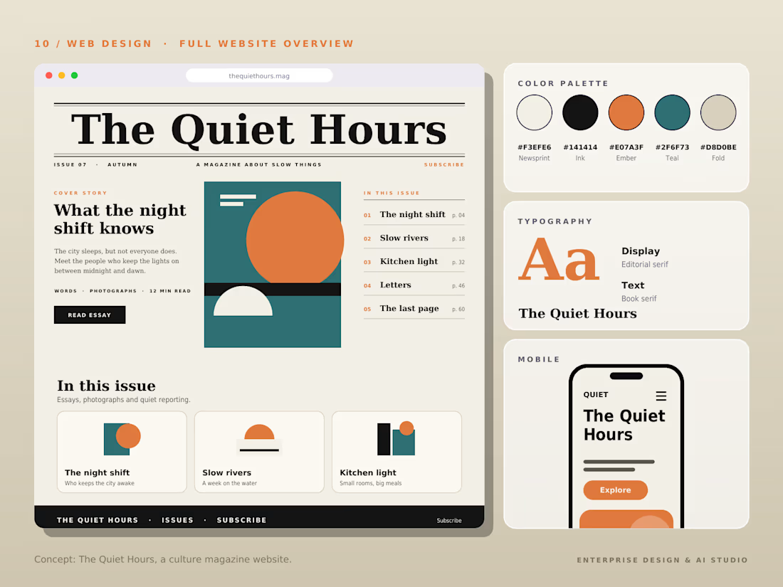
The Quiet Hours is an editorial-driven digital magazine concept focused on slow living, culture, and thoughtful essays, designed with a sophisticated print-inspired digital aesthetic.
Design Highlights:
Print-Inspired Editorial Layout: Engineered a structured grid system blending classic editorial serif display typography with clean body text for an immersive reading experience.
Calm & Earthy Color Palette: Curated a muted, harmonious color scheme (Pampad, Ink, Ember, Teal, and Pod) to evoke a sense of quiet and reflection.
Content Architecture: Structured clear content hierarchies, including issue highlights, article previews, and category navigation.
Mobile Responsive Layout: Designed a seamless mobile reading interface tailored for on-the-go content consumption.
Tools & Stack:
Figma, Adobe Illustrator, Editorial Typography, Web Design, UI/UX Layouts.



The Pampad, Ink, Ember, Teal and Pod palette names alone tell me this is a thoughtfully built system. Print-inspired editorial grids are so satisfying when they respect the reading experience, and this clearly does.

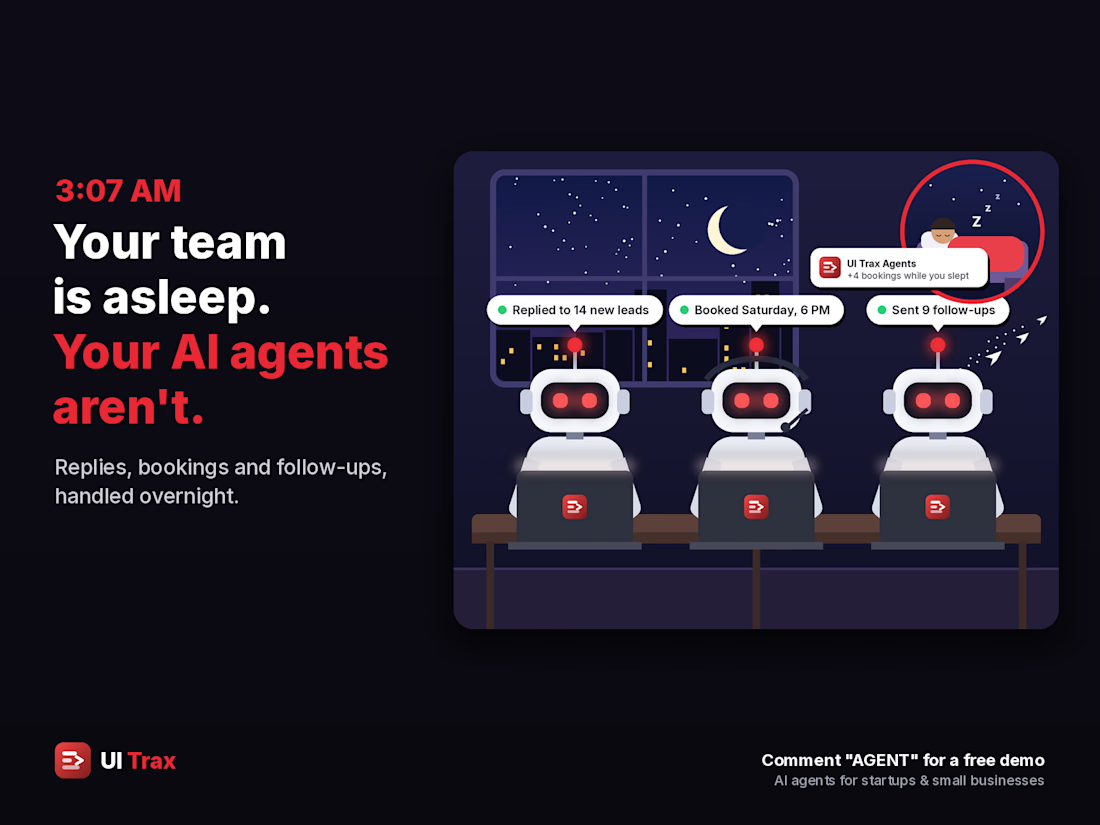
🌙 3:07 AM. Your team is asleep. Your AI agents aren't. 🤖
While you sleep, they:
💬 Reply to every new lead in seconds
📅 Book the slot straight into your calendar
🔔 Follow up before the lead goes cold
📊 Have your morning summary ready
☀️ You wake up to bookings, not missed messages.
🚀 I build AI agents for startups and small businesses.
🎁 Message me for a free of cost demo on your own services and prices 👋

The morning summary is what sells it. Owners want to see what happened overnight before they trust it.

Product page or landing page for your ads?
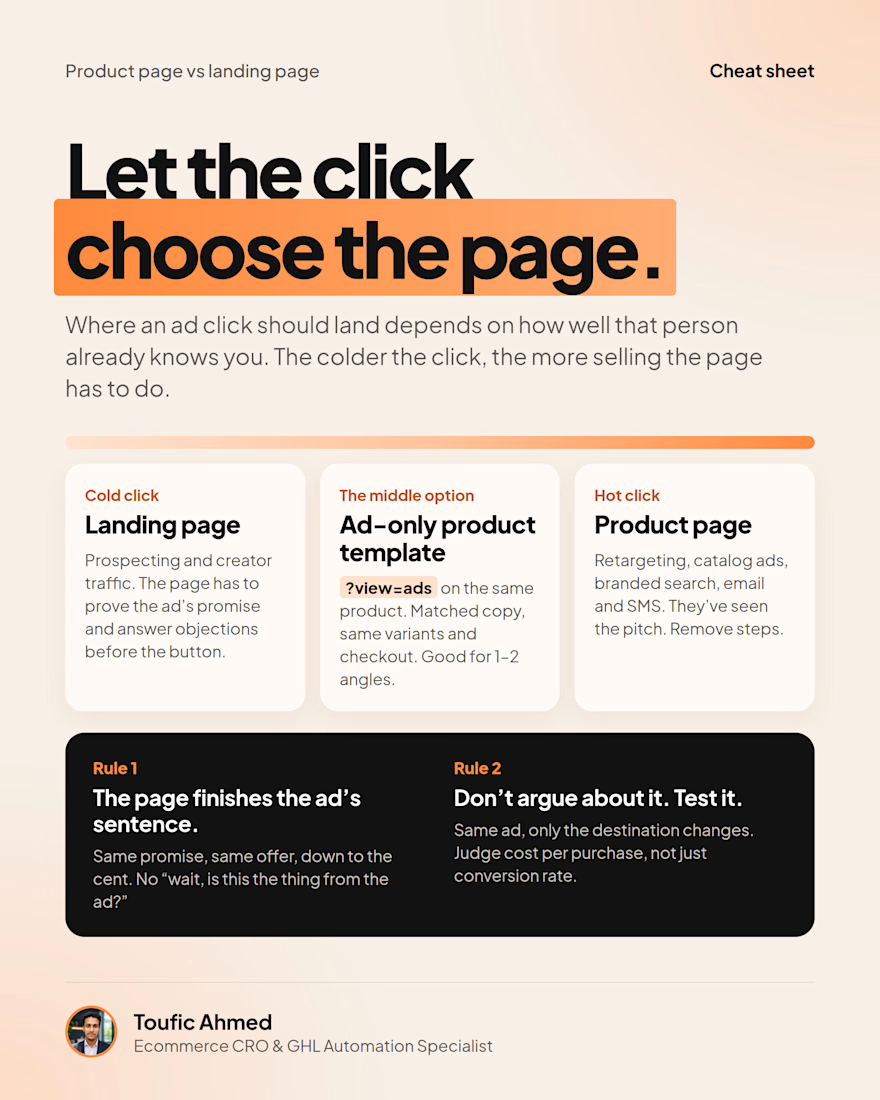
Neither by default. It depends on how warm the click is.
Cold traffic needs a page that does the selling. Warm and hot traffic need fewer steps.
Either way, the page should finish the ad's sentence. Then test it.


finish the ad's sentence is a good way to put it. cold clicks landing on a bare product page bounce so fast cause nothing tells them why they clicked