The network for creativity
Join 1.25M professional creatives like you
Connect with clients, get discovered, and run your business 100% commission-free
Creatives on Contra have earned over $150M and we are just getting started
Back to feedPost

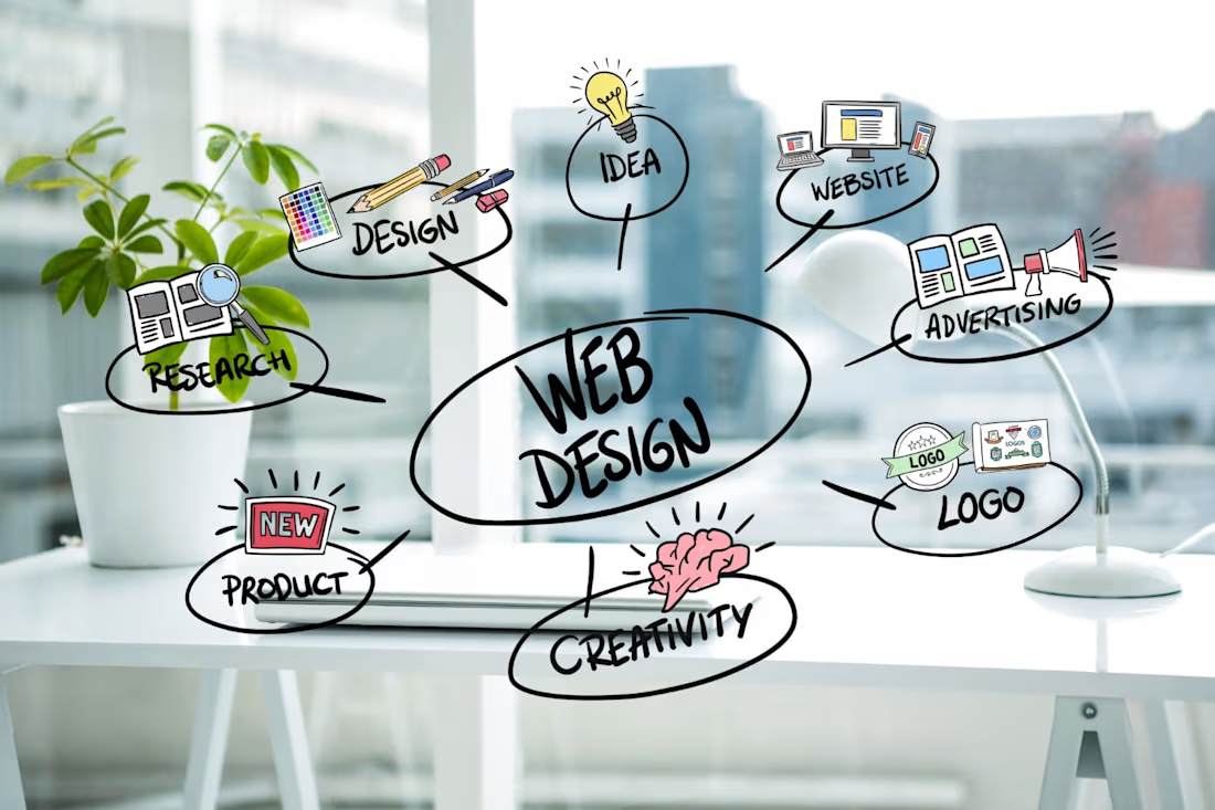
I didn’t start web design because it was “trendy.”
I started because I saw too many businesses losing opportunities due to poorly built websites.
Over time, I learned that a website isn’t just design—it’s strategy, user experience, performance, and clarity working together.
From fixing broken layouts to rebuilding entire platforms, every project taught me one thing: 👉 A good website solves problems before it tries to look impressive.
That mindset still guides how I work today.
If you’re building a product, brand, or team—this perspective matters.
💬 What made you start what you do?
The network for creativity
Join 1.25M professional creatives like you
Connect with clients, get discovered, and run your business 100% commission-free
Creatives on Contra have earned over $150M and we are just getting started





Related posts


The thing I keep relearning: a design is never finished because someone ran out of ideas. It's finished because someone decided to stop. Knowing when to stop is the hardest part.



Damn.... Crazy colors 👏😍

AI Sales Agent SaaS Landing Page
A modern AI Sales Agent & Sales Intelligence SaaS website designed for startups and growing businesses looking to automate sales workflows, streamline lead management, and boost revenue through intelligent automation and real-time insights. The design combines a premium SaaS aesthetic with a conversion-focused user experience, featuring clear product messaging, interactive sections, and a scalable interface built to support modern sales teams.


Amazing design


Professional work