The network for creativity
Join 1.25M professional creatives like you
Connect with clients, get discovered, and run your business 100% commission-free
Creatives on Contra have earned over $150M and we are just getting started
Back to feedPost
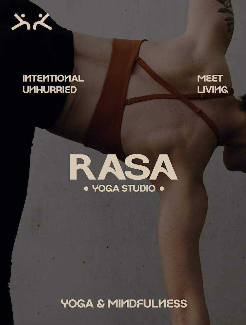
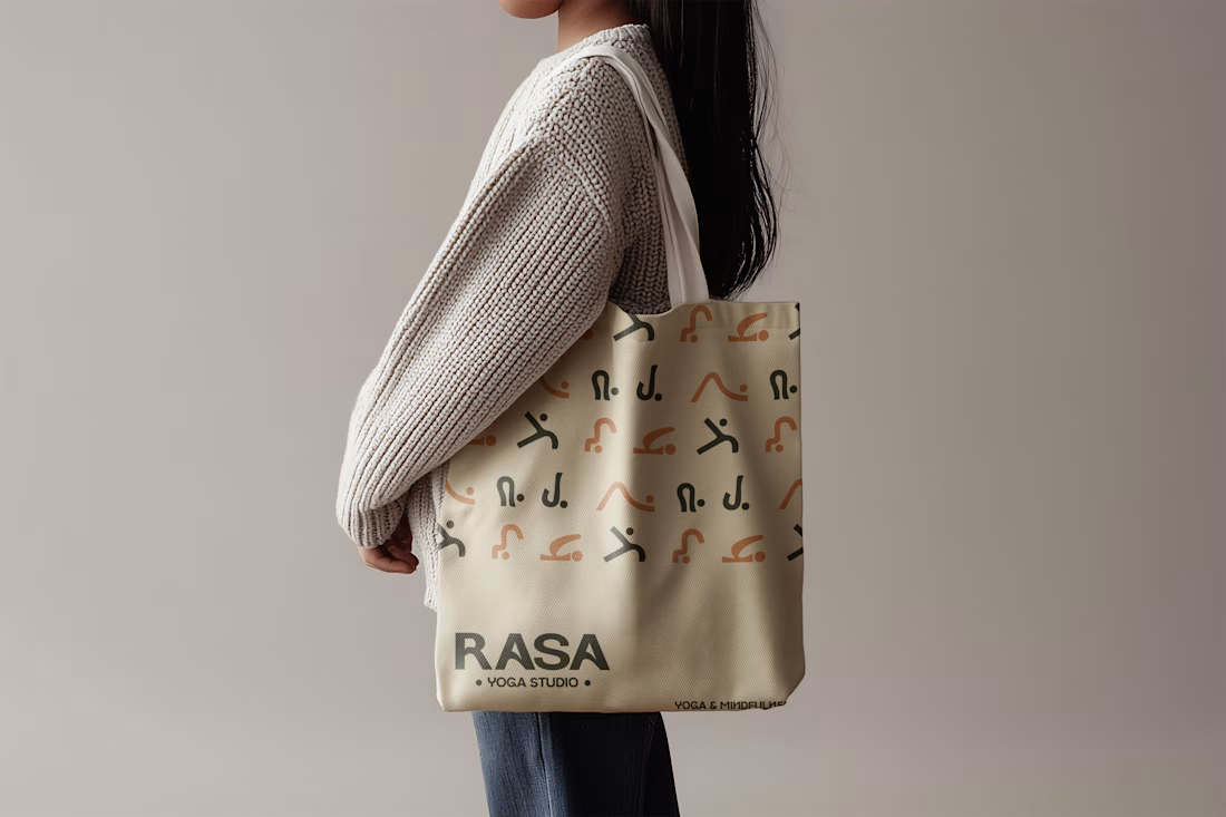
3 things I learned designing RASA, a yoga & mindfulness lifestyle brand:
1. Restraint is a design decision.
The temptation was to use every color in the palette — forest green, sage, blush, cream, mint, terra orange. But the identity only clicked when I pulled back and let 2–3 colors lead. The others became accents. Overcrowding a palette is just visual noise.
2. The typeface is the mood.
Before I touched a single shape, I spent time just sitting with Cormorant Garamond Light Italic. That one font told me everything — slow, intentional, feminine but grounded. Good brand typography doesn't decorate the brand, it is the brand.
3. Wellness brands lie to themselves.
Most go straight for white space and leaf illustrations. RASA needed to feel different — rooted, not sterile. That meant letting warmth into the palette and making the identity feel like something you'd actually want to hold, not just look at.
The network for creativity
Join 1.25M professional creatives like you
Connect with clients, get discovered, and run your business 100% commission-free
Creatives on Contra have earned over $150M and we are just getting started
Related posts
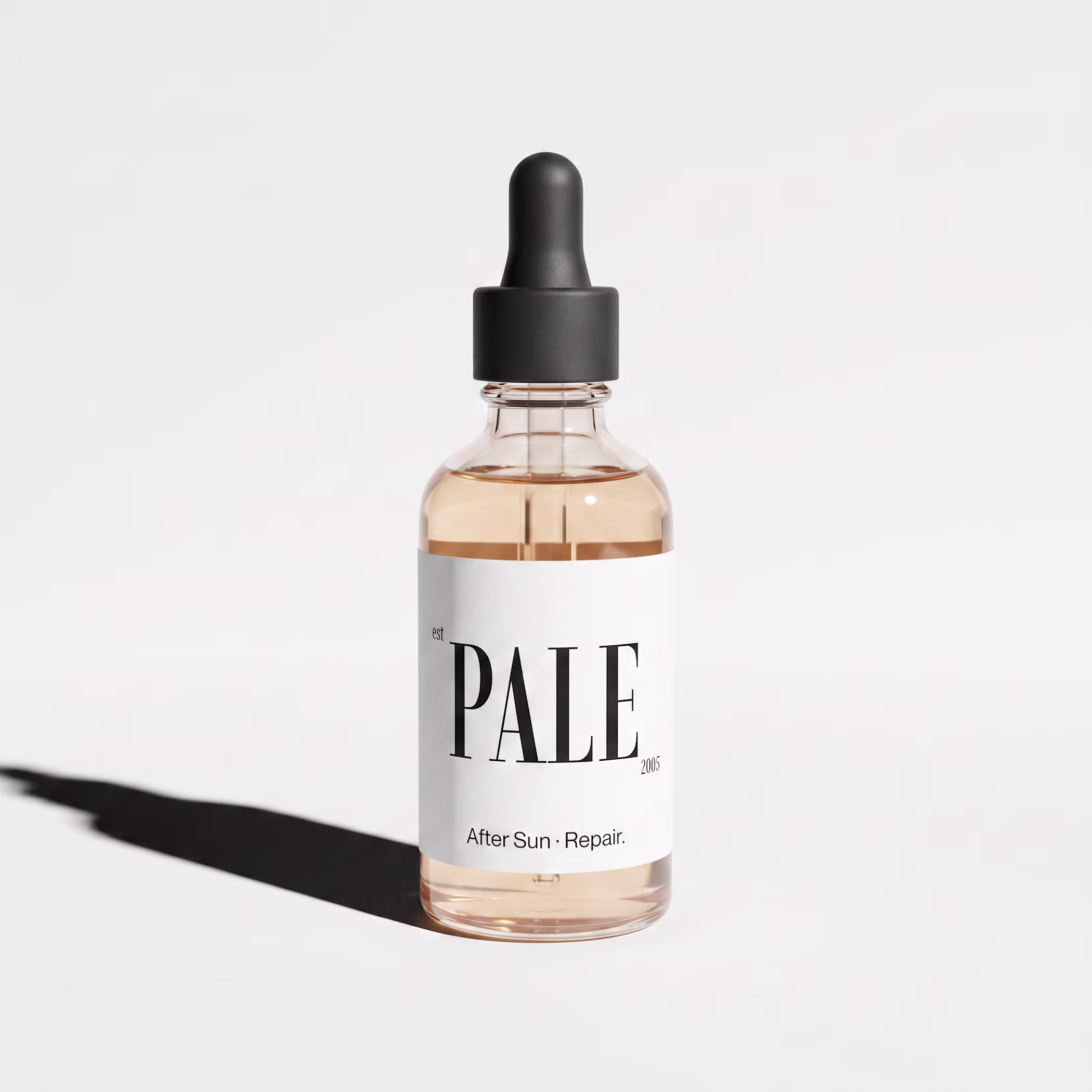
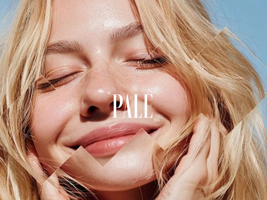
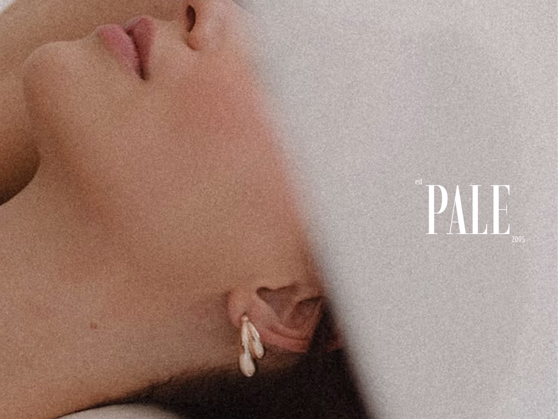
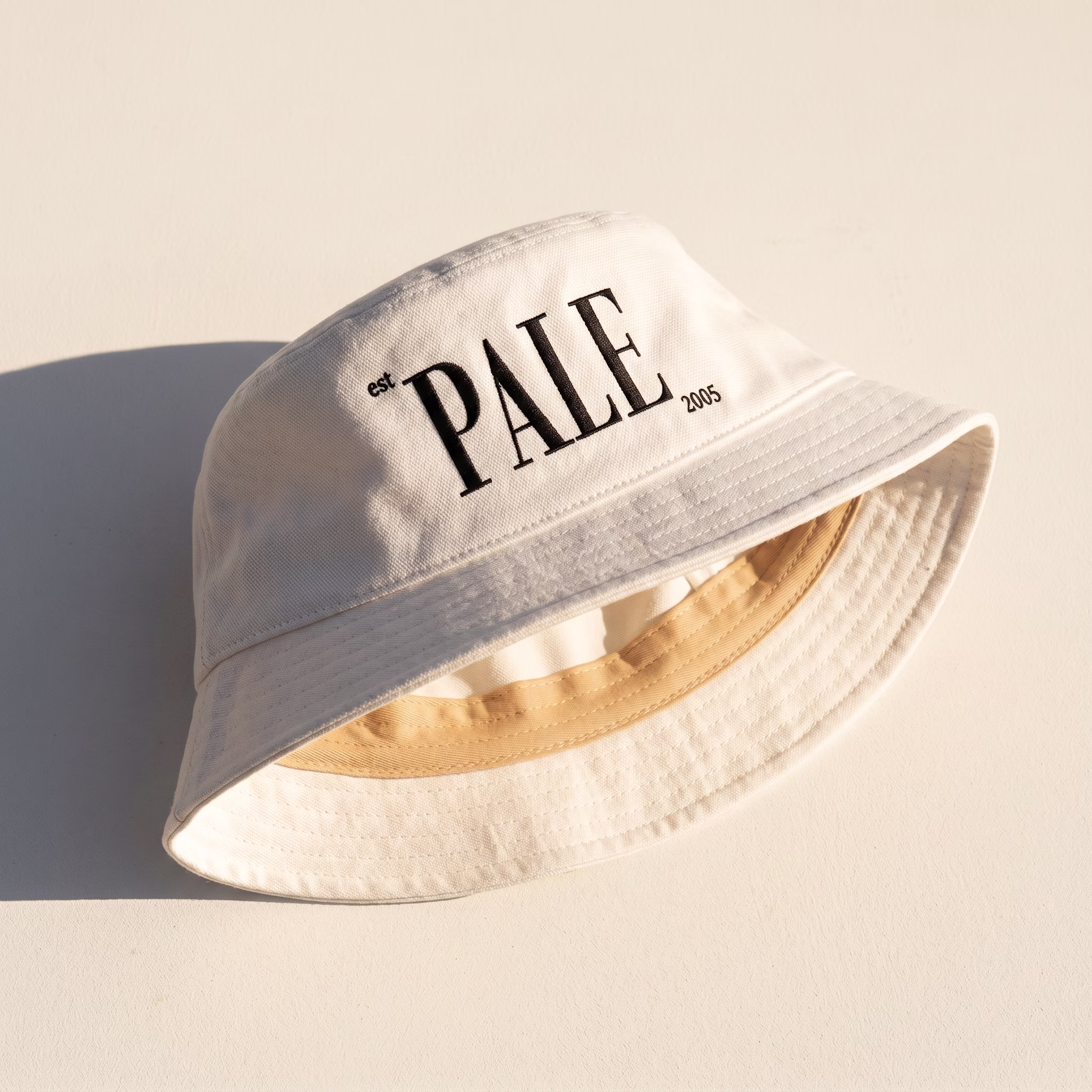
new case study: PALE ☀️
self-initiated concept. the brief I gave myself: explore minimal skincare branding, even though that's the opposite of what I usually do.
spoiler: I survived. also maybe I'm a little bit minimalist now??
Love this vibe 😍
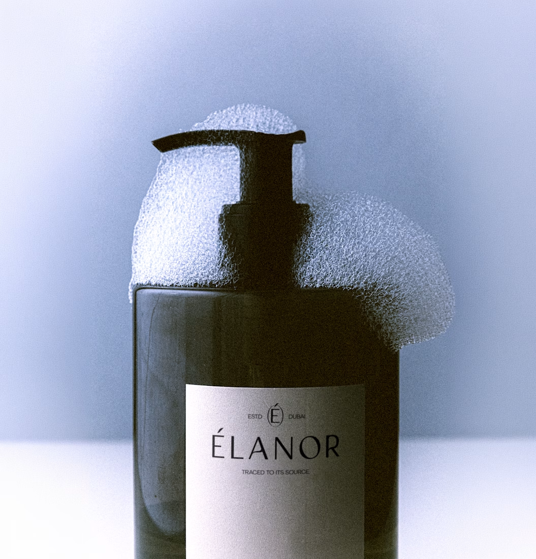
Currently preparing mockups and assets to build a brandbook for Élanor.
I'm super excited about this brand!
Elanor is a modern luxury skincare and wellness brand blending botanical purity, sensorial ritual, and refined design into an elevated everyday experience.
PS: I love you Bendito Mockup
This design is clean
What if you could build a lookbook without a photographer, a location, or a model?
I put Krea's new K2-alpha model to the test using my studio's visual identity as the creative brief, feeding in my moodboard and letting the style transfer do the heavy lifting.
Honestly impressed with where this thing landed.
#Krea #AIDesign #MotionDesign #Biathlon #CreativeWorkflow
Powerful presentation work. You’ve managed to turn information into a compelling visual story.
Trending
Claude
Claude has entered the design space. How are you using Claude Design?
Contra University
Learn from expert creatives how to earn more using next-gen AI tools.
creativeaiflow
Creative AI workflows are evolving. What tools do you use, and what are their strengths and weaknesses?
portfolioreview
The best portfolios tell a story, not just show a grid. Share yours for feedback.
freelancerlife
Freelancer life is wins, pivots, and everything in between. What’s yours right now?