The network for creativity
Join 1.25M professional creatives like you
Connect with clients, get discovered, and run your business 100% commission-free
Creatives on Contra have earned over $150M and we are just getting started
Back to feedPost

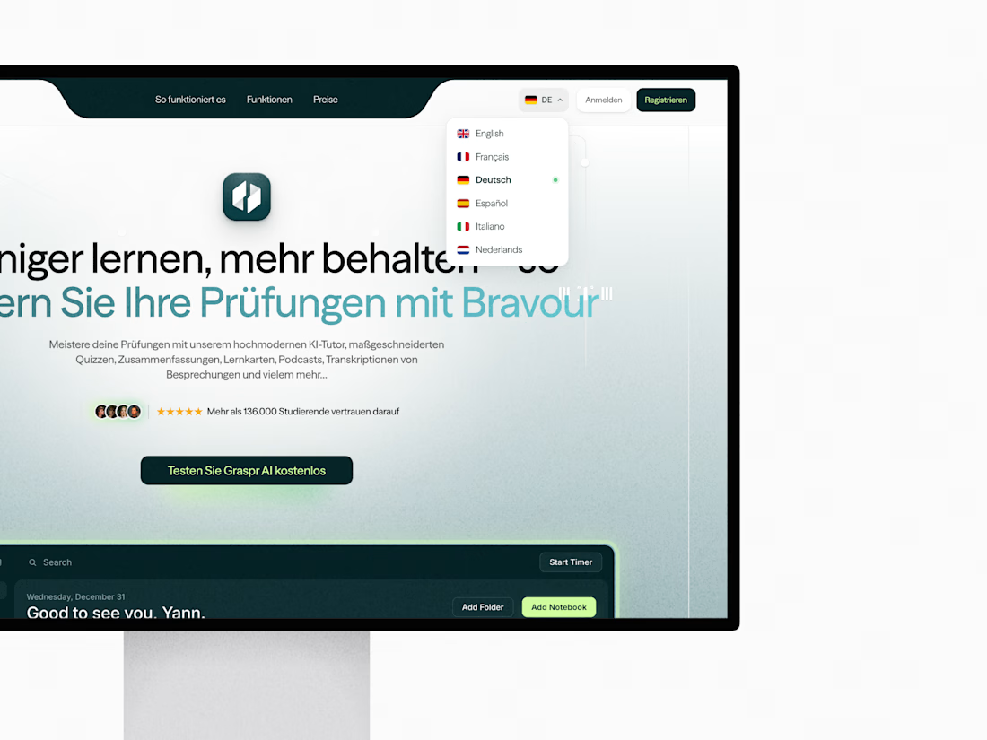
New case study live: GrasprAI website, built from scratch in Webflow from the client’s Figma design.
Fully fluid layout on Client-First, Weglot localization into 5 languages (plus English), custom animations, a smooth domain migration from the old site, and green-zone PageSpeed on desktop and mobile.
See how it was built →

The network for creativity
Join 1.25M professional creatives like you
Connect with clients, get discovered, and run your business 100% commission-free
Creatives on Contra have earned over $150M and we are just getting started



Related posts

How do you make a construction brand feel consistent from a business card to a building site?
Brixon’s identity brings angular lettering, an assembled geometric symbol, and a lime, black, and white palette together.
I carried those elements into stationery, brand guidelines, team identification, social graphics, and site signage, then brought the system into motion with Adobe After Effects.
The connecting decision: keep the geometry and layout structure consistent while the logo details, messages, and application previews change within the animated panels.
My contribution covered brand design, graphic design, and motion design.
What draws your attention first: the wordmark, the lime palette, or the rotating symbol?
See the full Brixon case study. If you’re shaping a construction or development brand, I’m available for brand identity and motion projects.

Incomparable work!


Niceee

A migration is not complete when the pages have moved. It is complete when the customer journey still makes sense.
For DVA, the work brought a Wix website, two lead funnels, a client portal, and segmented nurture automations into a clearer Kajabi experience.
Five checks I use before launch:
Map every public page and redirect.
Rebuild forms, tags, and follow-up paths.
Test offers and product access with a real user journey.
Check mobile pages and portal navigation.
Document what the client will manage after handoff.
#Kajabi #PlatformMigration #CourseCreator


two funnels, a portal, and nurture in one move. thats a lot of moving parts


