The network for creativity
Join 1.25M professional creatives like you
Connect with clients, get discovered, and run your business 100% commission-free
Creatives on Contra have earned over $150M and we are just getting started
Back to feedPost

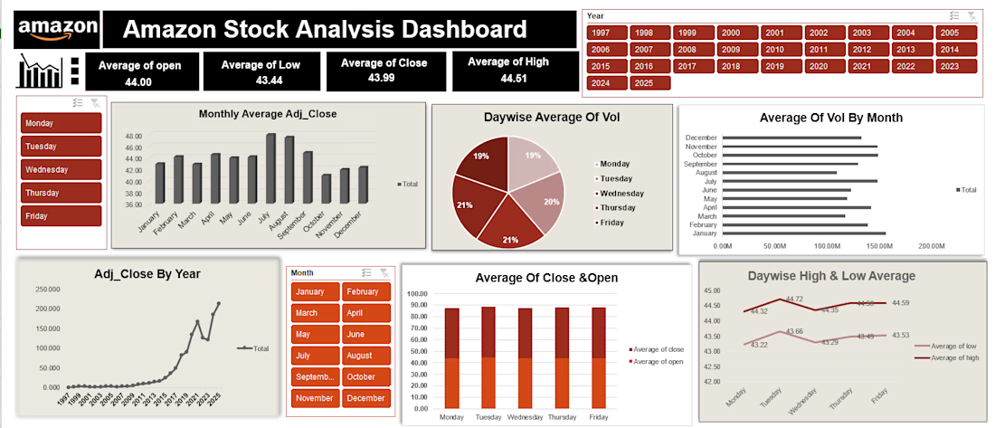
Amazon Stock Analysis Dashboard — Contra Description
Created an interactive Excel dashboard to analyze Amazon stock performance across different years, months, and weekdays. The dashboard visualizes opening, closing, high, low, and adjusted closing prices, along with trading volume trends.
It includes interactive Year, Month, and Weekday filters, allowing users to explore stock trends and compare market performance across different time periods.
Tools: Microsoft Excel, Pivot Tables, Pivot Charts, Slicers, Data Analysis, Data Visualization

The network for creativity
Join 1.25M professional creatives like you
Connect with clients, get discovered, and run your business 100% commission-free
Creatives on Contra have earned over $150M and we are just getting started





Related posts

Renewable energy production changes constantly, and grid operators need faster ways to understand what is happening across load, generation, storage, and market conditions.
Gridora explores a SaaS dashboard experience built for energy forecasting and balancing.
The dashboard surfaces forecasted peak load, curtailment risk, available storage, spot market price, generation sources, and recommended next actions in one clear workspace.
Natural imagery, soft neutral surfaces, and green accents connect the interface to the renewable energy context while keeping the product practical and easy to scan.


Runove - A Minimal Running App Designed Around Performance & Progress
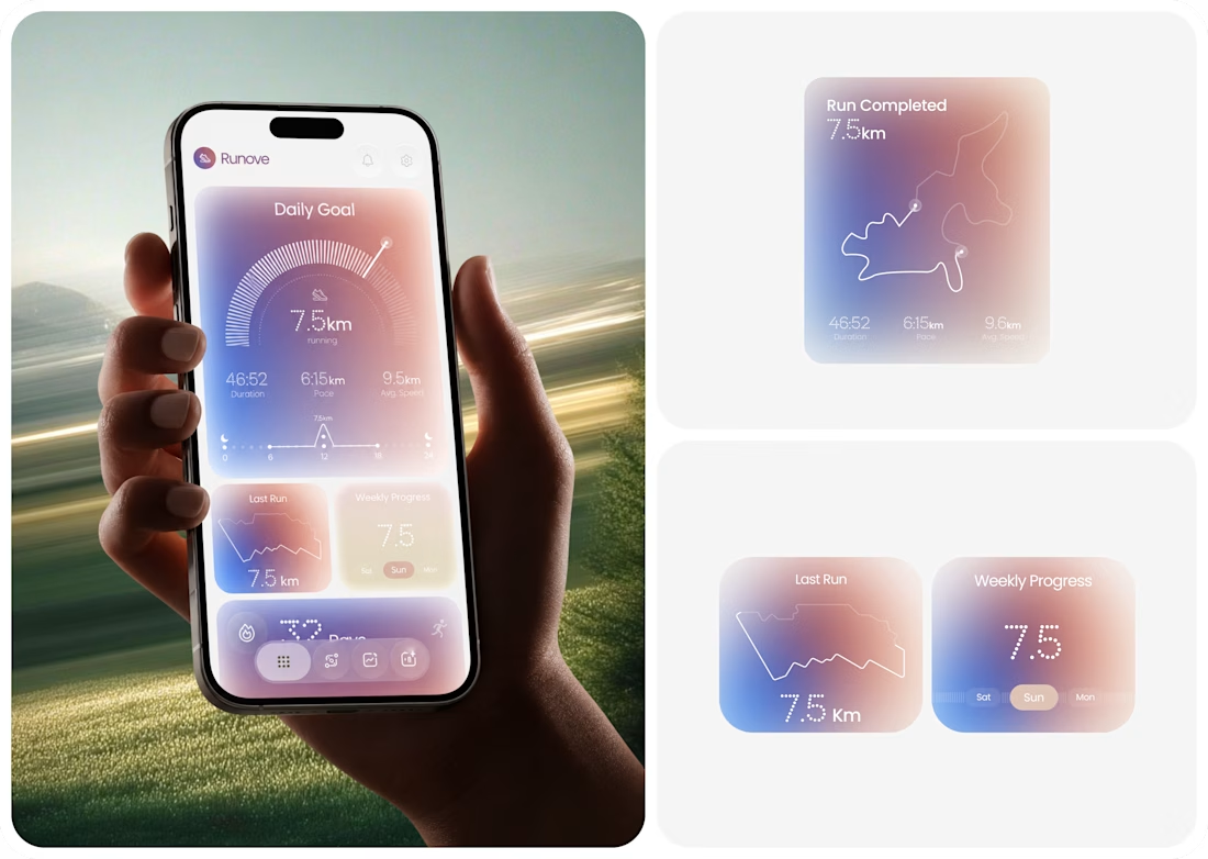
Runove explores how a running app can turn performance data into a focused and approachable experience.
The product experience brings together:
• Daily running goals
• Distance, pace & duration
• Average speed
• Weekly progress
• Running streaks
• Completed route visualization
The design direction uses soft gradients, rounded surfaces, subtle depth, and structured data visualization to keep the experience calm while giving performance metrics a clear visual hierarchy.
The goal is simple: Less friction. Better visibility. A more intentional fitness experience.
If you're building a fitness app, health platform, sports product, or data-heavy mobile experience, Taqwah can help you transform the product idea into a polished, user-focused UI/UX system.
Have a product in mind? Let's discuss the UX, structure, and visual direction needed to bring it to life.
fitnessapprunningapphealthtrackerMobile DesignUI DesignUX DesignAdobe IllustratorAdobe PhotoshopFigma



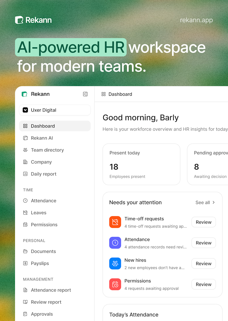
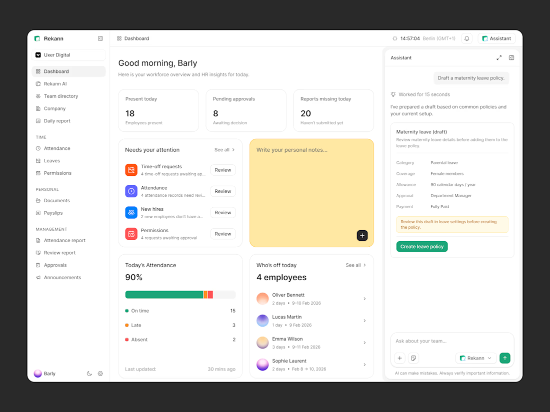
Closer look at the Rekann dashboard. Exploring how the HR workspace, daily overview, and AI assistant can live together in one simple interface.