The network for creativity
Join 1.25M professional creatives like you
Connect with clients, get discovered, and run your business 100% commission-free
Creatives on Contra have earned over $150M and we are just getting started
Back to feedPost

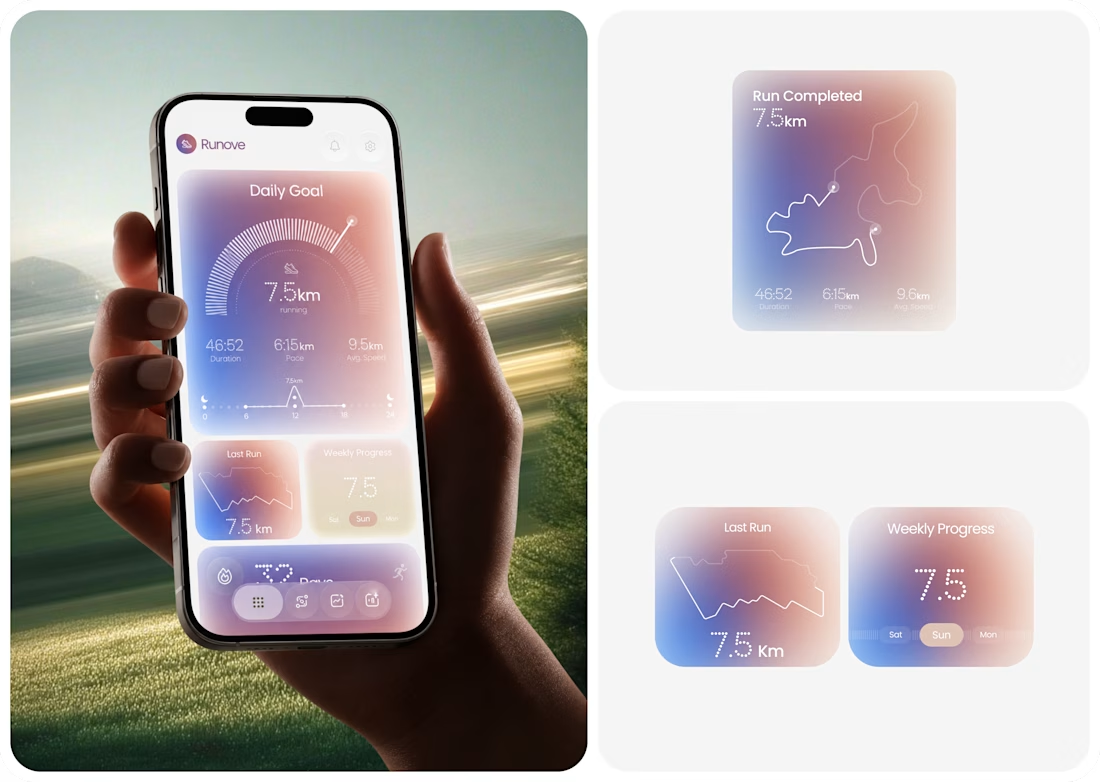
Runove - A Minimal Running App Designed Around Performance & Progress
Runove explores how a running app can turn performance data into a focused and approachable experience.
The product experience brings together:
• Daily running goals
• Distance, pace & duration
• Average speed
• Weekly progress
• Running streaks
• Completed route visualization
The design direction uses soft gradients, rounded surfaces, subtle depth, and structured data visualization to keep the experience calm while giving performance metrics a clear visual hierarchy.
The goal is simple: Less friction. Better visibility. A more intentional fitness experience.
If you're building a fitness app, health platform, sports product, or data-heavy mobile experience, Taqwah can help you transform the product idea into a polished, user-focused UI/UX system.
Have a product in mind? Let's discuss the UX, structure, and visual direction needed to bring it to life.
fitnessapprunningapphealthtrackerMobile DesignUI DesignUX DesignAdobe IllustratorAdobe PhotoshopFigma



Just Awesome

Top notch design

Cool
The network for creativity
Join 1.25M professional creatives like you
Connect with clients, get discovered, and run your business 100% commission-free
Creatives on Contra have earned over $150M and we are just getting started


Related posts

A few months ago I got to work with Coderhouse, one of the leading education brands in Argentina, and the place where I took several courses myself.
So this one feels like a full circle. A brand that shaped my career and helped me grow as a designer, and now I got to design for it.
The funny part is Chris had no idea I was a former student when he reached out. I was really happy when that message came in.
I built a visual system for their 60+ course covers, made so their team can keep producing them on their own. Today it lives across their app, website and Meta ads.
Thanks Chris for trusting my work and for the opportunity 🧡 And thanks @Contra HQ for making connections like this one possible.


This looks great


The colorful spines on the wood shelf under the big TOKYO STYLE title feel like a real bookstore. When a book slides out, does the shelf close the gap or leave a space?

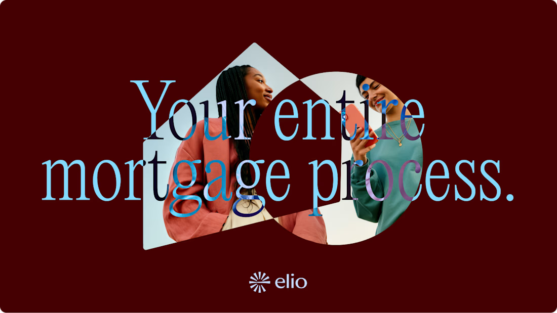
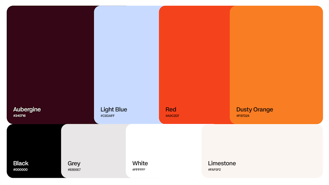
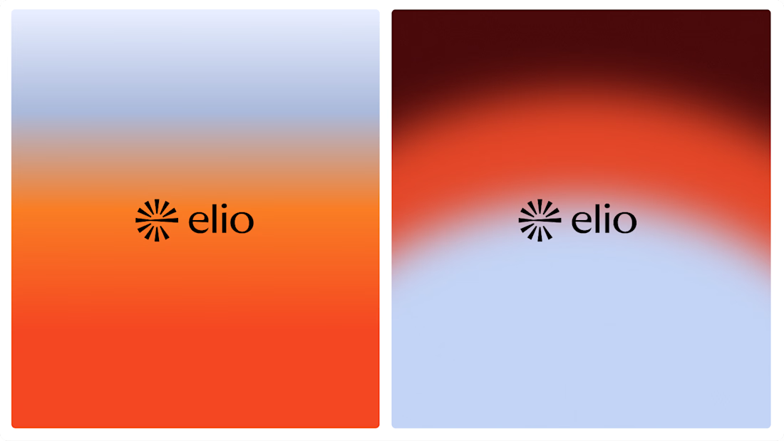
Another very cool brand Identity project I got to work on this year for Elio Mortgage.
Bringing warmth and love to a brand that is usually cold and stressful. Elio are doing things differently to make mortgages easier to deal with. We made a brand that felt more approachable.
Full case study here:


Warm, approachable identity for stressful mortgages.


