The network for creativity
Join 1.25M professional creatives like you
Connect with clients, get discovered, and run your business 100% commission-free
Creatives on Contra have earned over $150M and we are just getting started
Back to feedPost
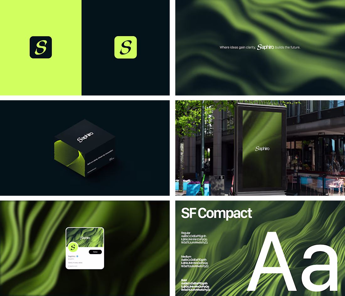
I developed Saphiro’s visual identity as a brand focused on clarity, sophistication, and technology. The name concept refers to purity and precision, reflecting the proposal of creating intelligent and well-defined solutions. The identity was built around a minimalist visual system, using a vibrant green palette combined with dark blue tones to convey confidence and modernity. The SF Compact typeface was chosen for its high functionality, ensuring strong legibility in user interfaces (UI) and reinforcing the brand’s technological aesthetic.
sick bro!
Awesome Vladmir 🙌
Love the color pallet Vlad 🙌 Brand application looks awesome🔥
Loving the green wavy stuff!
love this color pallete nice work
Love it
The network for creativity
Join 1.25M professional creatives like you
Connect with clients, get discovered, and run your business 100% commission-free
Creatives on Contra have earned over $150M and we are just getting started
Related posts

You're certainly an inspiration on being productive & creative, man!
Looks amazing!
How to make a light beam effect in Framer ⚡️
1. Go to @framer
2. Prepare your web section layout
3. Go to Framer University
4. And find this component
5. Just hit copy and paste to your Framer canvas
6. Here you can easily style to fit your web styleAnd even adjust the beam properties
👉 Use code JAN to get free month of Framer Pro!
Thanks 😊
Trending
Claude
Claude has entered the design space. How are you using Claude Design?
Contra University
Learn from expert creatives how to earn more using next-gen AI tools.
creativeaiflow
Creative AI workflows are evolving. What tools do you use, and what are their strengths and weaknesses?
portfolioreview
The best portfolios tell a story, not just show a grid. Share yours for feedback.
freelancerlife
Freelancer life is wins, pivots, and everything in between. What’s yours right now?