The network for creativity
Join 1.25M professional creatives like you
Connect with clients, get discovered, and run your business 100% commission-free
Creatives on Contra have earned over $150M and we are just getting started
Back to feedPost

What's more important to you:
Looking good or communicating clearly?

The network for creativity
Join 1.25M professional creatives like you
Connect with clients, get discovered, and run your business 100% commission-free
Creatives on Contra have earned over $150M and we are just getting started


Related posts

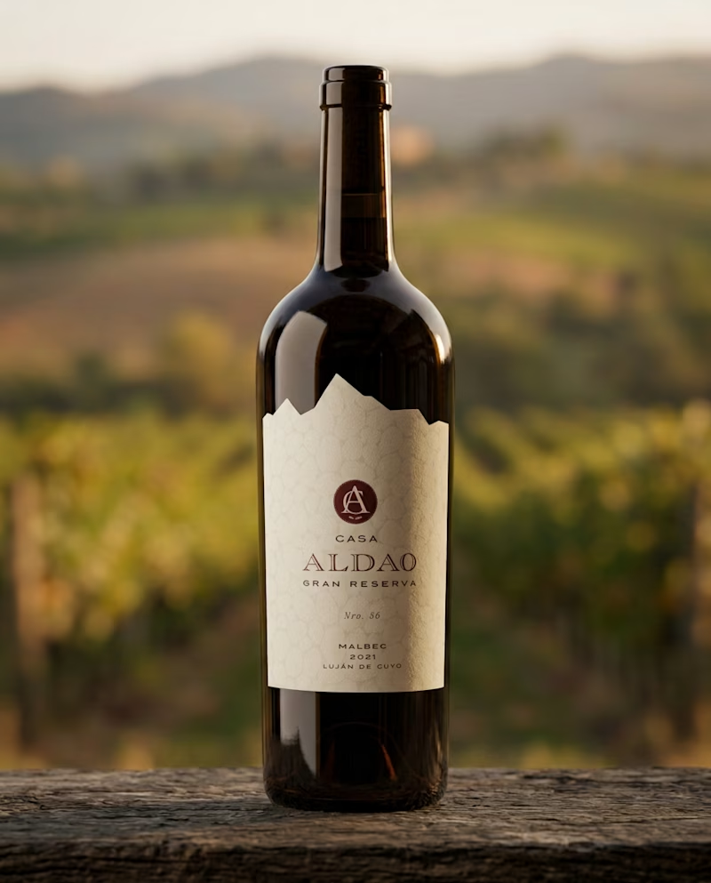
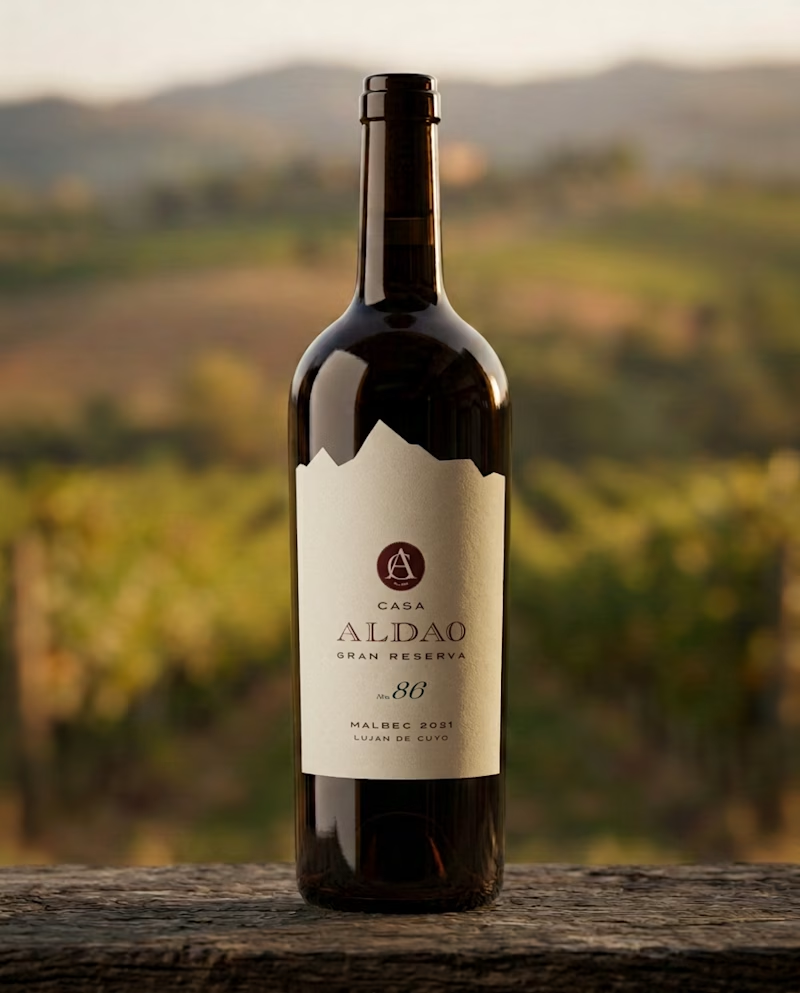
Testing designs for a Gran Reserva wine label that needs to feel traditional, sober, and confident. I chose a design with minimal ornamentation, where information hierarchy plays a key role in a clean layout.
Which of the two do you think reads better?

25 votes
Ends in 14h

Hola Luci! Cómo estás? Soy Argentina también!
De que provincia es el vino? Me encargo de las redes de una vinoteca en mi ciudad, y me llamó la atención. Tenemos cata este finde, y me gustaría proponer esta opción.


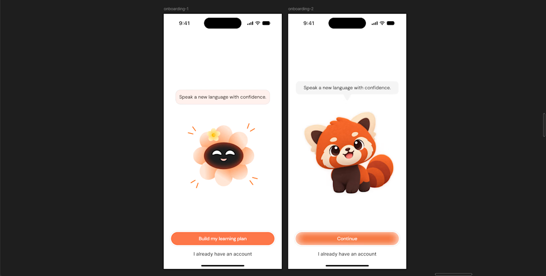
I'll go with first one

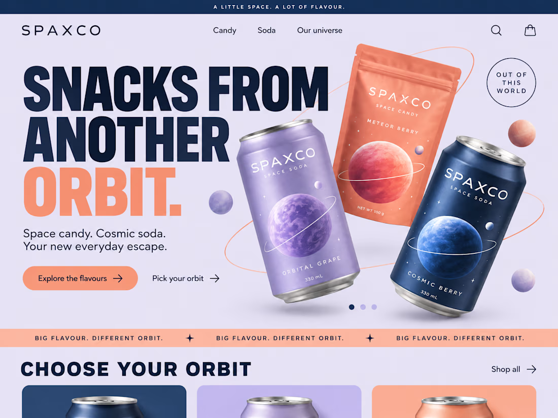
First impressions happen in seconds. We made them count.
A landing page should do more than look good. It should tell a story, build trust, and make the next step feel natural.
We brought together bold visuals, thoughtful layouts, and clear messaging to create an experience that keeps visitors engaged from the first scroll to the final click.
Good design catches the eye. Great design gives people a reason to stay.
What's your next big idea?