The network for creativity
Join 1.25M professional creatives like you
Connect with clients, get discovered, and run your business 100% commission-free
Creatives on Contra have earned over $150M and we are just getting started
Back to feedPost

Back to Burger was born from the meeting of Guilherme Lopes, Felipe Lopes and Matheus Mencarini, three partners who each already had their own experience in the burger business before deciding to build something new together. Guilherme and Matheus met at an entrepreneurship event and saw the chance to join forces on something different from what each of them had been doing until then. The project's goal became to translate that ambition into a brand strong enough to stand out in a crowded market, with an identity bold enough to carry the irreverent voice the partners were after.
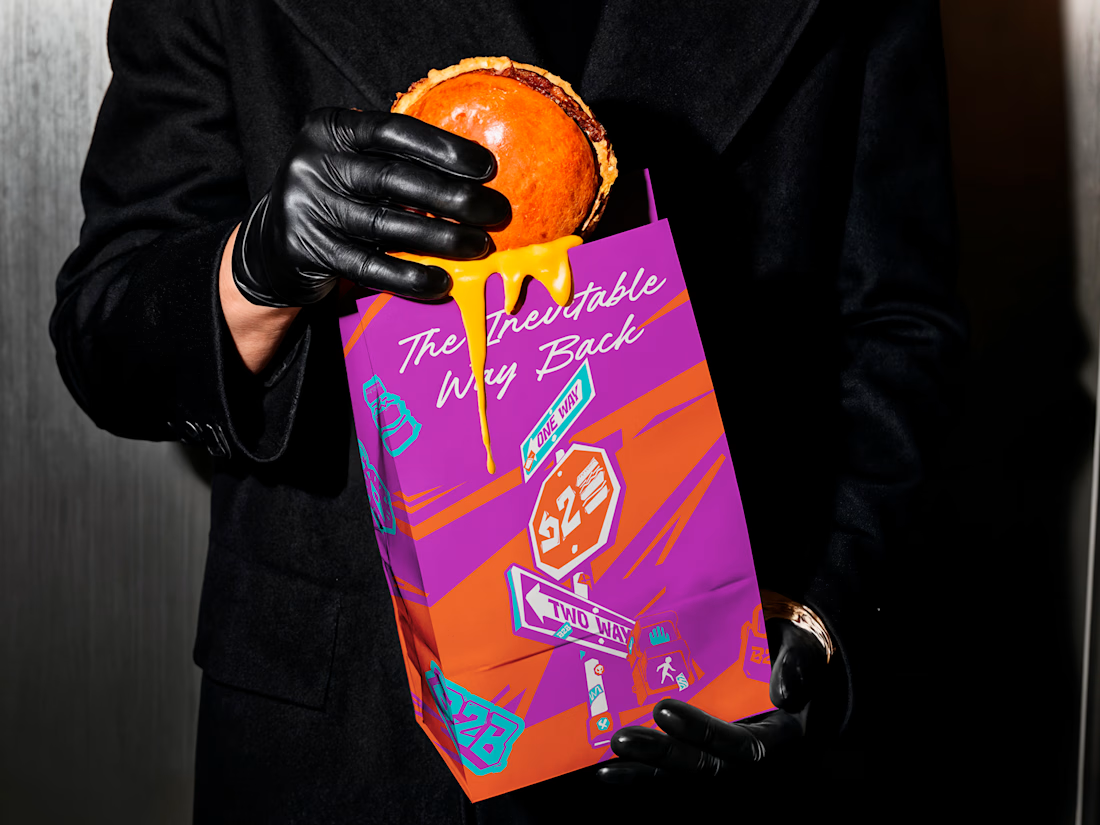
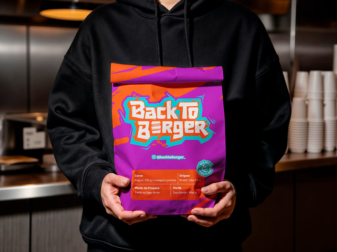
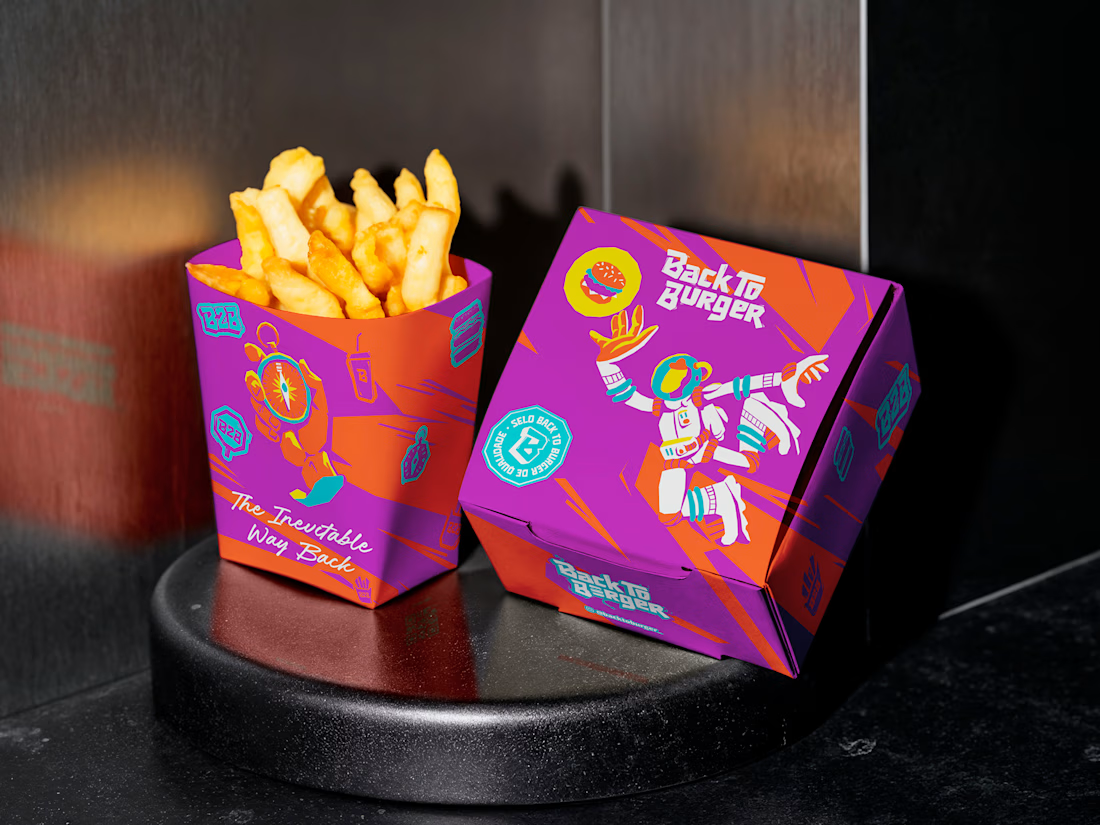
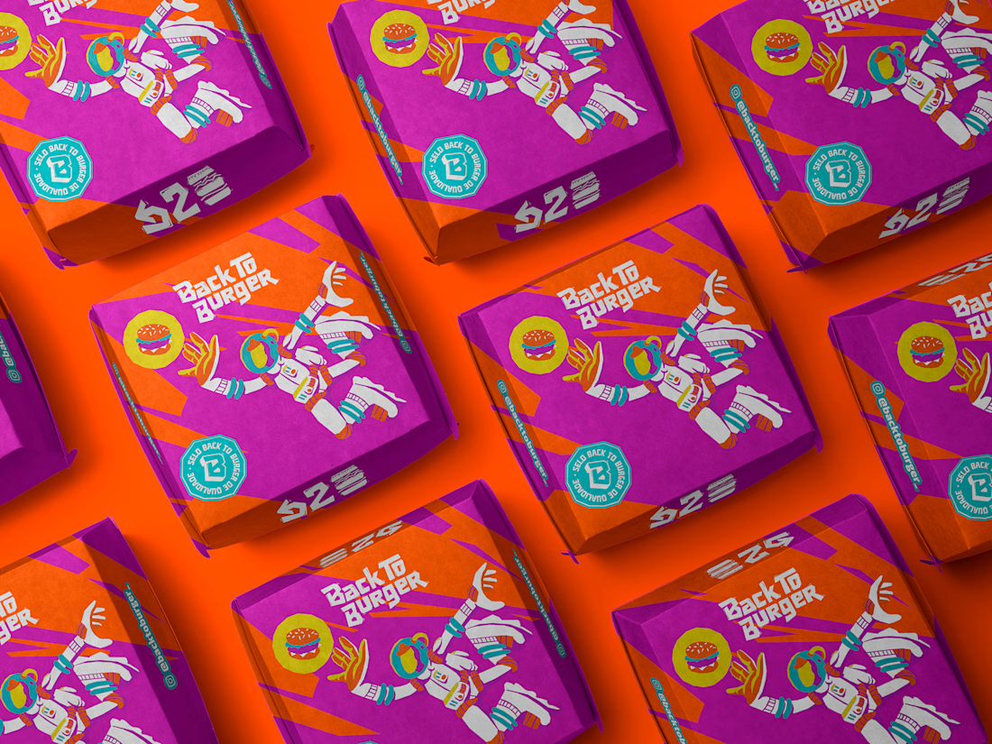
The starting point was the naming itself, built around a play on the phrase "back to back" to tell the story of an inevitable return to the burger, that one dish that keeps making sense at every stage of life, no matter how chaotic the routine around it gets. From that concept, a full visual system was developed grounded in graffiti aesthetics, with gestural typography, loose linework and a palette of purple, orange, cyan and yellow that gives the brand its young, urban tone without losing the warmth needed to welcome families too. A set of original illustrations reinforces this narrative of searching and returning across touchpoints like packaging and the menu, helping the brand communicate personality even in a quick interaction with the customer.


The network for creativity
Join 1.25M professional creatives like you
Connect with clients, get discovered, and run your business 100% commission-free
Creatives on Contra have earned over $150M and we are just getting started











Related posts

A flower that inflates arrives in the mail.
Next month, a phone made of shell.
STILL LIFE SERVICE. Case study dropping soon.
Which object earns your shelf? Reply below.
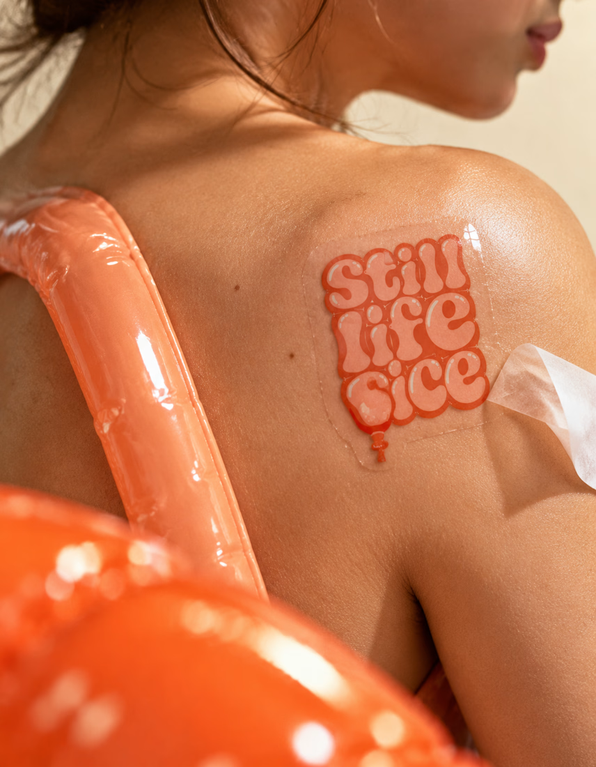
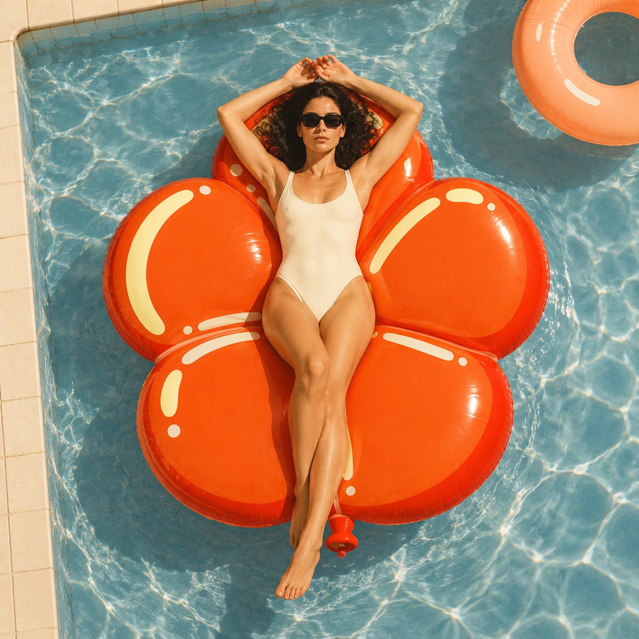
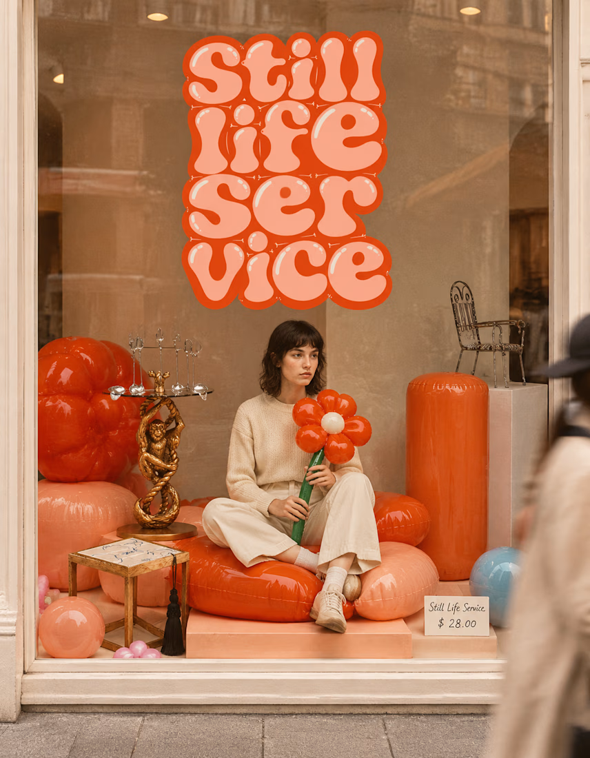

The inflatable flower. Only houseplant I'm guaranteed not to kill. Also, a new object every month is a sneaky good retention hook, people will stay subscribed just to see what's next.

HuroPay Branding for Fintech
We built its identity to feel the same way: fast, clear and human.
Need a branding? DM Now...
#branding #brandidentity #logo


Congrates!!