The network for creativity
Join 1.25M professional creatives like you
Connect with clients, get discovered, and run your business 100% commission-free
Creatives on Contra have earned over $150M and we are just getting started
Back to feedPost

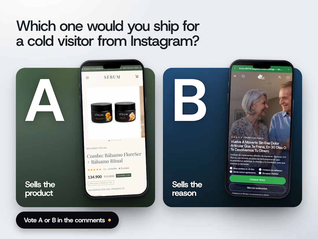
Two product pages. Same goal. Opposite bets.
A bets you already want the product. Photo, name, rating, price, done. Clean, calm, honest. The buy button waits one scroll down.
B bets you don't care yet. It opens with a person, a promise and four reasons, and puts the buy button on the first screen. The price shows up later, after you've been convinced.
Both are live stores I built on Shopify (Sebum skincare and Factores 2x2 supplements), captured on a phone on 3 Oct 2026.
Now picture someone who just tapped an Instagram ad and has never heard of either brand.
A or B? Vote in the comments. And if you'd steal one thing from the page you didn't pick, tell me what.
The network for creativity
Join 1.25M professional creatives like you
Connect with clients, get discovered, and run your business 100% commission-free
Creatives on Contra have earned over $150M and we are just getting started

Challenges
View all


Related posts

𝗦𝗵𝗼𝗽𝗶𝗳𝘆 𝗔𝗽𝗽 𝗕𝗹𝗼𝗮𝘁: 𝗧𝗵𝗲 𝗧𝗼𝗽 𝟱 𝗘𝘀𝘀𝗲𝗻𝘁𝗶𝗮𝗹 𝗔𝗽𝗽𝘀 𝗬𝗼𝘂 𝗔𝗰𝘁𝘂𝗮𝗹𝗹𝘆 𝗡𝗲𝗲𝗱 (𝗮𝗻𝗱 𝗪𝗵𝗮𝘁 𝘁𝗼 𝗗𝗲𝗹𝗲𝘁𝗲)
Installing 30 different Shopify apps will slow your store down and kill your conversion rate.
𝗛𝗲𝗿𝗲 𝗮𝗿𝗲 𝘁𝗵𝗲 𝗢𝗡𝗟𝗬 𝟱 𝗮𝗽𝗽 𝗰𝗮𝘁𝗲𝗴𝗼𝗿𝗶𝗲𝘀 𝘆𝗼𝘂 𝗮𝗰𝘁𝘂𝗮𝗹𝗹𝘆 𝗻𝗲𝗲𝗱:
1. Advanced Product Reviews (Judge.me/Loox).
2. Email Marketing (Klaviyo)
3. Cart Upsell / Drawer (Rebuy/Slide Cart)
4. SEO & Schema optimizer
5. Backup & restore tool.
What apps are you running on your store? Share below!


Amazing, Clouting any form of website with apps or plugins will definitely slow down the conversion rate.

Customer reviews can reveal what your website needs to explain better.
For BONK Golf, I turned recurring questions into a product-finder quiz.
It guides shoppers through gifting, fit and style to a relevant recommendation helping them choose with confidence and aiming to reduce unsuitable purchases and returns.
See it: https://bonkgolf.com/pages/quiz-page
Are your shoppers struggling to choose? I design & build Shopify shopping experiences. DM your store URL.


Words first or product first, which opening would you keep?
Same concept app, same brand, two different first seconds.
A opens on a bold question in big type. B drops you straight into the app planning a week.
We built six openings for one launch and these two are the furthest apart.
Which one stops your thumb?
https://contra.com/p/7XmrRUrA
https://givemeprompts.com

3 voted
60%
2 voted
40%
5 votes
Closed

Love A! ❤️