The network for creativity
Join 1.25M professional creatives like you
Connect with clients, get discovered, and run your business 100% commission-free
Creatives on Contra have earned over $150M and we are just getting started
Back to feedPost
🚀 Started learning Framer this week.
After years of building websites the "traditional" way, I finally decided to see what all the Framer hype was about.
A few hours in, and I've already learned:
• Stacks are your best friend 🤝
• Making something responsive is easier when you stop fighting the layout engine
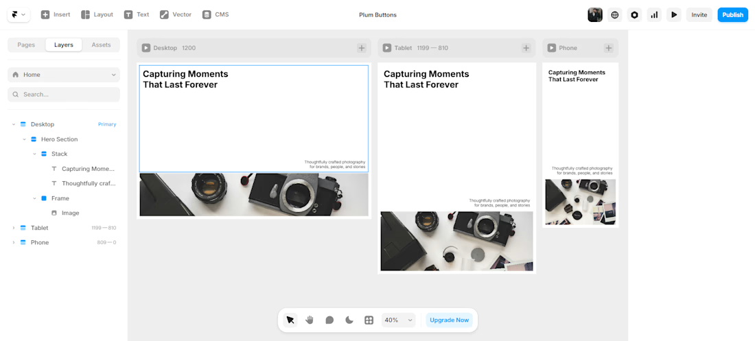
As a small milestone, I designed and built a modern minimal hero section that works across desktop, tablet, and mobile. 📱💻 Still very much in the learning phase, but I'm enjoying the process and looking forward to building more projects with it.
More experiments, mistakes, and hopefully some cool websites coming soon. 👀
What do you think of the hero section? Any improvements you'd make or Framer tips you'd give to someone just getting started? 👇
#Framer #WebDesign #UIDesign #NoCode #WebDevelopment #DesignJourney


Stacks are genuinely the thing that unlocks Framer. Once you stop thinking in fixed positions and start thinking in flows, everything clicks. For the hero section, try experimenting with the breakpoint preview while you build so responsive behavior becomes instinct early.

Absolutely! That's been the biggest mindset shift for me so far. Once I stopped trying to position everything manually and started trusting stacks, things became much smoother. 😄
And that's a great tip about building with breakpoint previews open from the start, I'll definitely...

This is awesome, how come you learnt this so fast mine took me up to 2 days to learn this but am now an expert
Thank you! 😄
To be fair, I already had experience building websites, so concepts like layout, spacing, and responsiveness weren't completely new to me. Framer's workflow was the main thing I needed to learn.
Still very much a beginner with Framer though, so I've got a lot more to explore before I can call myself an expert! 🚀😄
The network for creativity
Join 1.25M professional creatives like you
Connect with clients, get discovered, and run your business 100% commission-free
Creatives on Contra have earned over $150M and we are just getting started



Related posts


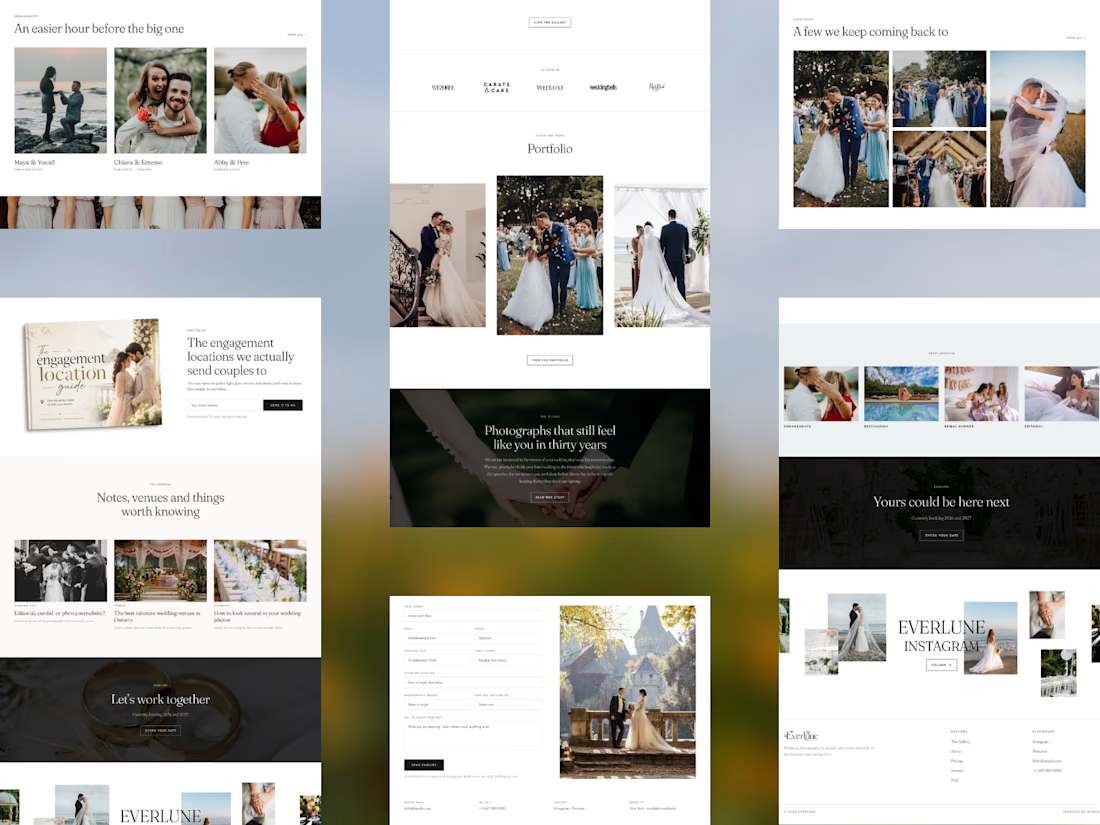
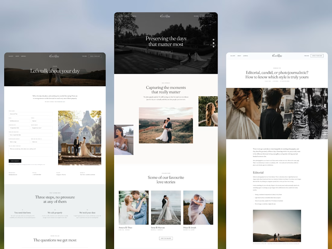
Everlune 🤍
A premium wedding photography portfolio x@framer template with 13+ CMS-powered pages, soft editorial design, built for photographers, planners & studios who want their site to feel like their work
#Framer #FramerTemplate #WeddingPhotography #WebDesign
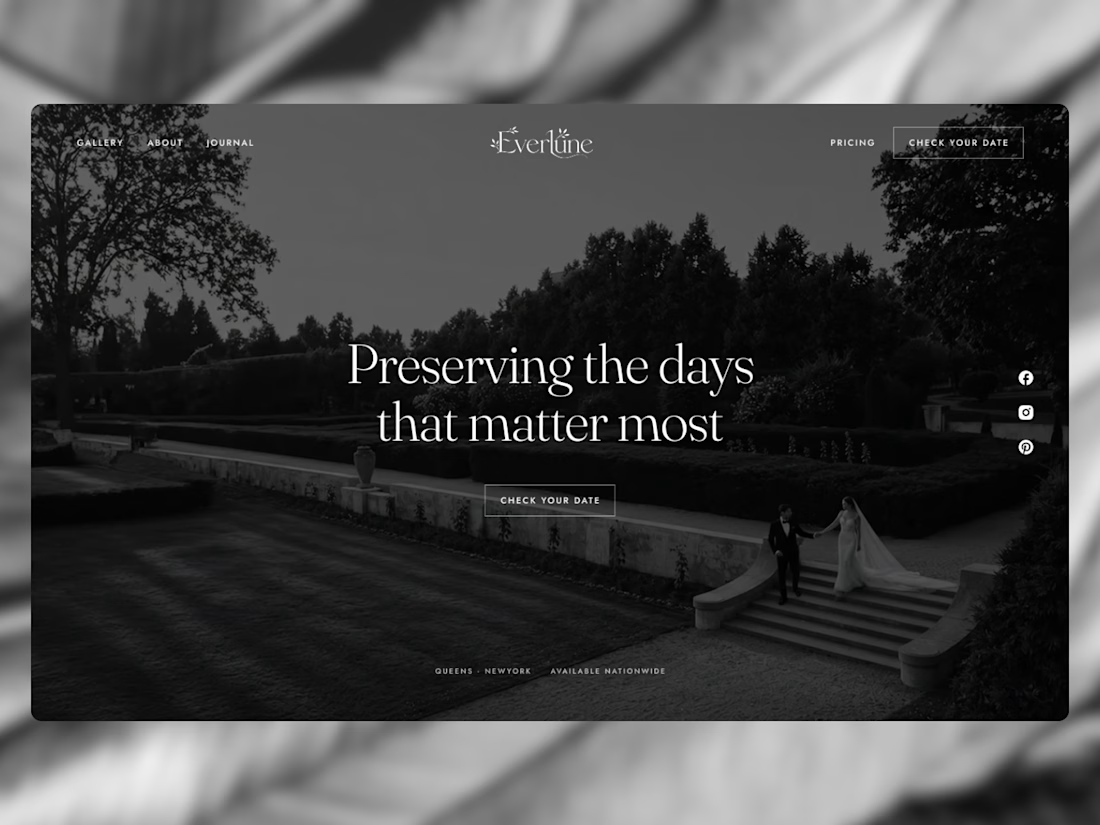

The visual direction is Nice!

Day 12/30 of my hero section challenge.
Another day of prioritising the visuals and imagining a company that doesn't exist. I promise the next one is a tech brief with barely any imagery at all, I've leaned hard on beautiful photography for twelve days straight.
Concept: a mycelium materials company producing leather, packaging and foam grown from fungal networks. The design deliberately inverts the category's defaults; biotech branding tends toward dark, clinical and electric blue, so this one goes warm and botanical, with a subtle looping video of spores drifting and mushrooms emerging. The copy pulls hard the other way: plain, technical, B2B-direct, anchored by two concrete numbers instead of sustainability adjectives.
Twelve briefs across travel, food retail, personal branding, events, landscape architecture, pet services, hospitality, coffee, lighting, wellness, restaurants and now biomaterials.
12 down, 18 to go.
Built on the Viper template by Westhill Studio, adapted and customised by me.
Imagery and video generated with AI.


brilliant

💳 Making Financial Products Feel Simple
I designed this finance website for Sendit, with one goal in mind: make everyday payments feel simple, trustworthy, and effortless.
The design focuses on:
Clear messaging and strong visual hierarchy
Trust-focused finance UI
Simple payment interactions
Clean, modern layouts
Conversion-focused sections
A responsive experience designed around the user
For fintech products, good design isn’t just about looking modern. It’s about making people feel confident when money is involved.
If you’re building a fintech, SaaS, payment platform, or financial product and need a website that communicates trust and clarity, I’d love to work with you.


This caught my eye instantly! 🎨