The network for creativity
Join 1.25M professional creatives like you
Connect with clients, get discovered, and run your business 100% commission-free
Creatives on Contra have earned over $150M and we are just getting started

The network for creativity
Join 1.25M professional creatives like you
Connect with clients, get discovered, and run your business 100% commission-free
Creatives on Contra have earned over $150M and we are just getting started




Related posts

UX/UI designer and Framer expert here, sharing my work.
I'd love to connect and collaborate with other creators here on Contra!


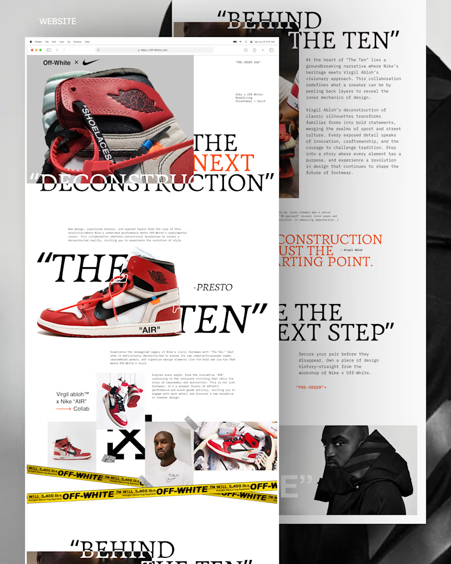

I signed my first contract through Contra and was so happy 🥹

congrats!

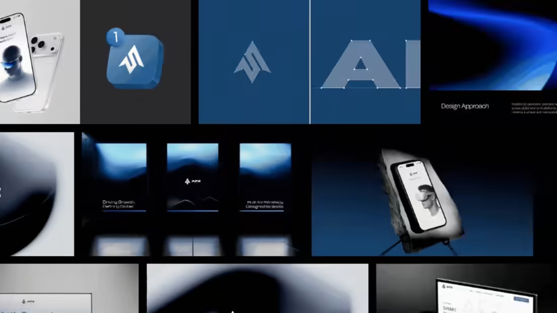
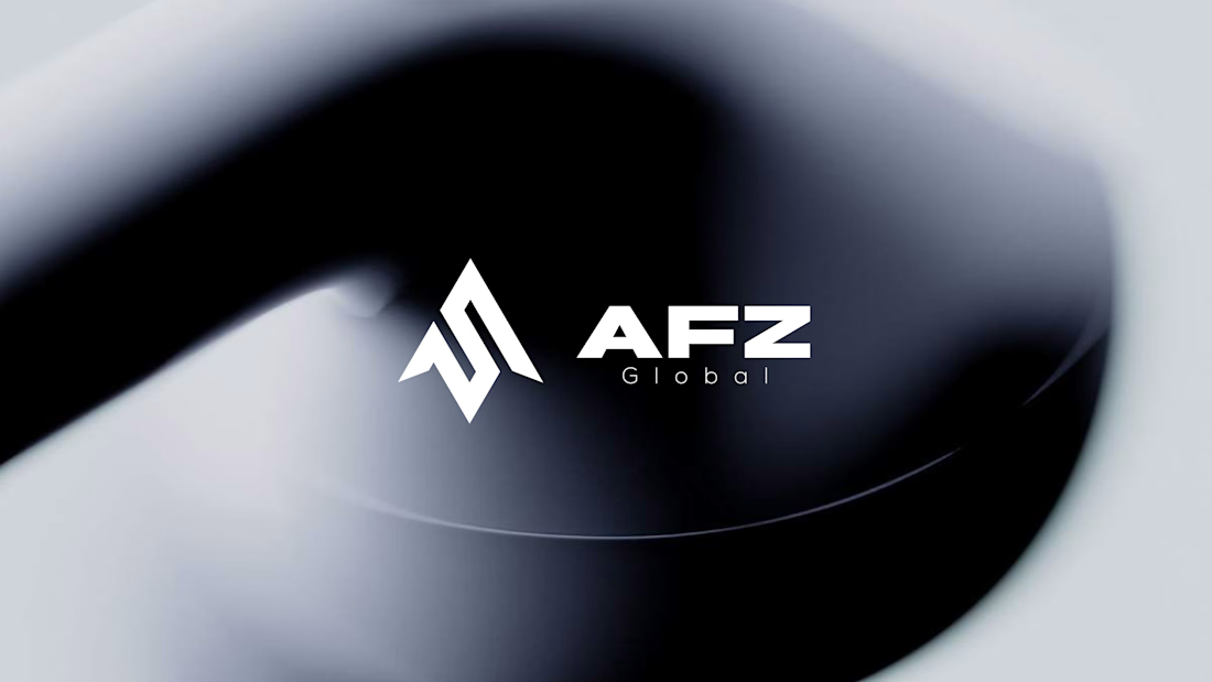
Hi Contra 👋 Here’s the first logo direction I presented for AFZ Global, a US-based tech services company.
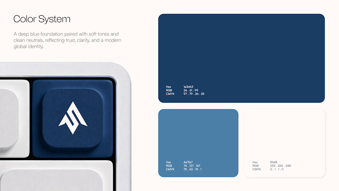
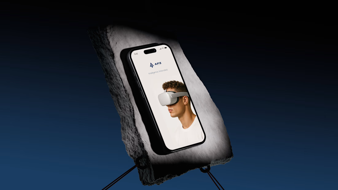
I built the geometric mark around the AFZ initials, using upward-moving forms to suggest progress and forward thinking. I paired it with a bold wordmark and a deep-blue visual identity designed to feel clear and confident across digital applications.
The project is complete now, but I’d love your first impression: if this concept landed in your inbox, would you approve it or ask to see another direction? What would you change?