The network for creativity
Join 1.25M professional creatives like you
Connect with clients, get discovered, and run your business 100% commission-free
Creatives on Contra have earned over $150M and we are just getting started


The network for creativity
Join 1.25M professional creatives like you
Connect with clients, get discovered, and run your business 100% commission-free
Creatives on Contra have earned over $150M and we are just getting started



Related posts

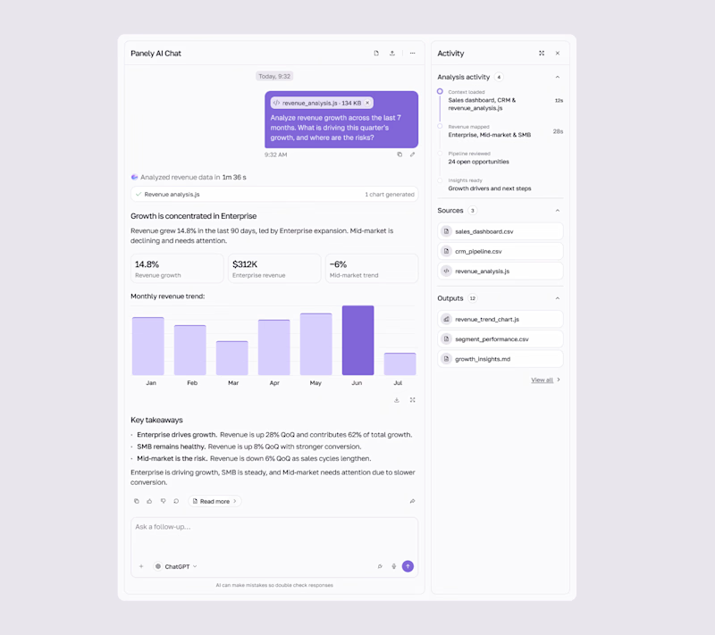
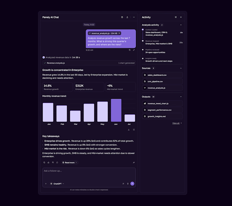

I'd pick Light for an analysis tool, the charts and sources read better on a pale surface and the violet bars still pop. Dark works as the night option. Is the sources panel on the right open by default?

The first thing I created for LedgerFlow wasn't a screen.
It was a set of questions.
I'm kicking off a new concept project: **LedgerFlow, an accounting and financial management SaaS platform for small businesses, freelancers and independent business owners.
The goal is to design a website that helps visitors understand what the product does, how it helps their business, and why they should book a demo.
But before opening Figma, I needed to understand the business.
So I created a website discovery and brand strategy questionnaire.
It covers:
→ Brand vision and business goals.
→ Target audience.
→ Website goals and user experience.
→ Branding and visual direction.
→ Services and offers.
→ Project direction and logistics.
I want to understand things like:
Who exactly are we designing for?
What problem does the product solve?
What makes it different from traditional accounting software?
What should visitors understand within the first few seconds?
And what would make them confident enough to book a demo?
Because the answers will influence the website's messaging, content, visual hierarchy and calls to action.
You can't design a clear experience when you don't understand what the business needs to communicate.
LedgerFlow is a concept project, but I'm treating the process like a real client engagement.
I'll be sharing the journey from discovery to website structure, UI design and Webflow development.
And if you're building a SaaS product or need a website that communicates your business value clearly, I'm open to website design and Webflow projects.
Let's talk about what you're building. 🤝

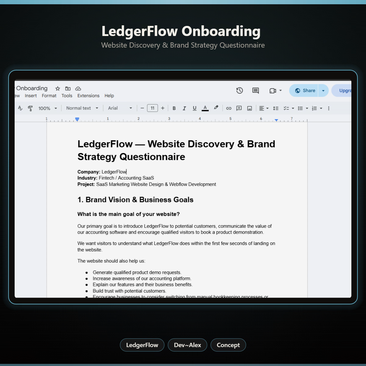
Starting with a discovery questionnaire instead of a screen is how good briefs begin, and "explain what LedgerFlow does in the first seconds" is the right goal to design around. Will the answers become a one page brief?

Building a great product is hard. It takes real time, focus, and dedication.
But in 2026, the hardest part is distribution. The moment you can’t build hype around your product or make people understand it, you are losing your customers. Lower impressions, higher CAC, and rising churn rate.
And the thing meant to fix that, your video, is usually the weakest link in your marketing funnel. It runs long, it explains nothing, and attention is gone.
After seeing this across a lot of ecommerce brands, we’ve engineered one of the sharpest ways to close that gap.
Script-first explainer videos for ecommerce brands. Script-first because the words decide whether your message is properly dialed in. And then the design, animation, and sound to make you feel every second of the video.
Explainers, launch videos, product demos, everything that’s part of your ecommerce funnel.
If you build the next great product and want the hype and clarity around it, we at WhyItWorks would love to help.