The network for creativity
Join 1.25M professional creatives like you
Connect with clients, get discovered, and run your business 100% commission-free
Creatives on Contra have earned over $150M and we are just getting started
Back to feedPost

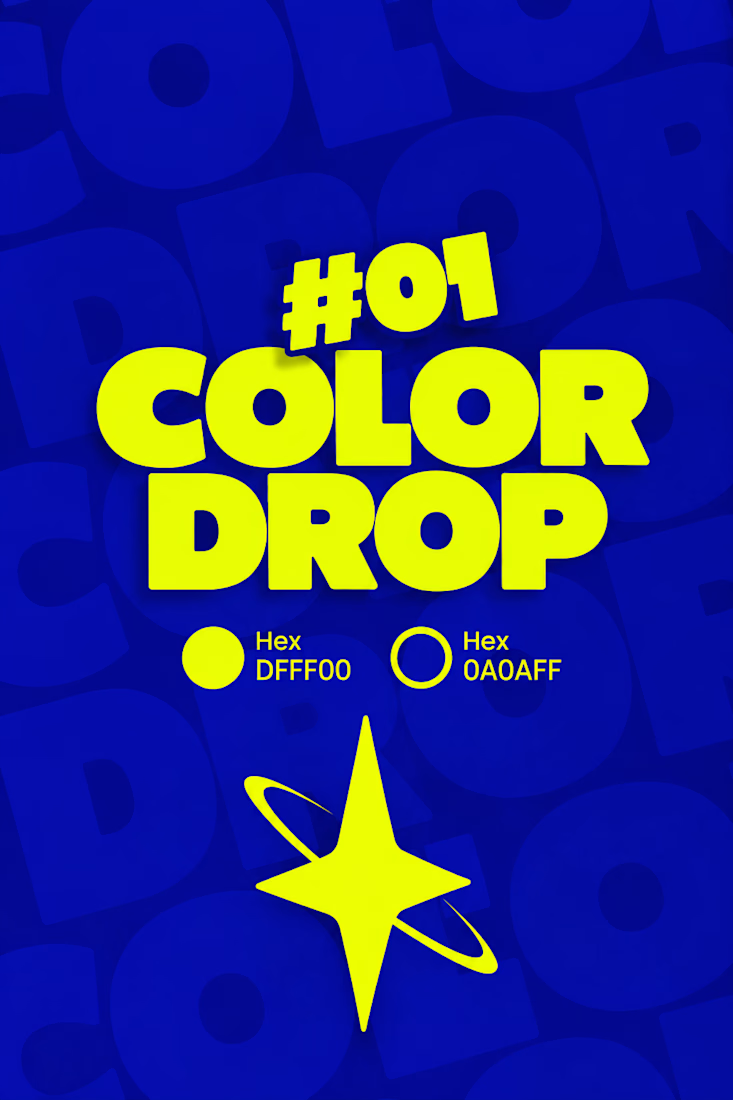
Color Drop #01 🎨
Color can change how a website feels before you read a single word.
For this Color Drop, I’m pairing electric blue and neon yellow to create a bold, energetic visual system — the kind of color direction that can turn an ordinary web design into an experience.
Good web design isn’t just about layouts.
It’s about knowing which colors to use, where to use them, and what they make people feel.
🎨 Color Drop #01
💻 Web Design & UI/UX
⚡ Bold Visual Direction
💛 #DFFF00
💙 #0A0AFF
Which color combination should I drop next?
#ColorDrop #ColorInspiration #ColorPalette #ColorTheory #WebDesign #WebDesigner #UIDesign #UXDesign #UIUXDesign #WebDesignInspiration #WebsiteDesign #BrandDesign #DigitalDesign #CreativeDesign #Figma #Contra
The network for creativity
Join 1.25M professional creatives like you
Connect with clients, get discovered, and run your business 100% commission-free
Creatives on Contra have earned over $150M and we are just getting started



Related posts

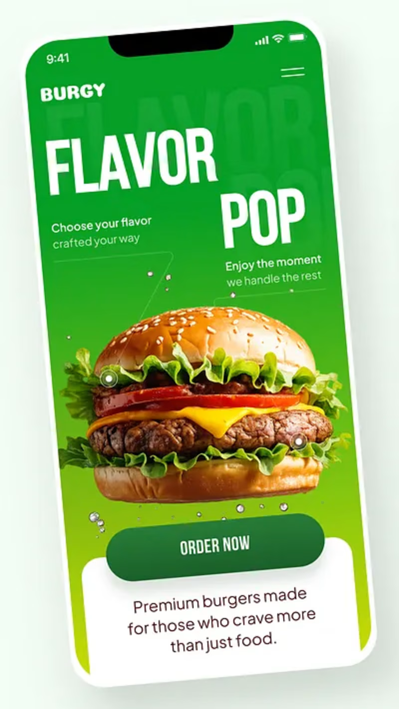
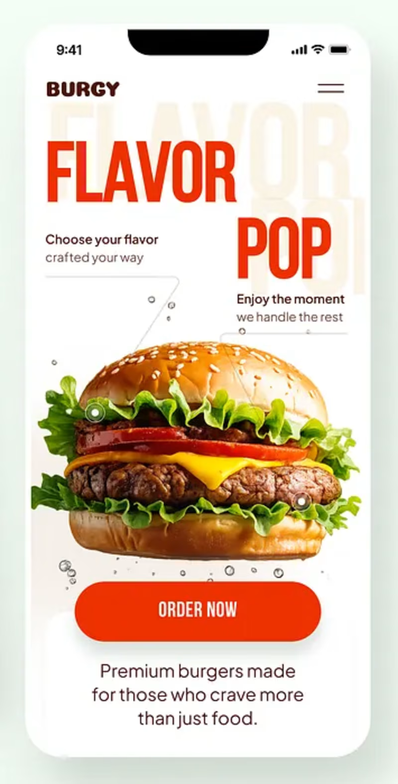
Burgy, a mobile concept for burger ordering. 🍔
Bold type, premium food visuals, and a fast path from craving to checkout.
Two color directions for the hero screen. Which one converts better?
Vote and tell me why 👇
Poll options: 🟢 Green | 🔴 Red
#UIDesign #MobileApp #FoodApp #AppDesign #UX #RestaurantApp


13 voted
43%
17 voted
57%
30 votes
Closed

Green for me, and I'd bet on it converting better too. The red version is loud in the way every food app is loud, while the green makes the burger the hero and the screen instantly recognizable in a feed. The green background also gives the white FLAVOR POP type far more contrast, so the message lands a beat faster.

Noise Reveal, a premium reveal component for Framer
I built a component that gives Framer sites cinematic reveals for images, video and live layouts. It has a soft, film-like edge with glow and grain, and can play on load, on view, from a variant or scrubbed by scroll.
It’s built for production: the reveal is prepared before it scrolls in, it’s accessible with reduced-motion support, it falls back when WebGL isn’t available, and pages stay plain HTML when nothing is moving.
Launched on the Framer Marketplace. Open to custom Framer and interaction work.


The WebGL fallback and reduced-motion support are the parts most reveal effects skip, so it's great to see them called out. Does the fallback keep some of the grain edge with CSS, or does it drop to a simple fade?

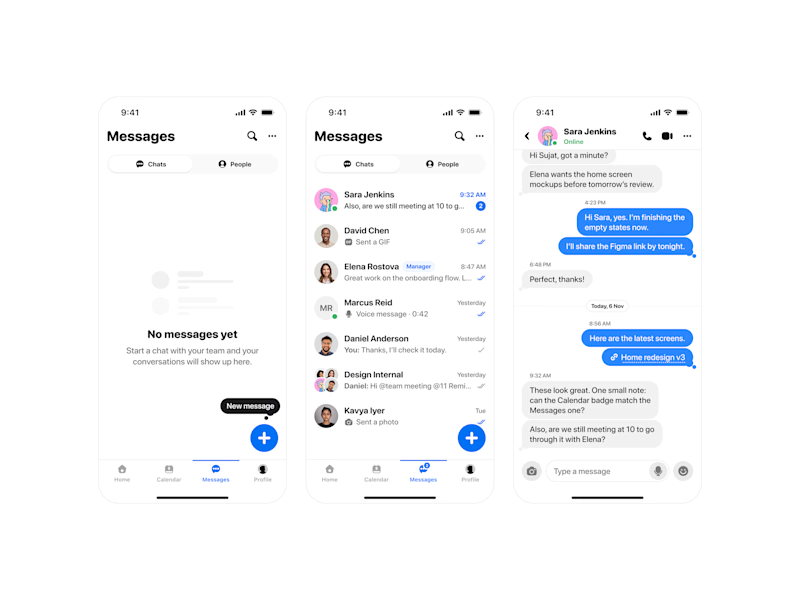
Started this messages flow in light mode. then I did a dark version just to check. Now I can’t pick, so i’ve handed the decision to strangers on the internet
0 voted
0%
12 voted
100%
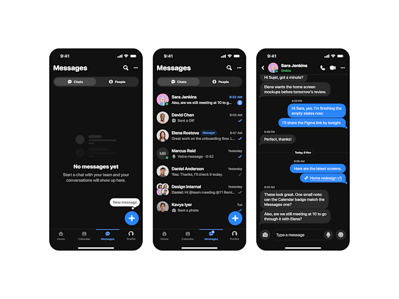
12 votes
Closed
Light mode gets my vote here. The message bubbles and the blue accent have room to breathe against the white, and the timestamps stay readable at a glance. The dark version looks slick, but for a screen people stare at all day, the light one will feel easier on the eyes over a long chat.