The network for creativity
Join 1.25M professional creatives like you
Connect with clients, get discovered, and run your business 100% commission-free
Creatives on Contra have earned over $150M and we are just getting started
Back to feedPost


Zayat Beauty
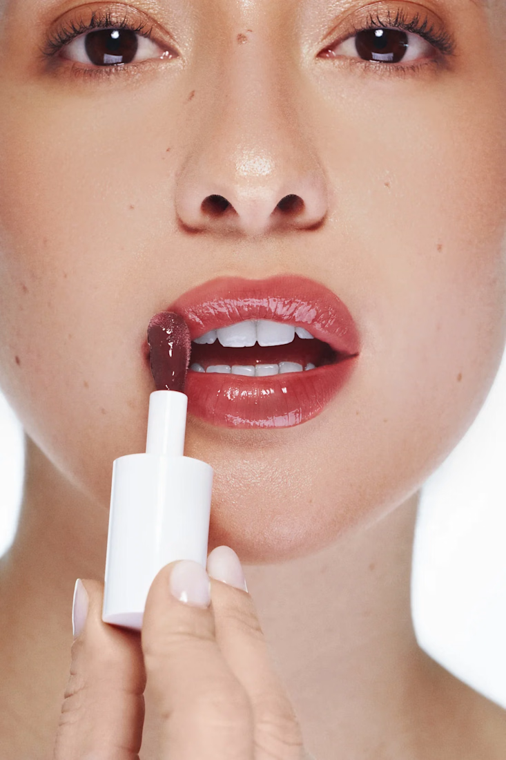
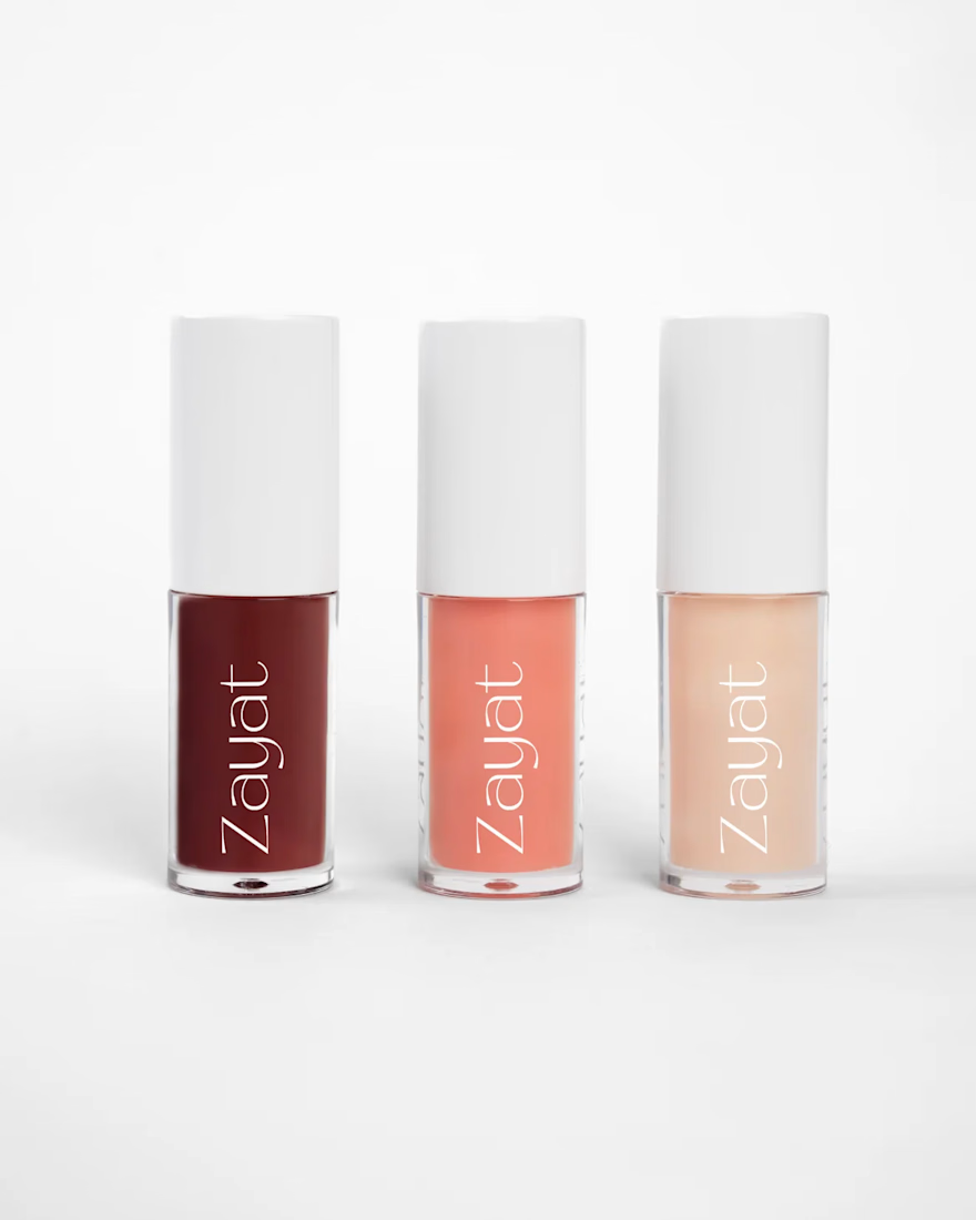
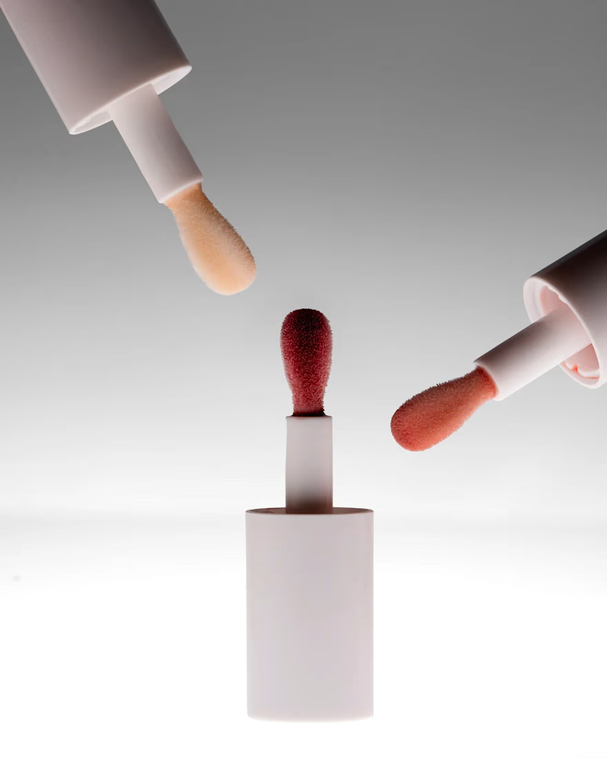

Hey Ganesh, thank you! No these are all real shots ✨

Clean brand work! Love the minimal + bold direction. I do similar Brand + Social kits — would love to connect.
Love your work, Raneem! "Building Lived-in Brands for Bold Ideas" — such a strong vision. Your work for women-led brands is truly inspiring. Would love to connect as a fellow Brand + Social Designer! ✨
Hey Divya, thanks so much!
The network for creativity
Join 1.25M professional creatives like you
Connect with clients, get discovered, and run your business 100% commission-free
Creatives on Contra have earned over $150M and we are just getting started







Related posts



Glow Salon - Modern Salon Appointment Booking App
I built Glow Salon, a luxury salon booking experience designed for modern women who value both beauty and convenience.
What I built:
Branded Intro - Contra x Lovable Challenge with watercolor aesthetic
Client Home - Welcome back, upcoming appointments, services, and a 20% off offer
Services - Haircut $35, Facial $50, Manicure $30, Hair Styling $60 with one-tap Select
Smart Booking - Visual calendar, time slots, and customer details
Owner Dashboard - Today's appointments, weekly appointments, revenue, customer notes, and reschedule options
Confirmation - Appointment Confirmed with complete booking details
Why I built it:
Most salon apps are cluttered. I wanted to create something that feels like a luxury salon itself - soft blush pink watercolor, hand-drawn leaf branches, dusty rose buttons, and elegant serif typography. The goal was to make booking feel calming and simple, not transactional.
Design decisions:
Blush pink and dusty rose color palette
Original design created in Lovable
Mobile-first design
Simple 3-step booking flow: Select service > Pick date/time > Confirm
Focus on a calm and elegant user experience
Built with Lovable • Original Design • Feminine Luxury Aesthetic
#lovablechallenge

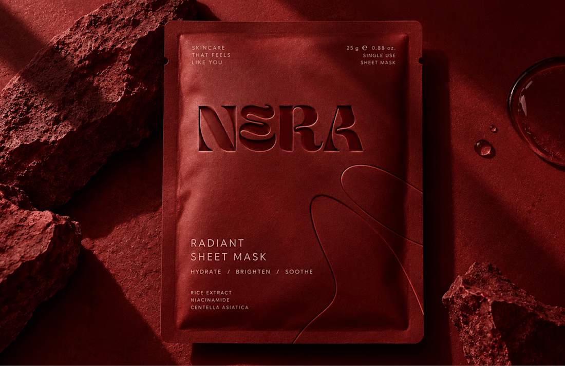
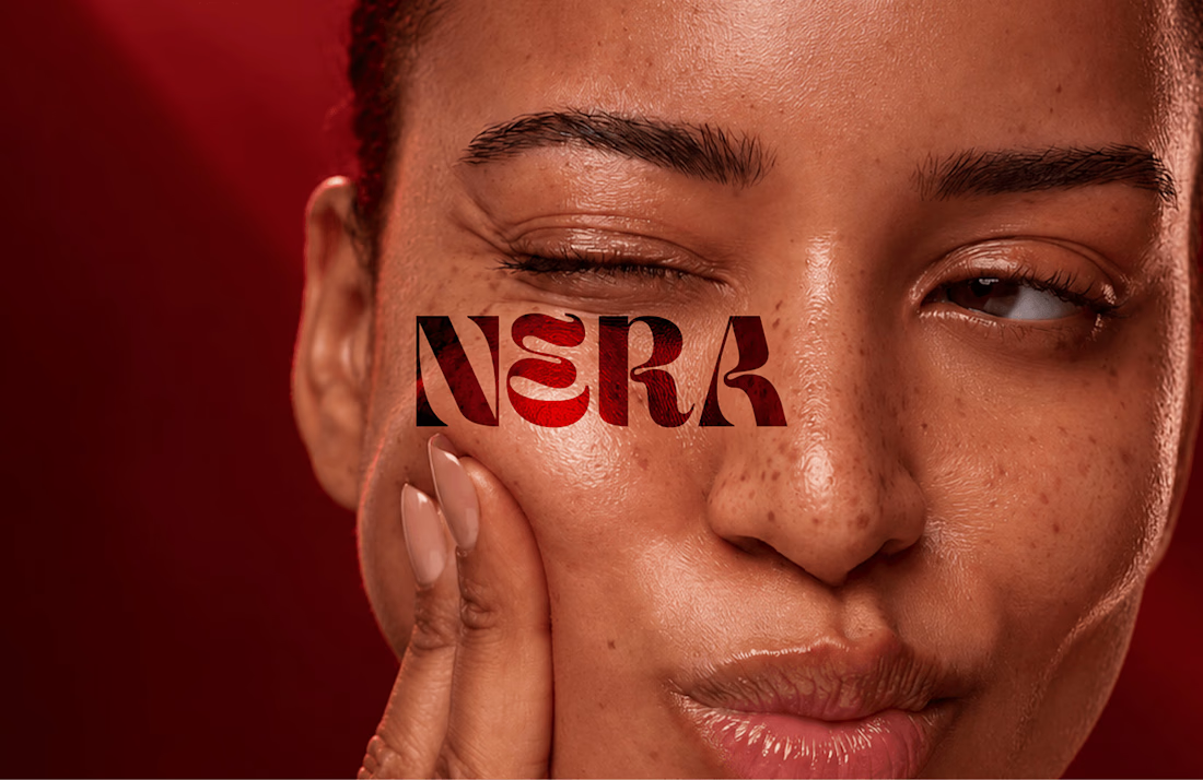
Built a skincare identity around one brief: intimate, confident, luxe, without looking like every other minimal beauty brand.
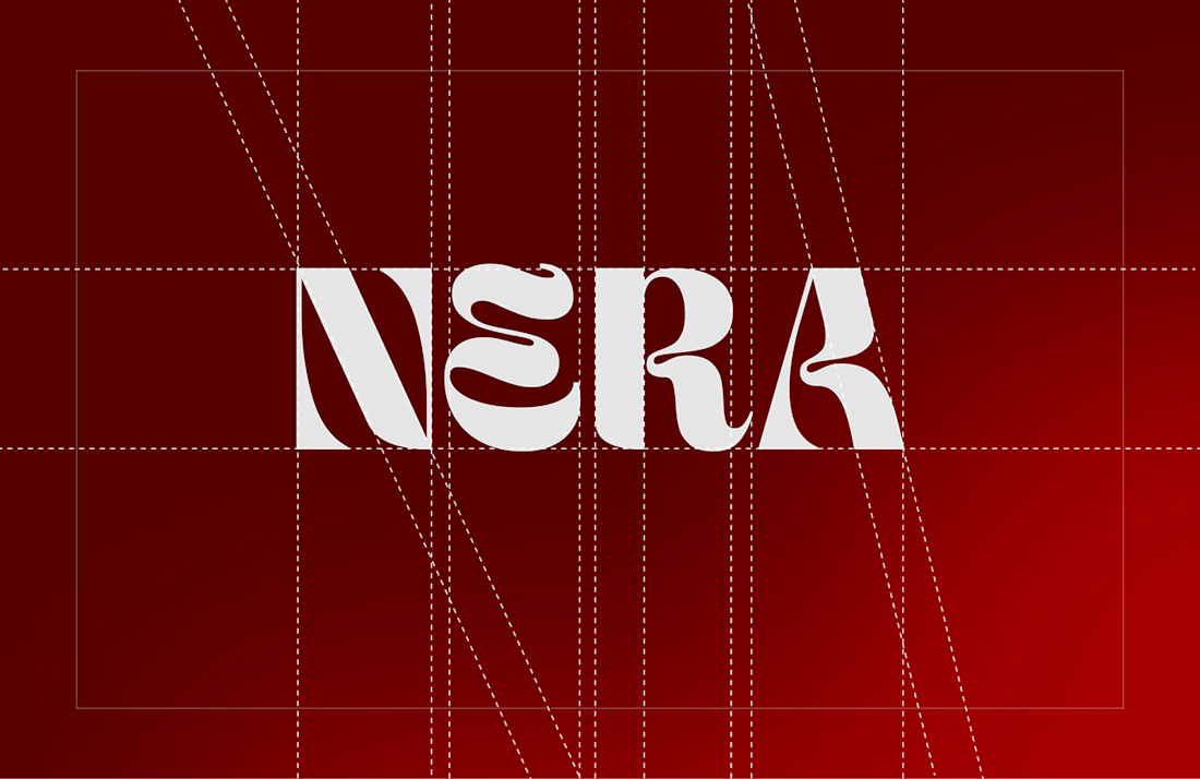
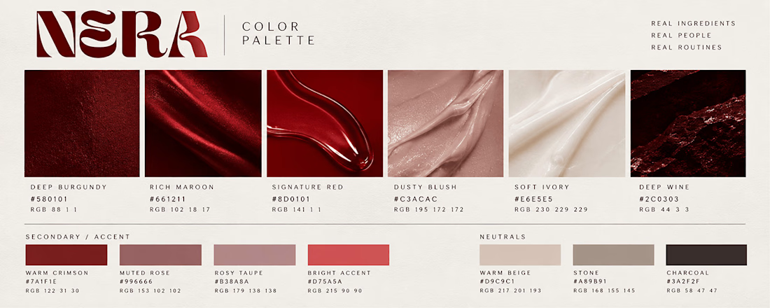
NERA got a custom wordmark, a deep maroon palette instead of the usual beige, packaging, and web + retail touchpoints so it holds together everywhere.
Full case study on my profile. Which touchpoint would you change first?
Amazing work! Love your design style, very creative and clean 👌