The network for creativity
Join 1.25M professional creatives like you
Connect with clients, get discovered, and run your business 100% commission-free
Creatives on Contra have earned over $150M and we are just getting started
Back to feedPost


Pelia Organic - Cosmetics Branding
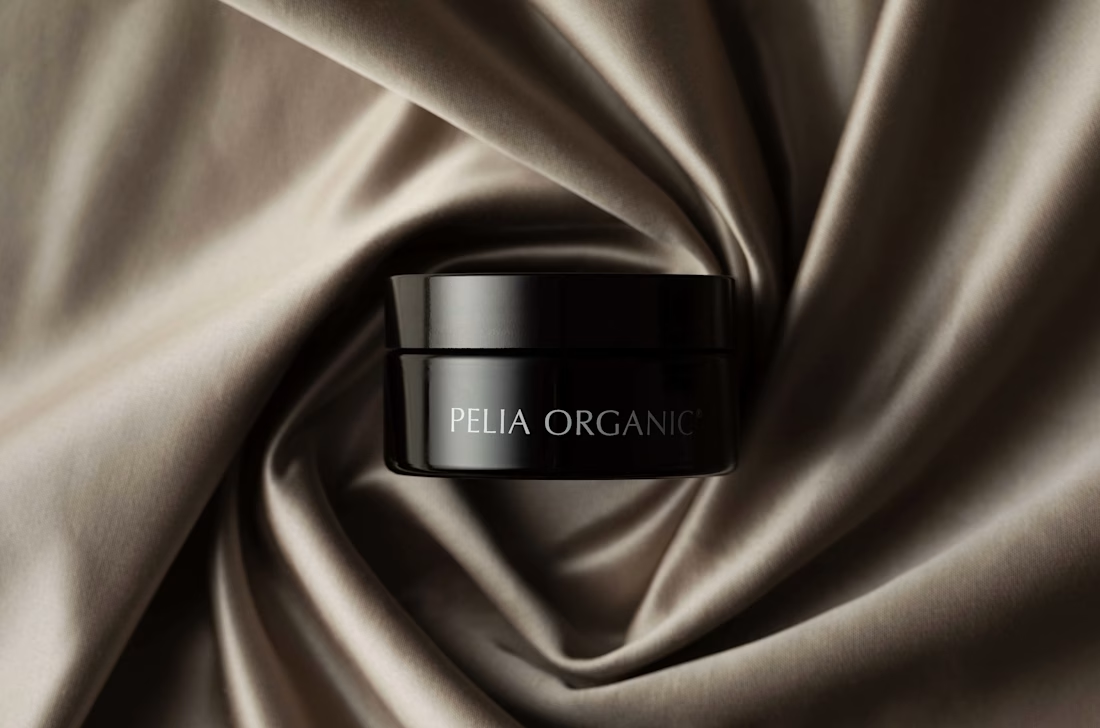
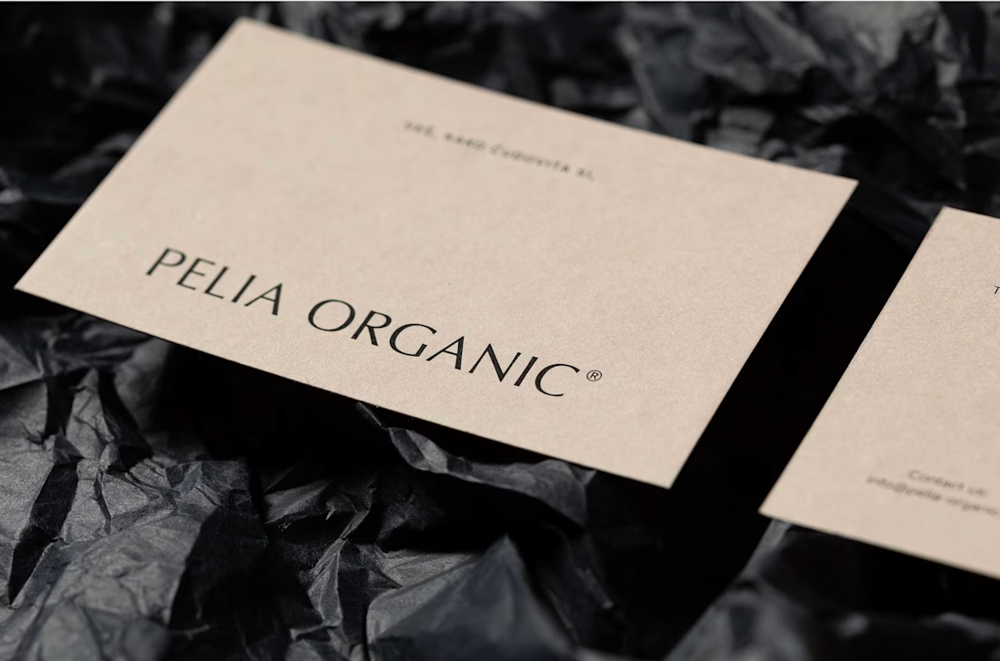
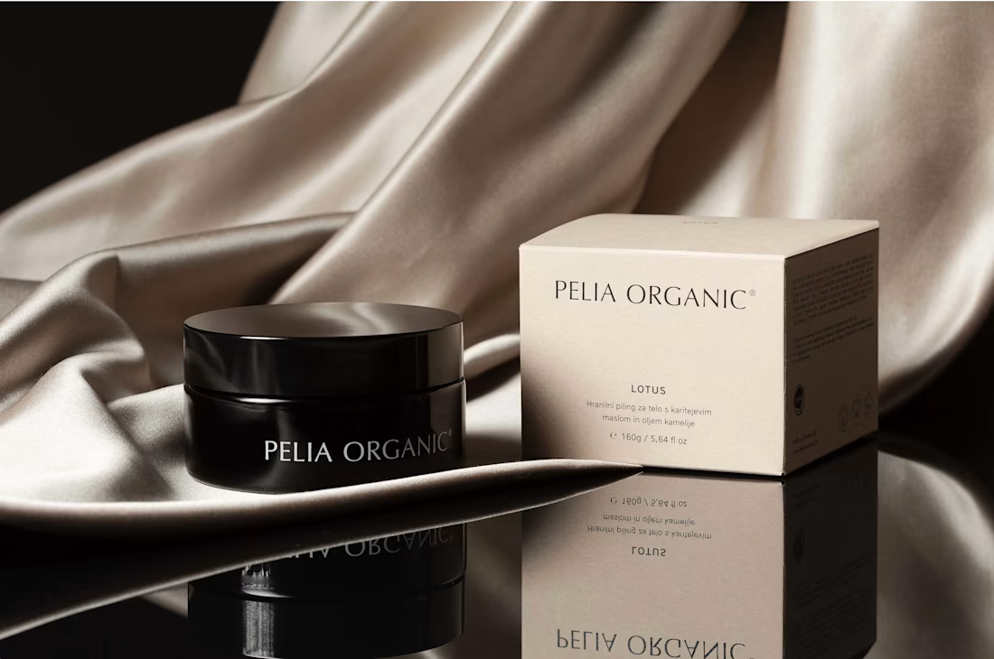
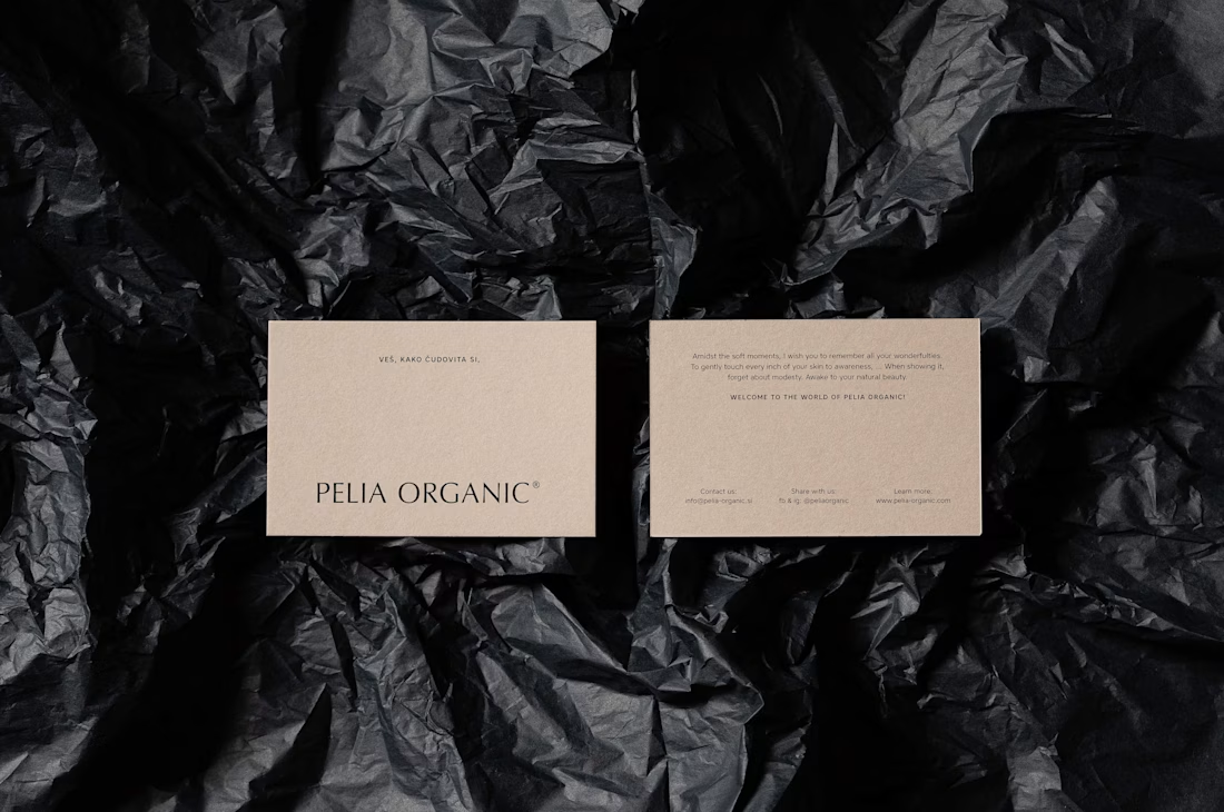
We selected a sans-serif typeface, which looks as elegant as serif typefaces with its curves, but less decorative or archaic. The selected typeface has distinctive stroke ends in letters l and i, whose concave shape resembles a skin pore, and the dot over i looks like an exfoliating bead. We counterbalanced the light hues of the brand and the natural look of the packaging paper with dark glass containers (black–violet glass), which communicate the superior quality of the product, as well as protect the ingredients from the UV light.
#PeliaOrganic #CosmeticsBranding #BeautyBranding #OrganicBeauty #SkincareBranding #CosmeticPackaging #PackagingDesign #BrandIdentity #LogoDesign #BeautyBrand #OrganicSkincare #VisualIdentity #GraphicDesign #PremiumBranding #BrandDesign #SkincareDesign #CosmeticsDesign #LuxuryBranding #CreativeBranding #ProductBranding #PackagingDesign #BeautyPackaging #ModernBranding #BrandIdentityDesign



Details like the pore-shaped stroke ends tend to live at a size a shopper never actually sees on a 50ml jar - they reward whoever reads the case study more than the person in the aisle. Did you draw a simplified cut of the wordmark for the small formats, or is one drawing carrying both?
Yes, I’d recommend a simplified cut of the wordmark for smaller formats. The primary version can retain the distinctive stroke details while the small-size version would prioritize clarity and legibility at actual shelf scale.

Beautifully considered material pairing. The contrast between the organic matte paper and dark violet glass feels both premium and purposeful, balancing sustainability with strong product protection.
The network for creativity
Join 1.25M professional creatives like you
Connect with clients, get discovered, and run your business 100% commission-free
Creatives on Contra have earned over $150M and we are just getting started

Challenges
View all


Related posts

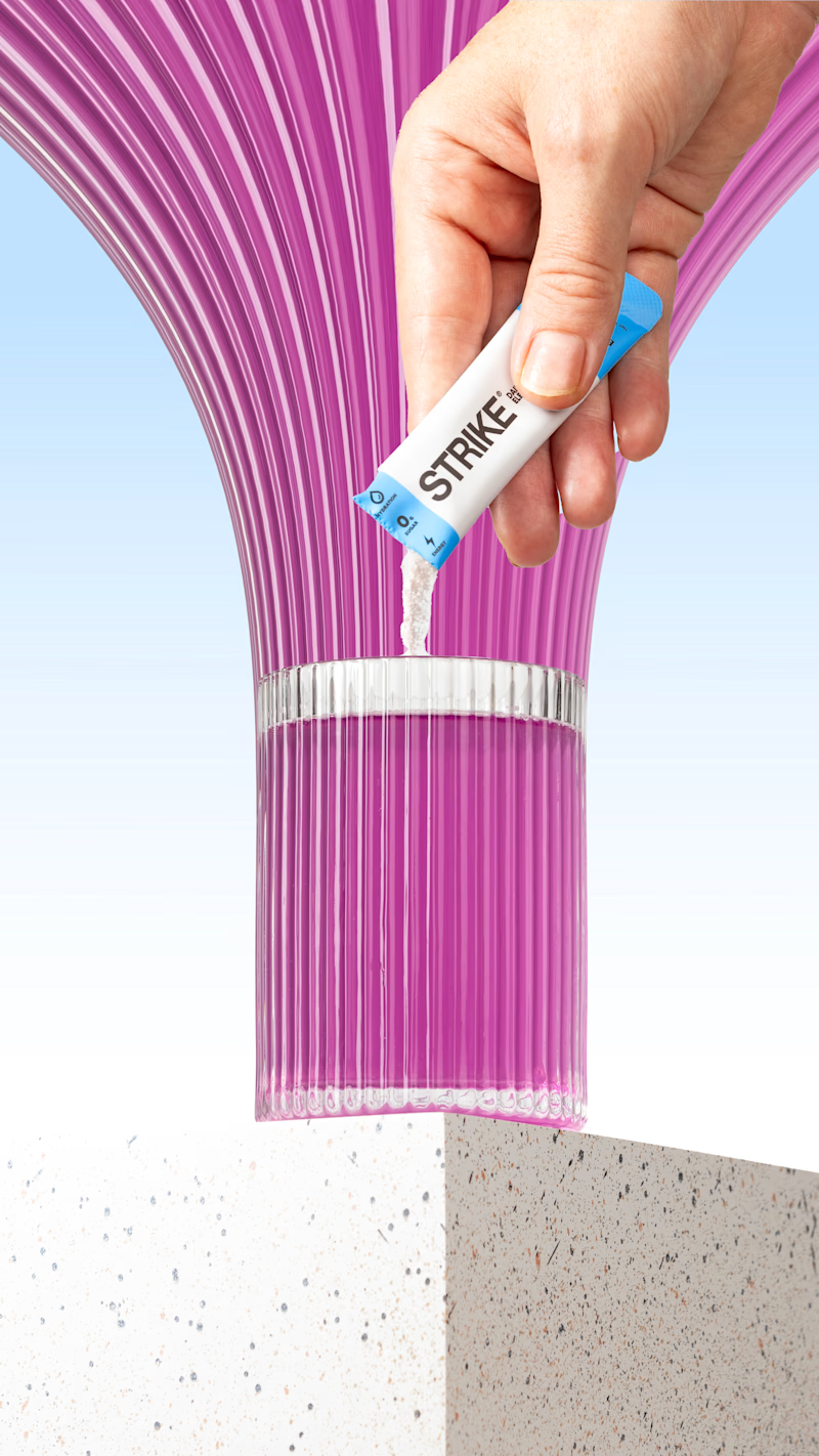
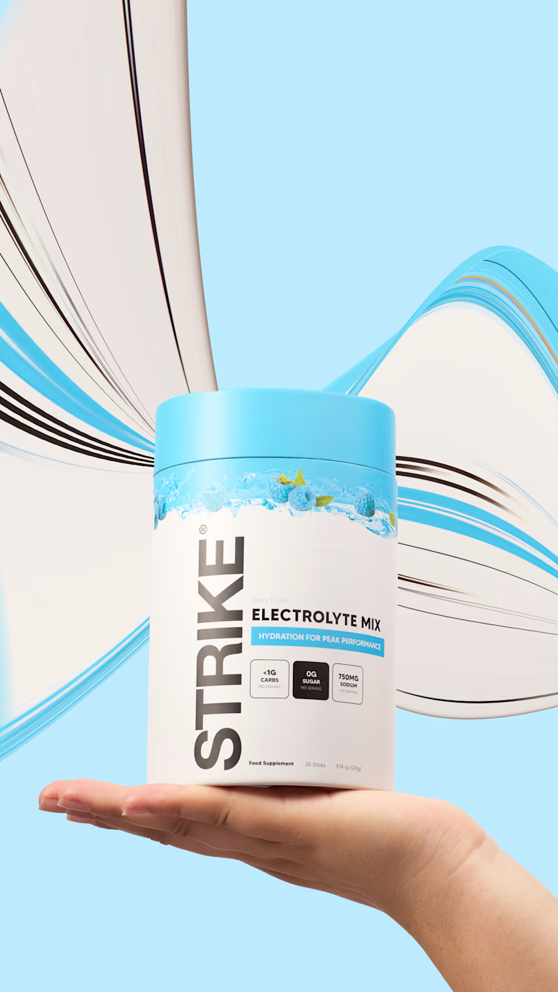
I tried the pixel-stretching trend on some packaging work recently, and I still can’t decide which version works better.
5 voted
29%
12 voted
71%
17 votes
Closed


the pink sachet looks so good. i pick sachet

The Luminary brand needed a refresh – brand equity was lacking, and while the company hurdled staffing changes, much of the original branding had been nearly wiped away.
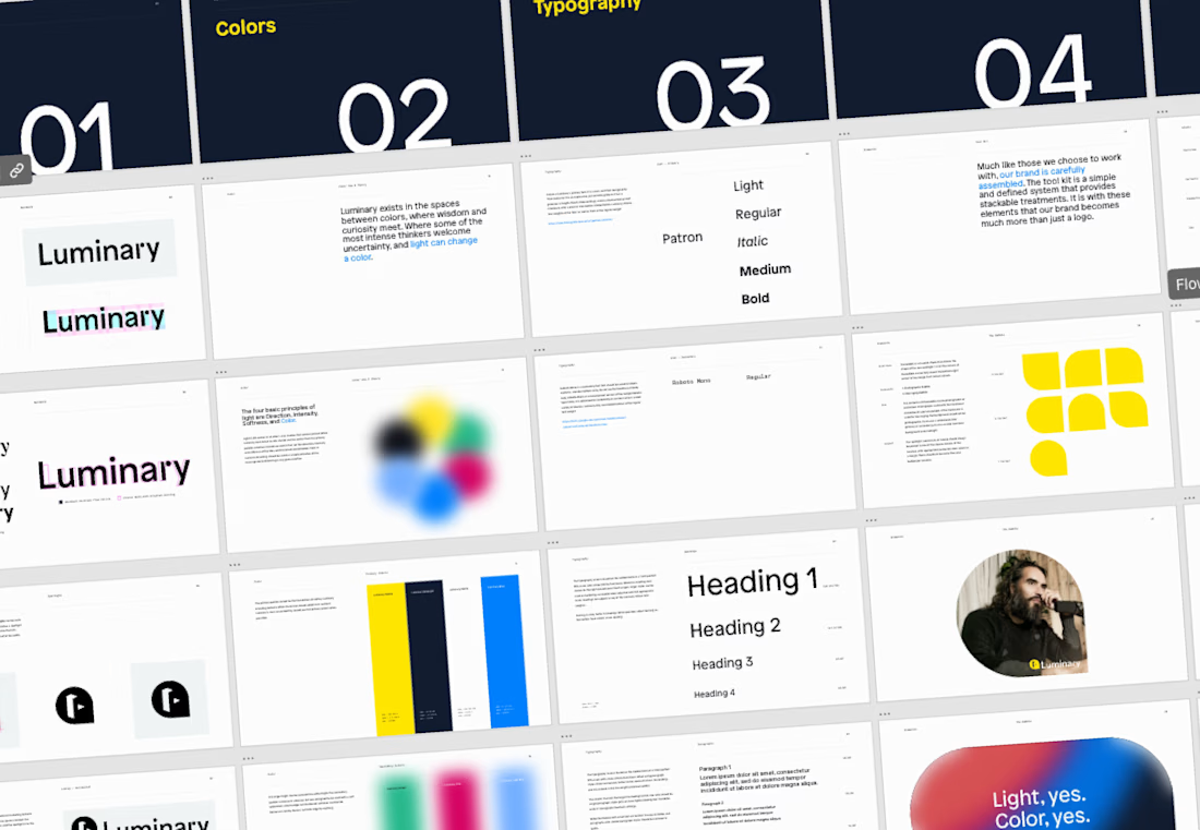
Soon after joining, it was clear that the design team would need some guidelines to lean up against to uphold quality and consistency in the brand.




Amazing work!


Great work.