The network for creativity
Join 1.25M professional creatives like you
Connect with clients, get discovered, and run your business 100% commission-free
Creatives on Contra have earned over $150M and we are just getting started
Back to feedPost

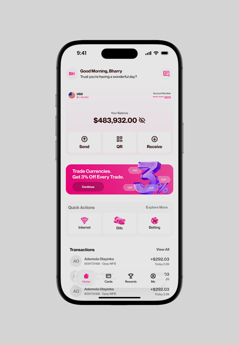
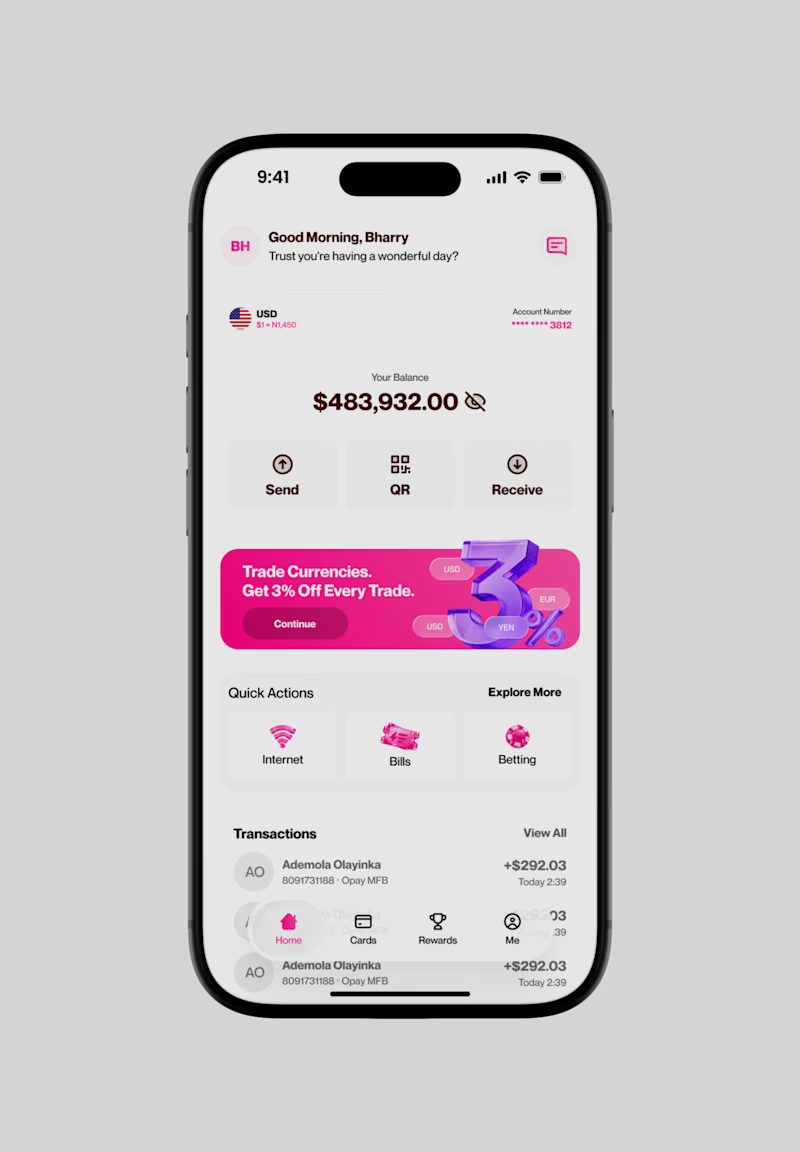
🚀 Just launched OrbitPay – Modern eWallet & Fintech Mobile UI Kit!
A premium Figma UI Kit featuring 90+ premium mobile screens, crafted to help designers, startups, and product teams build modern digital wallet and payment experiences faster with clean, scalable, and production-ready screens.
If you check it out, I'd love to hear your feedback. Thanks for your support! ✨
#UIUX #UIDesign #Figma #FigmaUI #MobileUI #Fintech #DigitalWallet #PaymentApp #FintechDesign #DesignSystem #ProductDesign #Startup #IndieMaker #UI8 #Contra #KoFi #OrbitPay


The network for creativity
Join 1.25M professional creatives like you
Connect with clients, get discovered, and run your business 100% commission-free
Creatives on Contra have earned over $150M and we are just getting started



Related posts

've reviewed 50+ startup websites, and I noticed a pattern.
Their hero sections are often simple. They tell you who the product is for and what it does.
While working on this redesign concept for
@Alloovium, I wanted to explore a different direction.
Their original website already explained the product and its audience.
But what if the hero also used visuals that reflected the world their customers work in?
People often scan websites before deciding what to pay attention to.
Relevant visuals can catch their attention and create a connection with the audience before they start reading.
So I explored a few visual directions inspired by the construction industry.
Building a startup? I'd love to help you explore a new direction for your website.
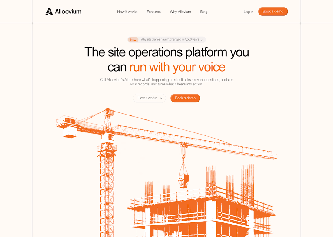
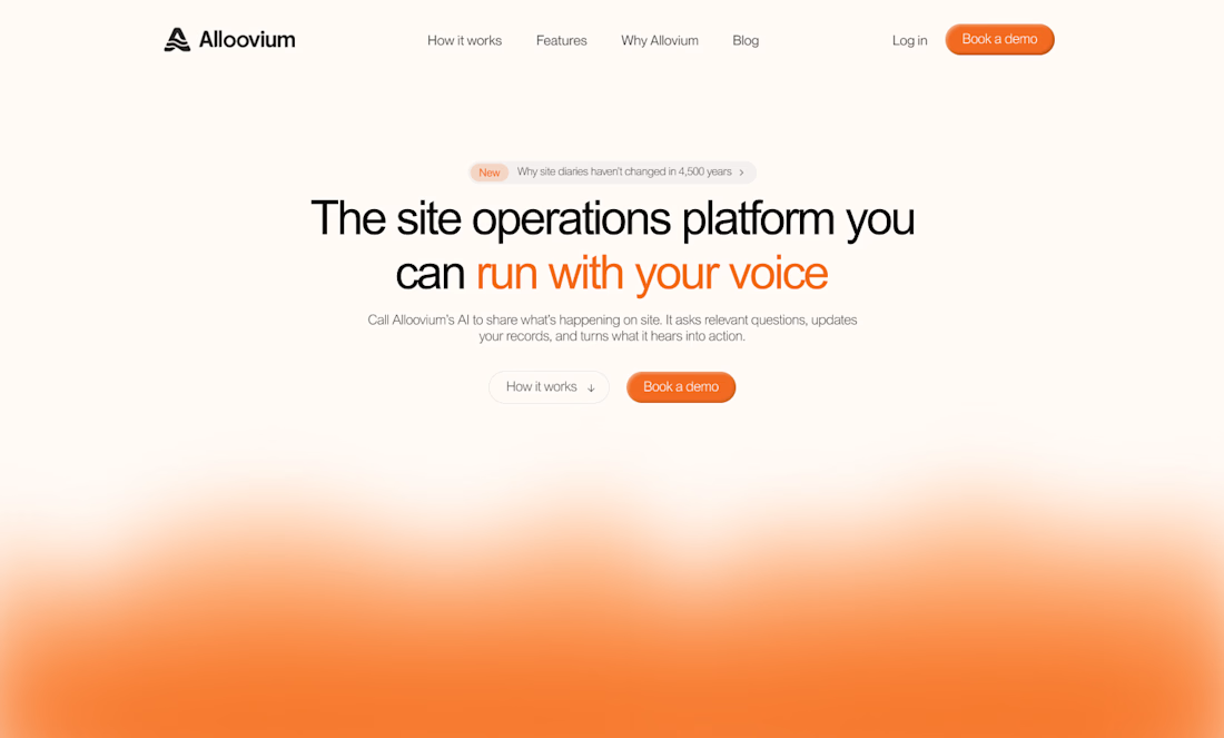
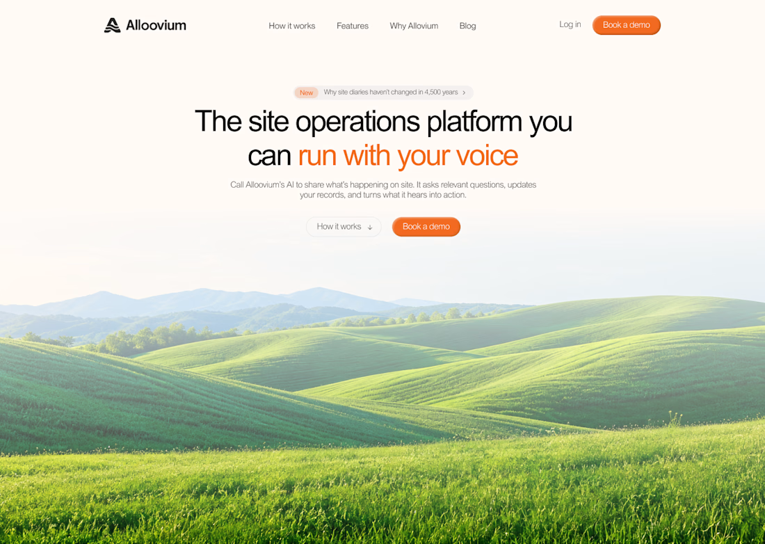

The construction visuals work well.

we're going live with our first @Studio /03 website in two days!!!
stay tuned🤩
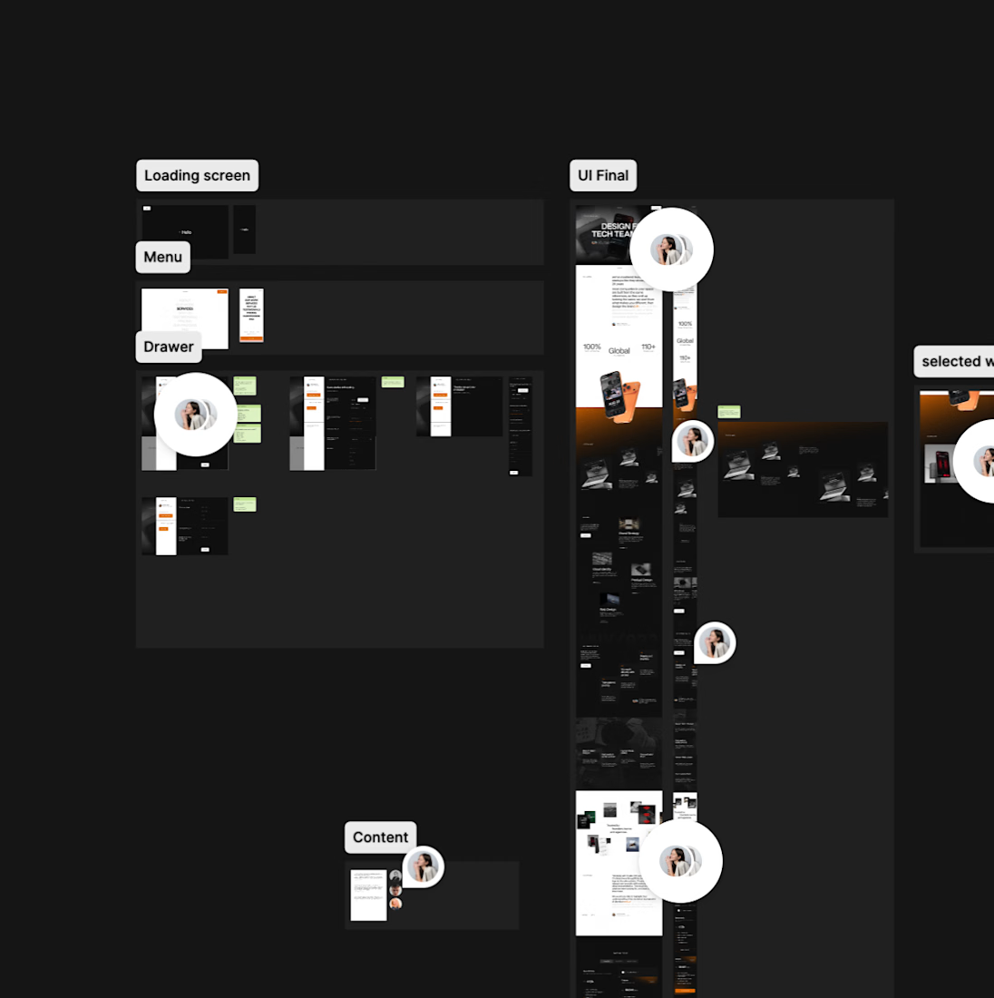
All the best for the launch!

Been working on this fintech concept and I’m curious about one thing: which direction feels better?
A or B? 👀
Same product, slightly different visual approach. One has to go, and I want you to be the judge.
What's your pick?
6 voted
75%
2 voted
25%
8 votes
Closed

To be honest both of them are the same to me but they are great 🎉