The network for creativity
Join 1.25M professional creatives like you
Connect with clients, get discovered, and run your business 100% commission-free
Creatives on Contra have earned over $150M and we are just getting started
Back to feedPost

🚀 Why Your WordPress Website Looks Good but Doesn't Convert
Your website looks amazing.
Beautiful colors. Modern layouts. Smooth animations.
But there's one problem…
Visitors are coming, but they're not becoming customers.
A beautiful website doesn't automatically mean a high-converting website.
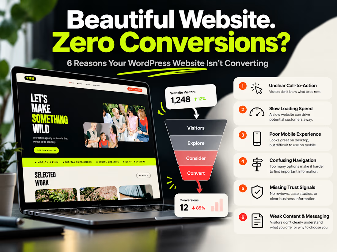
Here are 6 common reasons why:
🔹 1. Unclear Call-to-Action (CTA)
Visitors don't know what to do next. Every important page needs a clear next step.
🔹 2. Slow Loading Speed
A slow website creates friction and can drive potential customers away before they explore your services.
🔹 3. Poor Mobile Experience
A design that looks great on desktop might be difficult to navigate on mobile.
🔹 4. Confusing Navigation
Too many options, complicated menus, and unclear page structures make it harder for visitors to find what they need.
🔹 5. Missing Trust Signals
Without genuine reviews, portfolio examples, case studies, or clear business information, visitors may hesitate to take action.
🔹 6. Weak Content & Messaging
Your visitors need to understand what you offer, who it's for, and why they should choose you.
💡 The Solution?
Focus on more than just design.
A high-performing WordPress website should combine:
✅ Modern UI/UX Design
✅ Fast Loading Performance
✅ Clear Conversion Paths
✅ Mobile-First Responsiveness
✅ Trust-Building Content
✅ Strategic Calls-to-Action
As a WordPress and Elementor Pro developer, I focus on building websites that are not only visually appealing but also easy to use and aligned with business goals.
Your website shouldn't just impress visitors. It should help turn interest into action.
💬 What's the biggest challenge with your website right now — traffic, speed, or conversions?

The network for creativity
Join 1.25M professional creatives like you
Connect with clients, get discovered, and run your business 100% commission-free
Creatives on Contra have earned over $150M and we are just getting started


Related posts

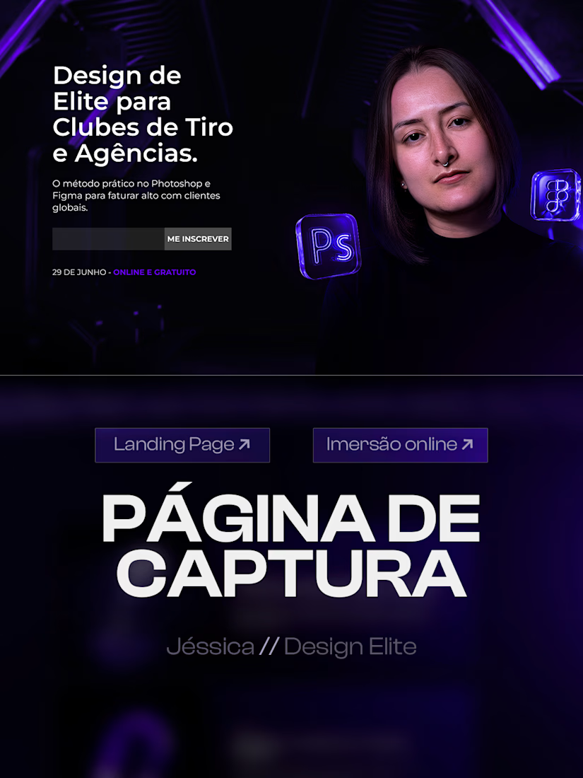
Just wrapped up a high converting landing page design for an online design masterclass.
The goal was to build a clear visual journey that turns visitors into students, guiding them from the hero section and class schedule down to the instructor presentation.
Key visual choices:
Deep purple and black color palette for a futuristic look
Custom 3D glass assets to elevate perceived value
Strong typography and structured cards for high readability
Swipe through to see the full layout structure. Available for new web and landing page design projects.

Nicely done!

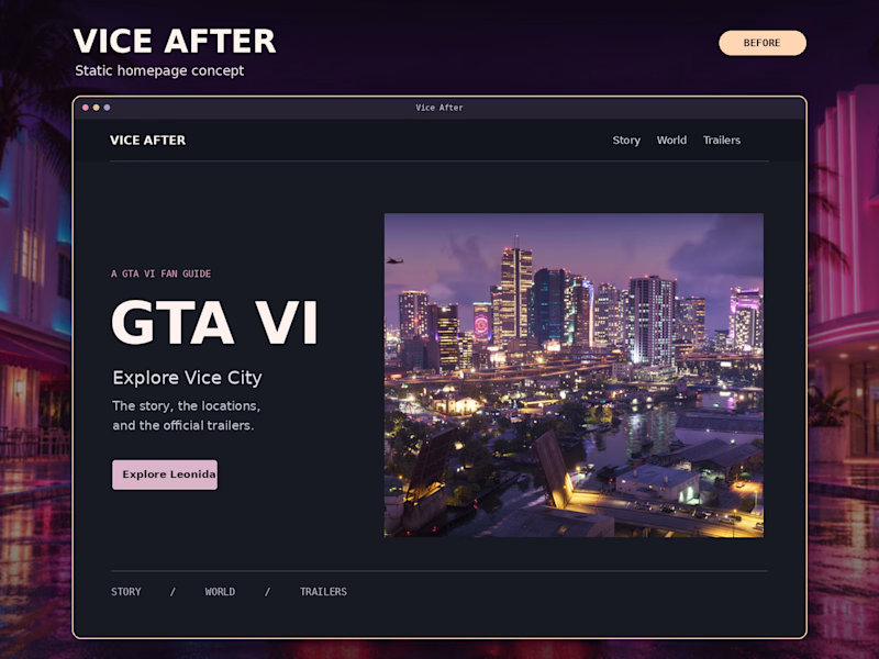
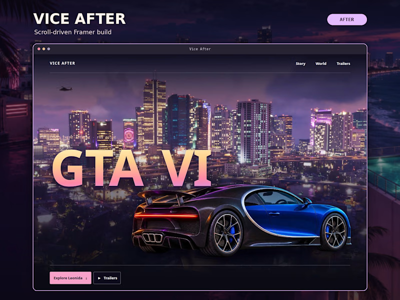
Same Vice City skyline. Which homepage makes you want to scroll?
Before: A clean, static concept with a split layout and a clear way into the site.
After: The Framer build. Scroll and the hypercar pulls into frame, the door opens, and the GTA VI title rises into view.
I wanted the first scroll to pull you into Vice City. Did the motion make you more curious about what’s below?
Vote Before or After. What caught your eye first?
watch the site i"ll build → https://gtavice6.framer.website/
#WebDesign #Framer #InteractionDesign

1 voted
20%
4 voted
80%
5 votes
Closed

After — the hypercar pulling into frame hooked me.

built 3 different cursors for this site before this one.
all of them worked. none of them felt like the brand.
this one did the second i saw it move. liquid, stretches when you move fast, morphs on hover. stopped there.
thinking about releasing it as a Framer component. would you use it?
Yes — that fast-move stretch would suit playful brands.