The network for creativity
Join 1.25M professional creatives like you
Connect with clients, get discovered, and run your business 100% commission-free
Creatives on Contra have earned over $150M and we are just getting started
Back to feedPost

We brought Going Greek to life on screen clean visuals, and a vibe that actually grabs attention.
From shoot to final edit, it was all done by 514 Digital.
Brand StrategySocial Media MarketingVideo EditingAdobe After EffectsAdobe Premiere ProDaVinci Resolve


The network for creativity
Join 1.25M professional creatives like you
Connect with clients, get discovered, and run your business 100% commission-free
Creatives on Contra have earned over $150M and we are just getting started




Related posts

Visual Experiment
A compilation of recent visual tests, focusing on atmospheric lighting, fast-paced rhythm, and high-contrast color treatment. Designed to explore the boundaries between cinematic realism and abstract motion.
Everything handled from initial style framing to final color grading and typography integration.
Tools: After Effects, DaVinci Resolve
Created by Johan Vane


The lighting and color treatment create a strong atmosphere.

Which WANDER logo would you choose?
A travel brand doesn’t just need a logo —
it needs a visual identity that makes you want to explore.
So I explored 2 different directions for the same brand
Bold & Minimal
Vote in the poll.
And Tell me what made you choose it in the comments.
#LogoDesign #BrandIdentity #GraphicDesign #LogoInspiration #VisualIdentity

11 voted
92%
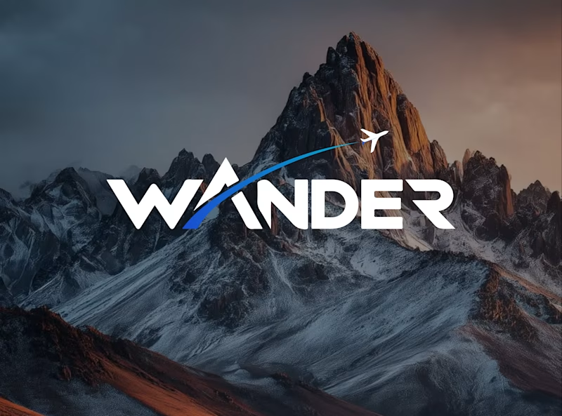
1 voted
8%
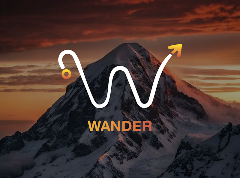
12 votes
Closed

Minimal for me. The W drawn as a winding mountain path is doing double duty, letterform and route in one, exactly what a travel brand wants. Bold is clean but the swoosh W tells a little story before you read a single word.


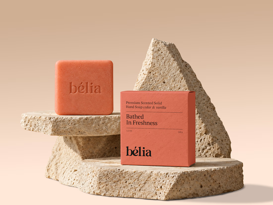
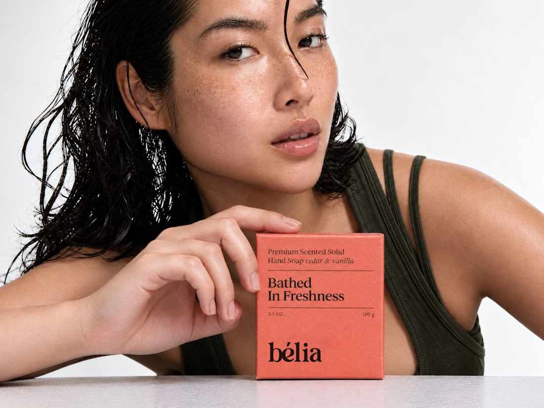
Simple, clear, and brand-ready.