The network for creativity
Join 1.25M professional creatives like you
Connect with clients, get discovered, and run your business 100% commission-free
Creatives on Contra have earned over $150M and we are just getting started
Back to feedPost

"Bonaca" is the Croatian word for a perfectly calm sea.
It's also the name of the product I'm designing: a revenue-decision copilot for charter fleets.
The name is a design decision — and nowhere more than on the crisis screen.
Every March, the same moment: summer still open, bookings thin, and every instinct saying — drop the price. Now.
This is the moment most tools reach for red badges and alerts. I did the opposite — the crisis screen became the calmest screen in the product.
The user arriving here is already scared. Adding urgency to a scared person doesn't produce action; it produces a worse decision. Panic doesn't need amplifying. It needs a room with the noise turned down.
So Bonaca's Panic view does four things:
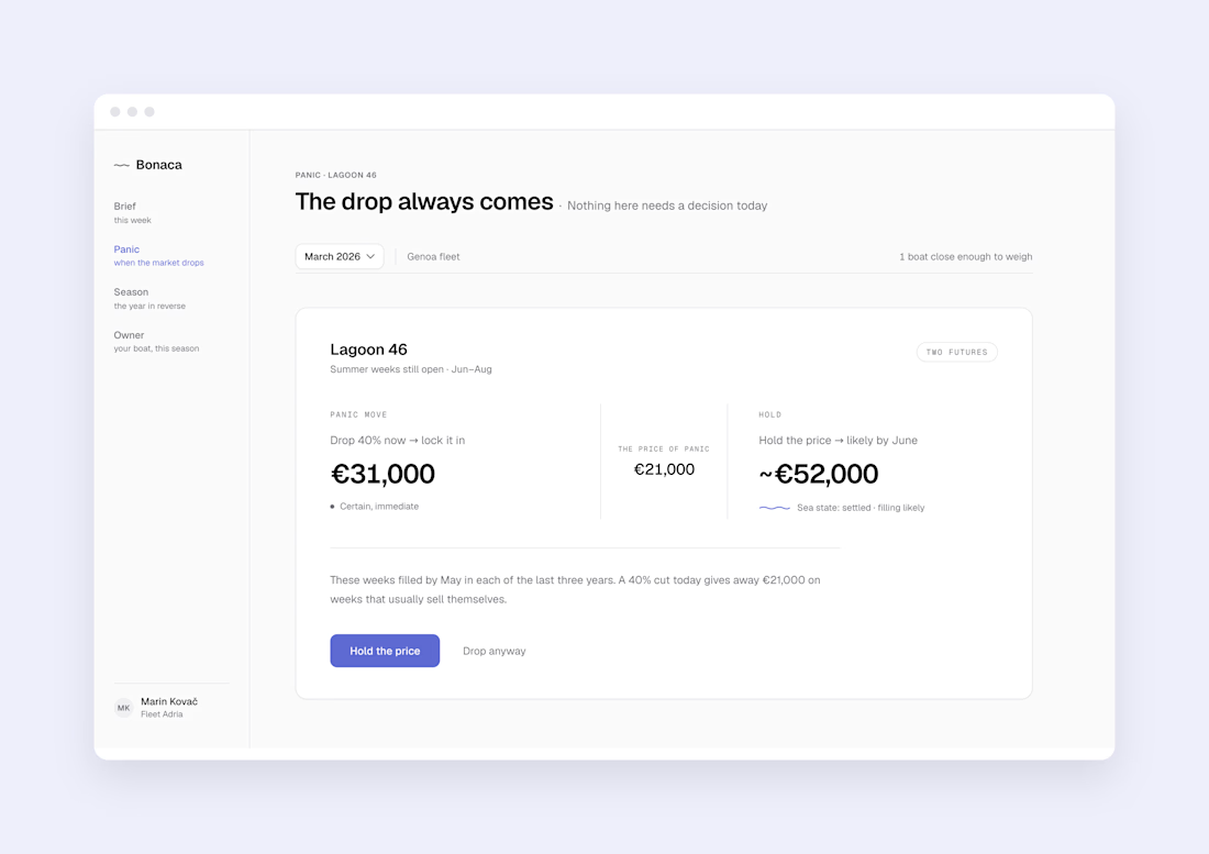
→ One boat at a time. Focus narrows to a single decision — not a wall of alarms.
→ Two futures, both priced. Drop now → €31,000, certain. Hold → ~€52,000, likely by June.
→ The gap gets a name: the price of panic. €21,000. Visible, never judged.
→ "Drop anyway" sits right there, quiet and unjudged. Sometimes locking in cash today is the right call — and a tool that overrides you once doesn't get opened twice.
No red anywhere. More whitespace than any other screen in the product. The design does what a good skipper does in a storm: it lowers its voice.
Because in a crisis, calm isn't decoration — calm is information. It tells the user: you have time to think.
The product carries the name. Even in March, the interface stays bonaca.


The network for creativity
Join 1.25M professional creatives like you
Connect with clients, get discovered, and run your business 100% commission-free
Creatives on Contra have earned over $150M and we are just getting started
Trending
retrofuturism
Share your favorite designs from the past exploring the distant future. Or your own take on the aesthetic 🚀
halftone
Dots. Texture. Grain. Let's see your designs using the halftone technique.

Midjourney
Creatives are showing off what they're making with Midjourney.
colorgrade
Video editors sound off: How do you enhance the mood of your video in color grading?





Related posts

Tool Finder Branding 🔎
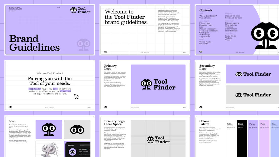
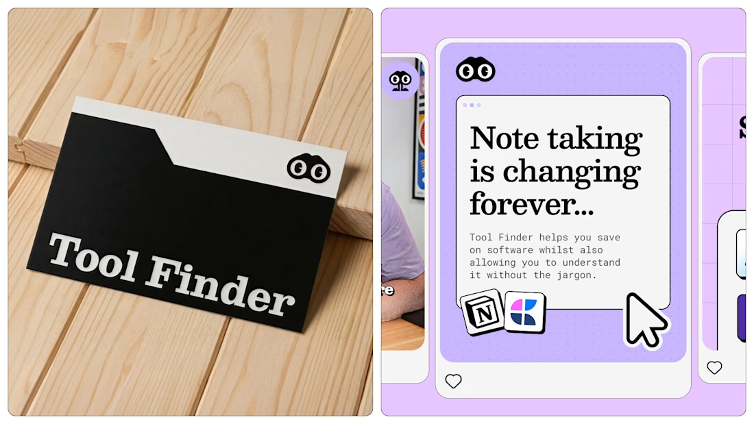
Tool Finder helps users make informed buying decisions through honest software reviews, comparisons and educational content. I reimagined the brand across YouTube and the web, developing a cohesive identity that strengthens recognition, reflects its authority and creates a consistent presence across every digital touchpoint.
When Francesco first reached out, Tool Finder had never established a true brand identity. The goal was to create a scalable brand system that could evolve alongside the business as it continued to grow its YouTube channel, website and future ventures.
The identity needed to feel like a modern media brand rather than another software company. It had to balance playfulness and approachability with professionalism, while remaining distinctive in an increasingly competitive market.
The result is a flexible identity system centred around the new 'Finder' mascot. Designed to adapt across content, digital products and marketing, the brand gives Tool Finder the foundations to grow with confidence and establish itself as the go-to destination for discovering, comparing and exploring better software.



Great Work

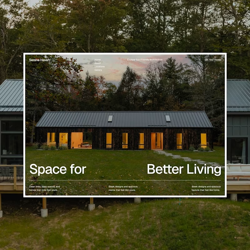
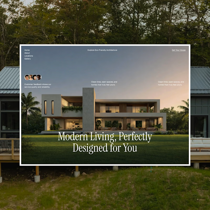
I have been playing around with two different hero section directions for an architecture/real estate landing page, and I honestly can't decide which one nails the vibe better. Both use the same layout structure, but the typography and photography give them totally different personalities.
Design A: Bold, modern sans-serif headline paired with a warm, rustic cabin. Feels grounded, cozy, and confident.
Design B: Elegant serif headline over a sleek concrete-and-glass villa. Feels luxurious, editorial, and refined.
Which one speaks to you? and tell me why?
Your feedback genuinely shapes what I build next, so thank you in advance for taking a second to weigh in!

42 voted
49%
43 voted
51%
85 votes
Closed

both are looking good, hard to choose , still go with A


one-shot this landing page with claude or codex
prompt is free for template supporters ↓
https://startfrom.co/templates/cohestra


Amazing, I've tried this kinda animations on my site too, you can check https://splitcreatives.com/
splitcreatives.com
Split Creatives | Partner for Startups
Design and development partners for startup founders. Our product stacks help founders raise capital, build teams, and launch products fast. We’ve previously worked with Safebook, FanFunded…