The network for creativity
Join 1.25M professional creatives like you
Connect with clients, get discovered, and run your business 100% commission-free
Creatives on Contra have earned over $150M and we are just getting started
Back to feedPost

✨ Branding is more than just a logo, it's the visual voice of a business.
For this project, I designed a bold and memorable brand identity centered around a vibrant yellow color palette 💛. The goal was to create a logo that reflects confidence, creativity, and professionalism while remaining clean, modern, and timeless.
From concept development ✏️ to the final polished design 🎨, every detail was carefully crafted to ensure strong brand recognition and lasting impact.
A great logo doesn't just look good—it tells a story, builds trust, and leaves a lasting impression. 🚀
#LogoDesign #Branding #BrandIdentity #GraphicDesign #LogoDesigner #AdobeIllustrator #CreativeDesign #VisualIdentity 💛✨


The network for creativity
Join 1.25M professional creatives like you
Connect with clients, get discovered, and run your business 100% commission-free
Creatives on Contra have earned over $150M and we are just getting started











Related posts


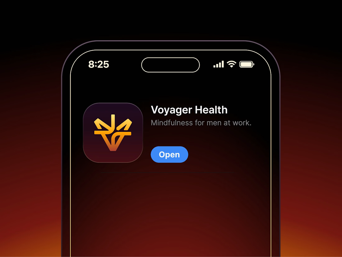

Aryna, that golden symbol pops so nicely against the plum background ✨

It’s been a minute since my last post here on Contra.
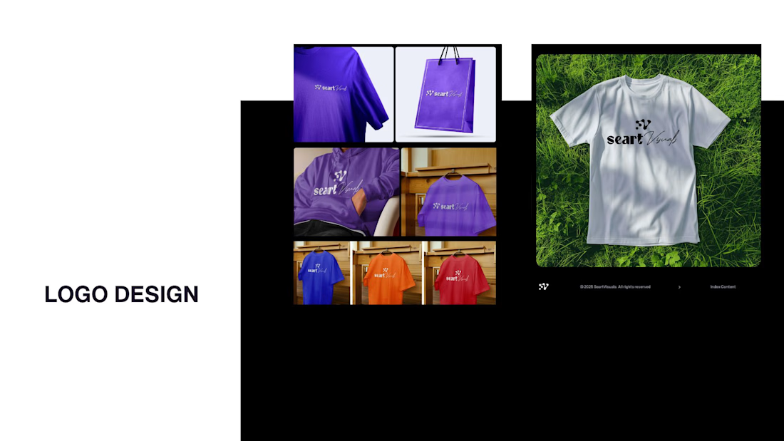
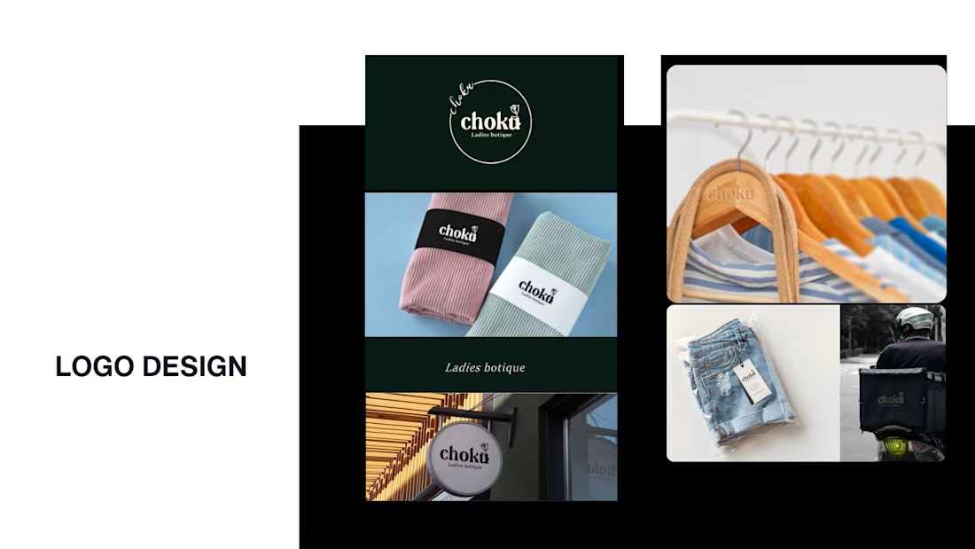
While my main focus usually lives in photo editing and digital design, I was digging through the archive recently and thought it’d be fun to share a couple of branding projects from the past:
Slide 1: Seart Visuals apparel & merchandise branding (1 year ago)
Slide 2: Choku Ladies Boutique identity and mockups (2 years ago)
Brand identity isn't my everyday lane, but tackling projects like these taught me a lot about visual consistency across different mediums. I’d love to hear your thoughts or see any feedback from fellow designers. Great to connect with the community again.


That's really great typography logo design❤️❤️

Finally a Contra Top Independent!
Been part of this community for a few years now, sharing my work, joining challenges, meeting some great people, and even picking up a few wins along the way.
I've genuinely enjoyed being part of Contra and seeing how much the platform has grown.
This one means a lot. Big thanks to the Contra team for the recognition!
More to come!
