The network for creativity
Join 1.25M professional creatives like you
Connect with clients, get discovered, and run your business 100% commission-free
Creatives on Contra have earned over $150M and we are just getting started
Back to feedPost

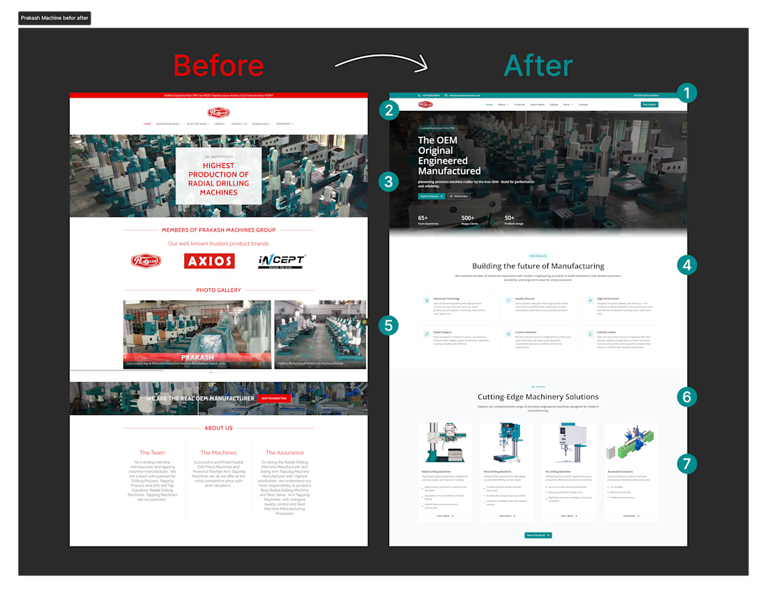
Here’s how I improved usability and clarity for an industrial website.
Before: cluttered layout, unclear hierarchy, difficult navigation
After: clean structure, improved readability, clear CTAs
The goal was to make complex industrial information easier to scan and understand.
The network for creativity
Join 1.25M professional creatives like you
Connect with clients, get discovered, and run your business 100% commission-free
Creatives on Contra have earned over $150M and we are just getting started





Related posts

The new Outredge site is live!
Building the studio has given me a clearer sense of what the brand should look and feel like.
This redesign is my way of catching the site up with that. Less chasing fancy effects, more trusting my own taste.
I also rebuilt it in Astro. Because I love a site that loads like a 🚀


It's cool... what font did you use on this?

A modern restaurant website designed to turn visitors into customers while making it easier to explore the menu, discover the dining experience, and take action.
The website is structured around the way restaurant customers actually browse and decide clear navigation, appetizing food presentation, easy-to-scan menus, prominent calls to action, and a smooth mobile experience. It can support restaurants, cafés, bars, food brands, and dining establishments that need a professional online presence.



🛒 Flipkart App — UI/UX Mistakes & Solutions
I explored the Flipkart app from a UI/UX perspective and identified several areas where the user experience could be improved.
From information overload and banner clutter to visual hierarchy, notifications, filters, product cards and checkout flow — small design decisions can have a big impact on how easily users browse and shop.
For each mistake, I explored a practical UX solution focused on clarity, simplicity and a smoother user journey.
4 explored — 3 more coming next. 🚀
Good UI gets attention. Great UX makes things easier.
#UIUX #UIDesign #UXDesign #Flipkart #UXCaseStudy #ProductDesign #UXDesigner #UIUXDesign #DesignProcess #ContraDesigner
