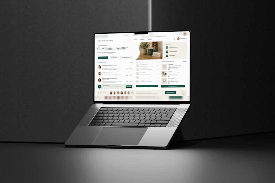
The network for creativity
Join 1.25M professional creatives like you
Connect with clients, get discovered, and run your business 100% commission-free
Creatives on Contra have earned over $150M and we are just getting started
Back to feedPost
🍽️ A magazine made to make you hungry!
For this project, I created a restaurant magazine that brings the food, story, and overall dining experience together in one visual story.
I focused on appetizing imagery, clean layouts, and a warm, inviting feel — making every page feel like an experience of its own. ✨
Designed in Canva with love for food, design, and storytelling. 🤍
#RestaurantDesign #MagazineDesign #CanvaDesigner #EditorialDesign #FoodBrand #GraphicDesign #CreativePortfolio


aweesome work

Thankyou so much!
The network for creativity
Join 1.25M professional creatives like you
Connect with clients, get discovered, and run your business 100% commission-free
Creatives on Contra have earned over $150M and we are just getting started



Related posts

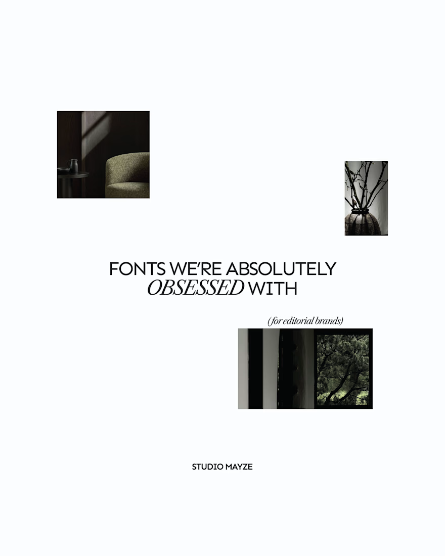
A few editorial typefaces we’re absolutely obsessed with right now.
These are some of the fonts we keep coming back to at Studio Mayze when we want a brand to feel considered, distinctive and a little more editorial without pushing the design too far.
Good type can do a lot of the heavy lifting. The right one can completely change how a brand feels before you’ve even added anything else.
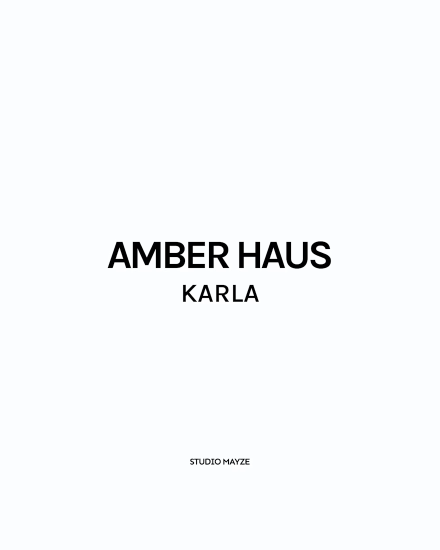
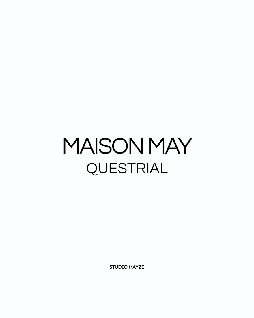
Each slide shows the typeface in use at the top, with the font name underneath, so you can see how it could look in context rather than just as a specimen.
These are three of our favourites at the moment. Want to see the full selection? We’ve shared all of our favourites over on Instagram.
Which one would you pick? 👀




Showing each typeface in context rather than as a bare specimen is such a good idea, you can feel the mood before you even read the name. Sunday Paper in Newsreader is my pick, that slanted serif has real character. Do you tend to reach for one of these for the body of a brand, or are they mostly headline voices for you?

MARLOW is a modern fashion and clothing brand identity built around individuality, everyday style, and self-expression.
The branding combines a custom rounded wordmark, bold M monogram, warm red tones, and minimalist typography to create a confident and recognizable fashion identity.
From logo design and brand guidelines to apparel graphics, clothing labels, hang tags, packaging, shopping bags, stationery, and advertising campaigns, MARLOW creates a cohesive visual experience across fashion and lifestyle applications.
Services: Brand Identity, Logo Design, Fashion Branding, Clothing Brand Design, Apparel Branding, Packaging Design, Visual Identity.

That rounded M monogram in warm red sounds like it carries the whole system. Fashion identities live or die on the small touchpoints, so going all the way down to hang tags and labels is exactly right. Which piece of the rollout was the trickiest to keep consistent, the packaging or the apparel graphics?