The network for creativity
Join 1.25M professional creatives like you
Connect with clients, get discovered, and run your business 100% commission-free
Creatives on Contra have earned over $150M and we are just getting started
Back to feedPost


The network for creativity
Join 1.25M professional creatives like you
Connect with clients, get discovered, and run your business 100% commission-free
Creatives on Contra have earned over $150M and we are just getting started



Related posts

Same lettering, two color directions. Which one would you pick?
I got nostalgic this week looking at this lettering design. About 8 years ago I was deep into it and drew every day. Little by little I lost that rhythm, and now I only do it once in a while for gifts and small things.
Back then I could spend a lot of time choosing colors and comparing options. A taste test like this would have saved me so much time. 😅 I keep wondering how much I would have improved if I had never stopped practicing.
Is there something you used to practice a lot and would love to get back to? I had my lettering, illustration AND tufting phase.
37 voted
61%
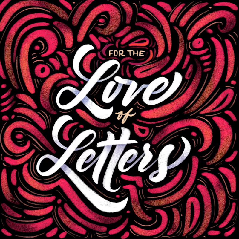
24 voted
39%
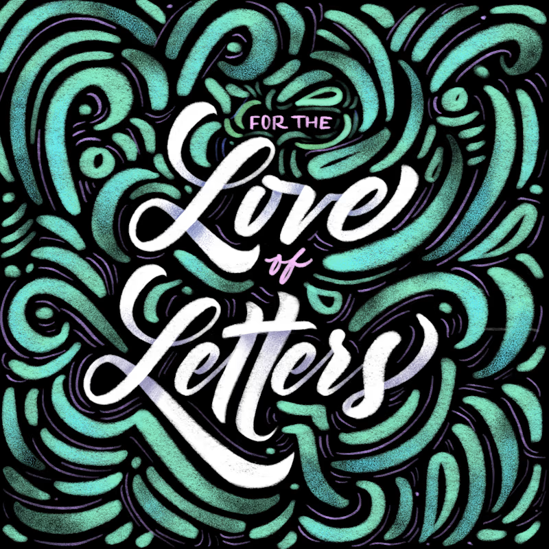
61 votes
Closed


8 years later and the lettering still holds up

Show Pony 🐎
Its been a long time since I animated any of my illustrations, so today I thought I'd jump back on the horse and see if I still got it.


09 XL — From a Portrait to a Visual Story.
This one started with a simple black-and-white portrait, but I wanted to give it a little more personality. I began experimenting with contrast, grain, and shadows to build a raw, almost cinematic atmosphere.
Then came the fun part — playing around with typography, adding the black strip across the eyes, and using minimal details like 09 and XL to give the composition a subtle editorial feel.
Once the poster came together, I placed it in a real-world bus stop mockup to see how it would live outside the screen.
A little experimentation, a few happy accidents, and lots of tiny adjustments later — this was the result.


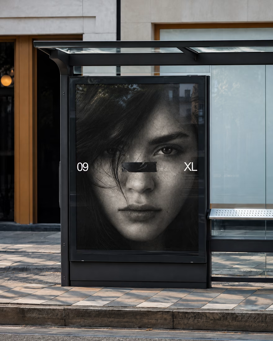
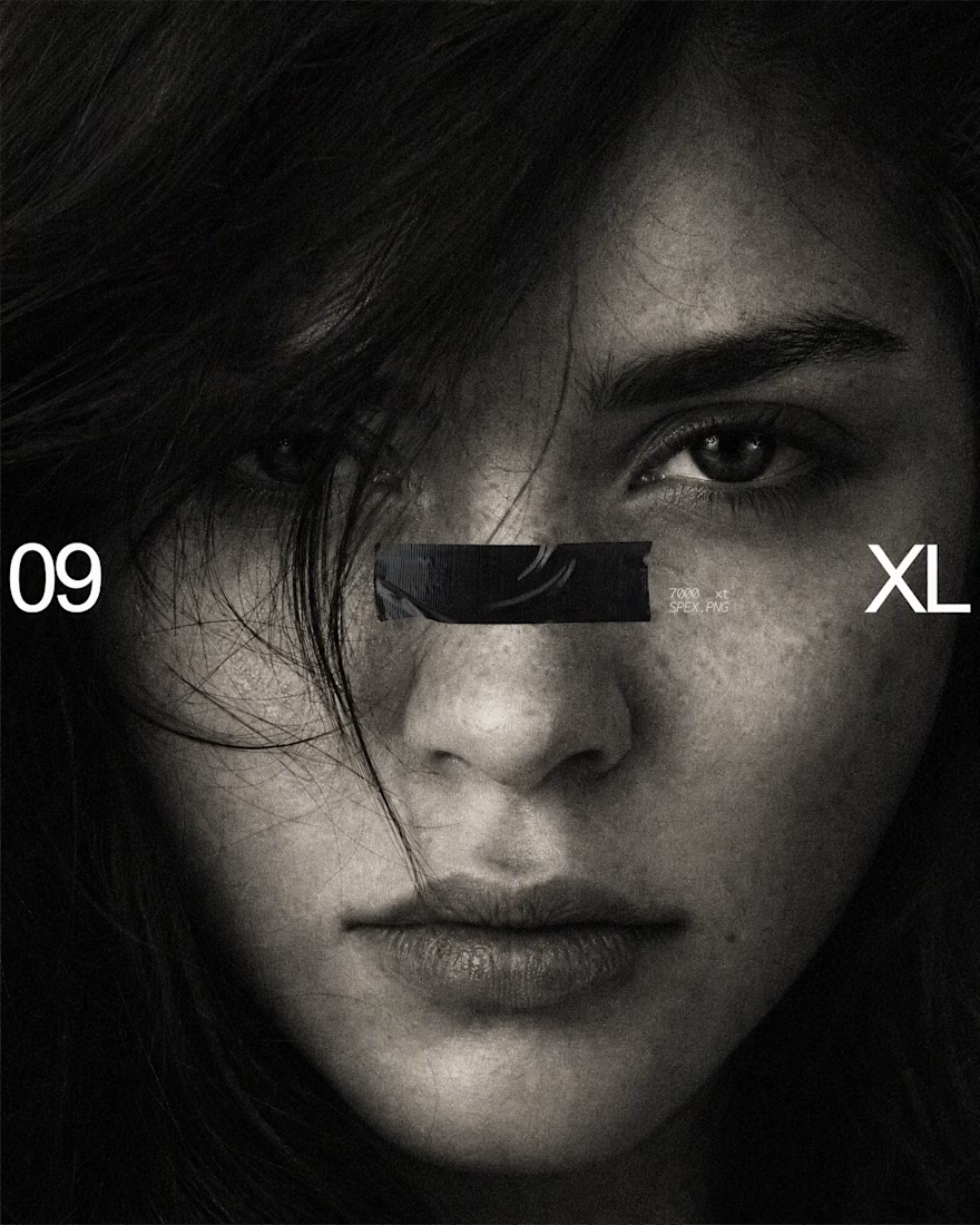

The black bar across the eyes with 09 and XL on the sides turns a simple portrait into a bold poster, and the bus stop mockup shows it works at street scale. Is the grain added in Photoshop or part of the original photo?