The network for creativity
Join 1.25M professional creatives like you
Connect with clients, get discovered, and run your business 100% commission-free
Creatives on Contra have earned over $150M and we are just getting started
Back to feedPost


The network for creativity
Join 1.25M professional creatives like you
Connect with clients, get discovered, and run your business 100% commission-free
Creatives on Contra have earned over $150M and we are just getting started



Related posts

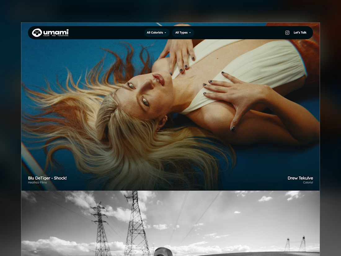
Umami Color & Finishing is an established color-grading studio in LA. Its work and reputation had outgrown its old site, and the studio was ready for one at the level of its work.
I designed and built it around the work itself: every project filterable by type and colorist, and every view with its own link, so the team can send a lead exactly what fits.
Case study
Live site: umamicolor.com


this is amazing work

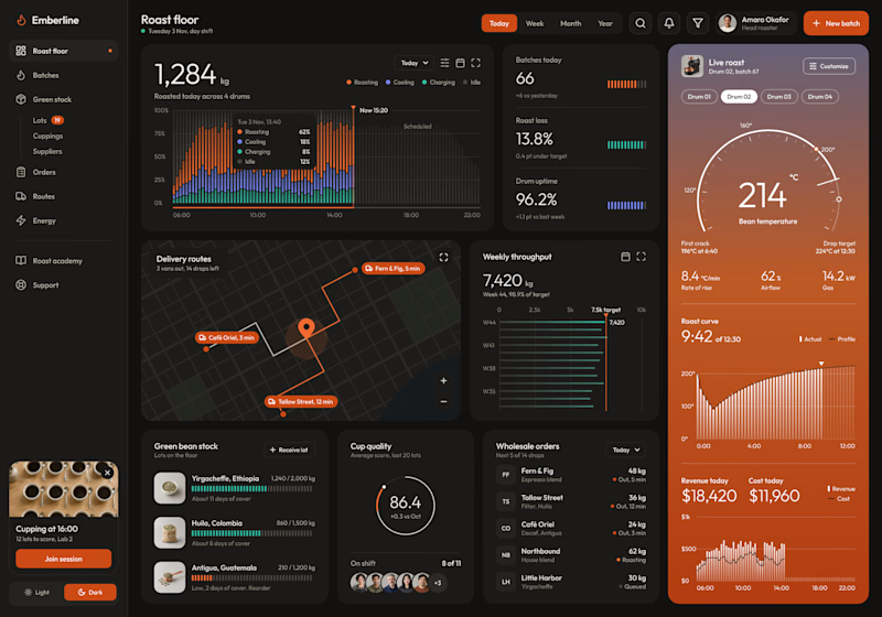
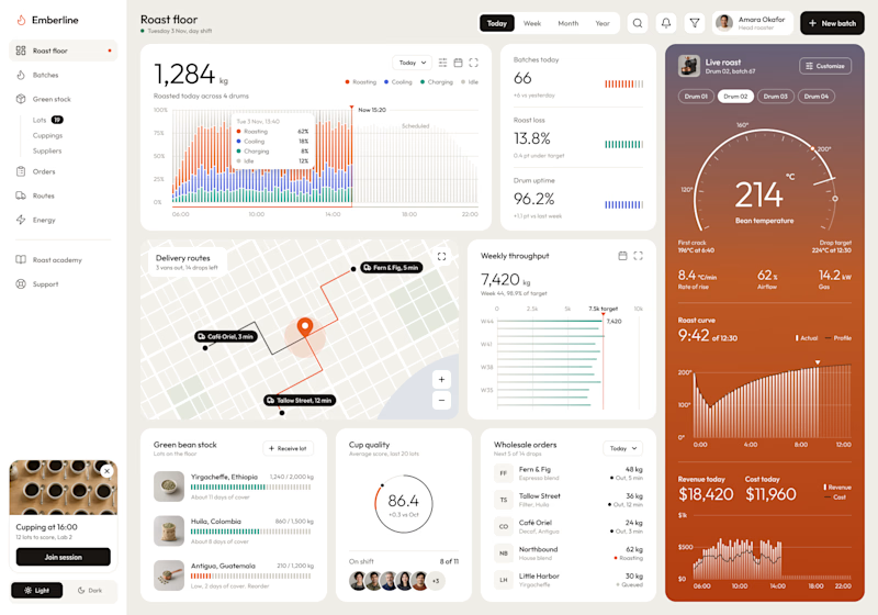
Dark or Light? Which dashboard design do you prefer?
I designed a production dashboard for a coffee roasting business in two themes, and I'd love your opinion! 🖤🤍
It brings everything into one view: live roast tracking, batch stats, delivery routes, weekly throughput, green bean stock, cup quality scores, wholesale orders, and daily revenue.
Both versions share the same layout and warm orange accents, but each creates a very different feel:
Option 1: Dark mode – Bold, focused, and easy on the eyes during long shifts.
Option 2: Light mode – Clean, bright, and airy with a modern minimal look.
Which one would you choose for your daily workflow? Vote and share why in the comments!

5 voted
63%
3 voted
37%
8 votes
Closed

The orange and black looks really good, and give me the sensation of Focus, Awesome

The hero has one job: explain Elysia before anyone scrolls. A home that runs on light, from morning to night.

Simple, sharp, and premium. Exactly how a good design should feel.