The network for creativity
Join 1.25M professional creatives like you
Connect with clients, get discovered, and run your business 100% commission-free
Creatives on Contra have earned over $150M and we are just getting started
Back to feedPost
Taste Test


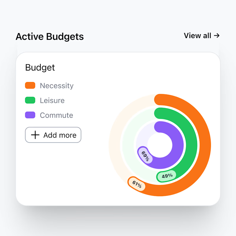
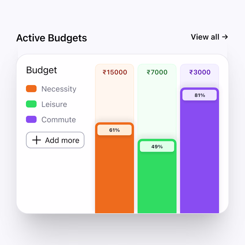


I love columns!

The columns version does a greater job at making the graph tell the percentage of the activity. Plus it is better if you want make each column clickable for further analytics😊🙌

thats actually a good idea! I took inspiration of the circular one from fitness apps haha
Great work

Columns works definitely 🙌

"Columns" because it conveys information more clearly than the circular one.

Circular


Going with Circular — the donut chart makes it much easier to visualize proportions at a glance, which is exactly what you want for budget tracking. The bar chart requires more cognitive effort to compare. That said, both are clean and well-designed. Maybe offer both as toggleable views?
yes, can try it

Great work
thank you!
The network for creativity
Join 1.25M professional creatives like you
Connect with clients, get discovered, and run your business 100% commission-free
Creatives on Contra have earned over $150M and we are just getting started
Related posts


Last year, I won a life-changing amount of money.
When I first saw this screen pop up I literally thought that someone had stolen my project AND was impersonating me. I had entered feeling so excited about my idea, but not at all thinking I would win (never mind the $50,000!!).
WEB POETRY is still one of my favourite ever projects and I am so, so excited that someone else is going to get to experience the same craziness I did <3
There's $100,000 up for grabs right now in the 2026 Figma Makeathon, running through to the 2nd of March. If you needed a sign to submit something, this is it.
Enter HERE <3
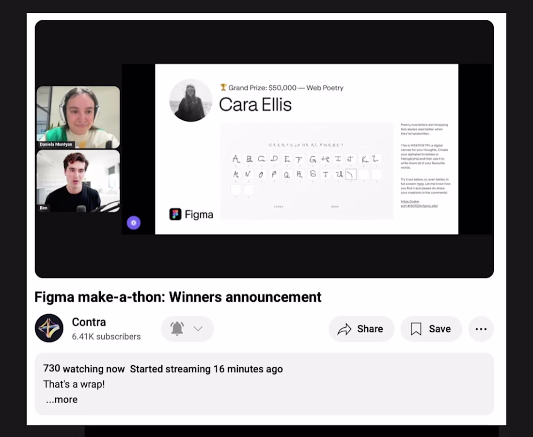

Love stories like this. Winning is great, but the mindset shift that comes from putting your work out there is the real prize. Huge congrats 👏


In designing this CRM dashboard, our focus was on creating a clear and structured environment for managing sales data and customer relationships. The interface consolidates key metrics such as total deal value, average deal size, win rate, and revenue dynamics into a single workspace, allowing users to quickly understand performance trends and identify changes over time.
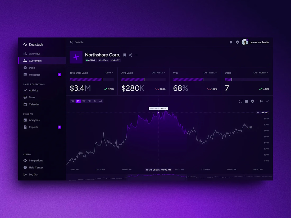

this is super clean🙌
Trending
maxearnings
The next frontier of payments is live on Contra. How are you maximizing revenue?
freelancerlife
Freelancer life is wins, pivots, and everything in between. What’s yours right now?
aidesignflow
AI tools are redefining how designer work. What does your workflow look like?
micrographics
Micrographics started as utility - barcodes, packaging, instruction labels. How would you use them?
aivideo
AI video tools are moving at warp speed. What tools are you using?