The network for creativity
Join 1.25M professional creatives like you
Connect with clients, get discovered, and run your business 100% commission-free
Creatives on Contra have earned over $150M and we are just getting started
Back to feedPost
Taste Test

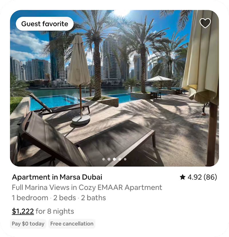
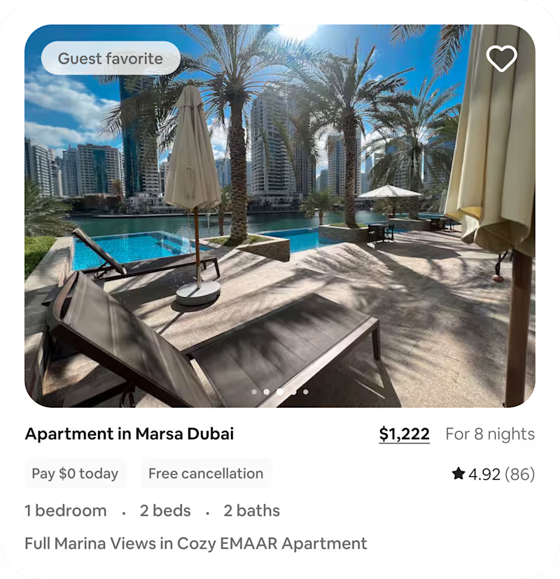
Today I explored an Airbnb search-result card with one question:
When users scan multiple listings, does the card visually prioritize the information that helps them decide what is worth opening?
When you scan accommodation results, what do you look at first?
0 voted
0%
3 voted
100%
3 votes
Closed


Definetely the exploration, it tells important things in first look without overloading the view.
The network for creativity
Join 1.25M professional creatives like you
Connect with clients, get discovered, and run your business 100% commission-free
Creatives on Contra have earned over $150M and we are just getting started



Related posts


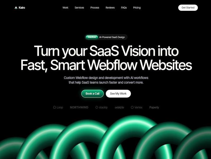
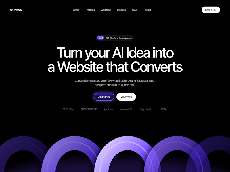

Both look great, but Violet & Black gets my vote! The purple accents give it a more modern, premium feel while keeping the design clean and focused on conversions. Amazing how a color change can create such a different brand personality. Have you tested which version performs better with visitors?

Codix - Which Visual Direction Works Better? 👀
Exploring two different visual styles for Codix, an experimental tech brand identity.
Option 1
Bold, geometric, and pixel-inspired. A playful mix of digital patterns, modular shapes, and vibrant colors.
Option 2
Abstract, expressive, and futuristic. A dynamic blend of flowing forms, gradients, and digital textures.
Same Brand. Two different creative directions.
Which one would you choose - 01 or 02?
5 voted
24%

16 voted
76%

21 votes
Closed

Option 2 was stunning🔥🔥

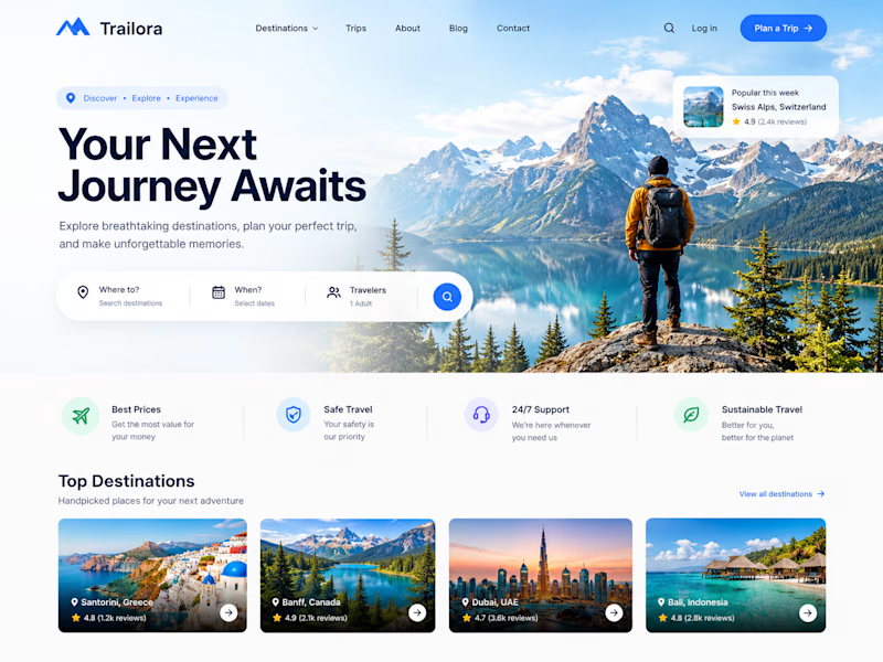
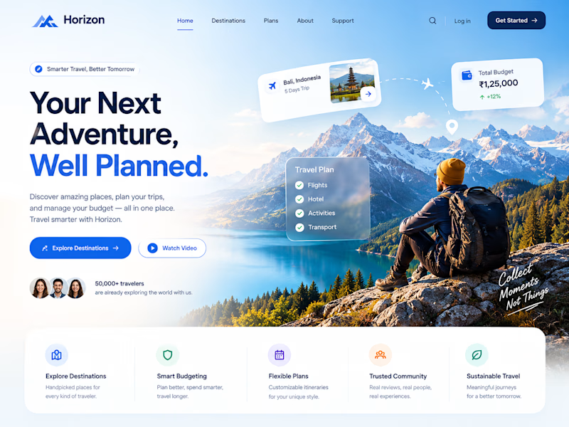
Two designs. One idea. Two different ways to experience travel. ✈️
What if planning your next trip felt less like managing a checklist and more like discovering a story waiting to unfold?
Trailora makes discovery feel effortless, while Horizon turns travel planning into a smarter, more structured experience.
Same industry. Different design directions.
Which direction would you choose: the freedom to explore or the confidence of a well-planned journey?
25 voted
71%
10 voted
29%
35 votes
Closed

Both are lovely! The second one feels more like an adventure, which fits travel well.