The network for creativity
Join 1.25M professional creatives like you
Connect with clients, get discovered, and run your business 100% commission-free
Creatives on Contra have earned over $150M and we are just getting started
Back to feedPost

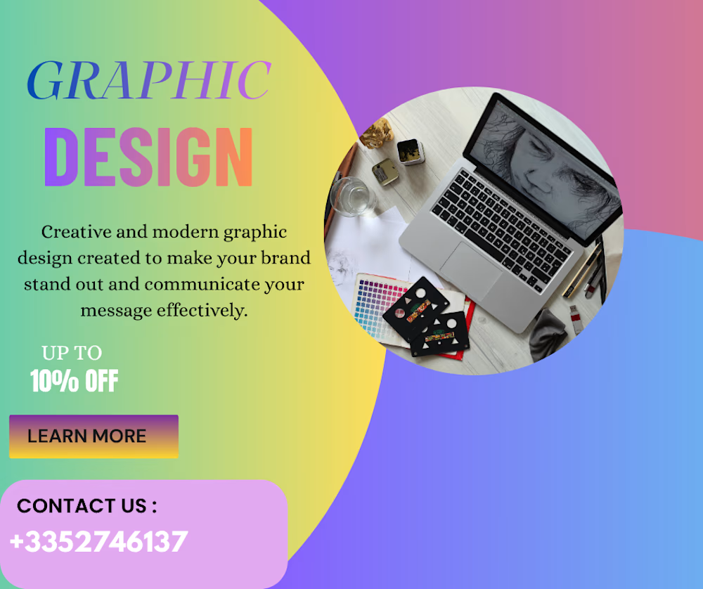
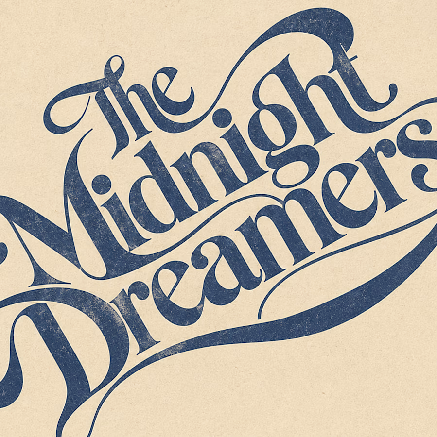
Graphic Design Project
Creative, modern graphic design focused on visual appeal, clear communication, and professional brand presentation. This project showcases a promotional graphic designed to attract attention and communicate the brand message effectively.
The network for creativity
Join 1.25M professional creatives like you
Connect with clients, get discovered, and run your business 100% commission-free
Creatives on Contra have earned over $150M and we are just getting started



Related posts


Branding & Visual Identity for AirCon West based in London.
Designers! Present your work with motion! It breathes life into your work and conveys your ideas in a dynamic way.
Use free online motion tools to do it.
My favorites:
https://animos.app/
https://arqe.ai/
https://orelin.app/editor
https://openvid.dev/en
(Or animate it yourself, like I did here using EffectCraft!)


Nice work!!

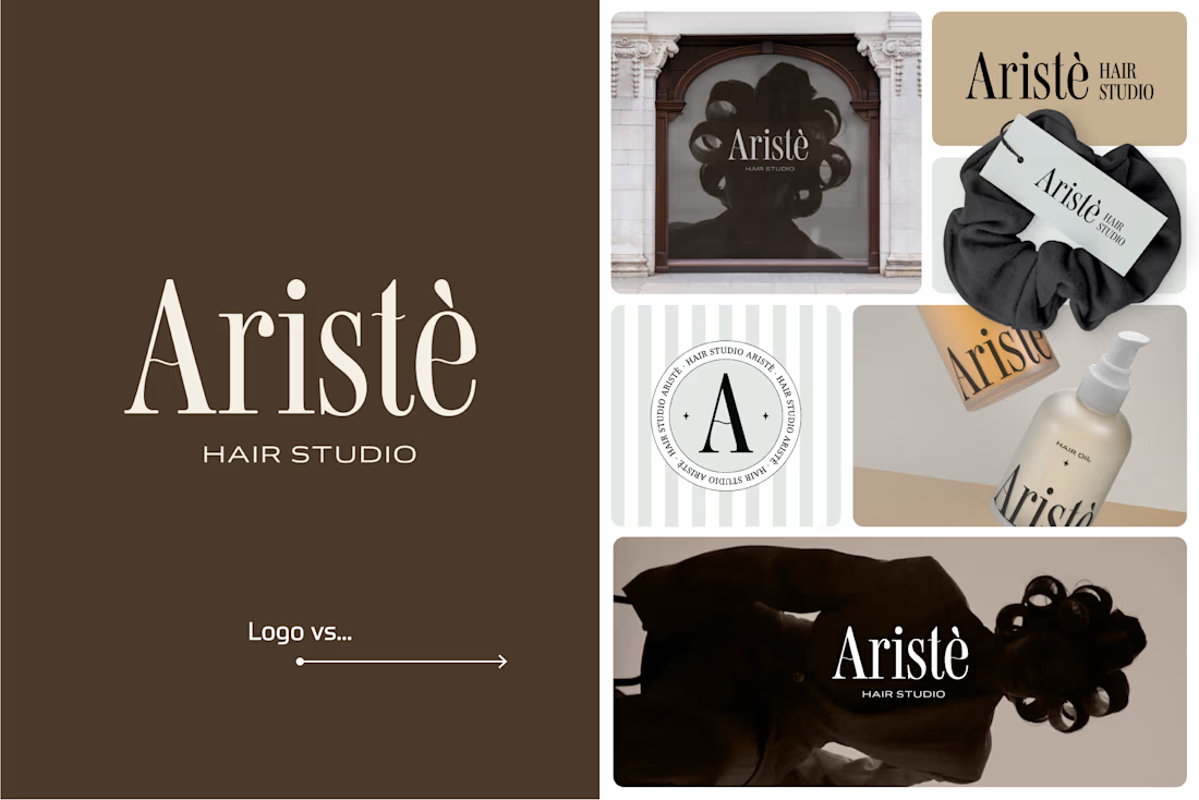
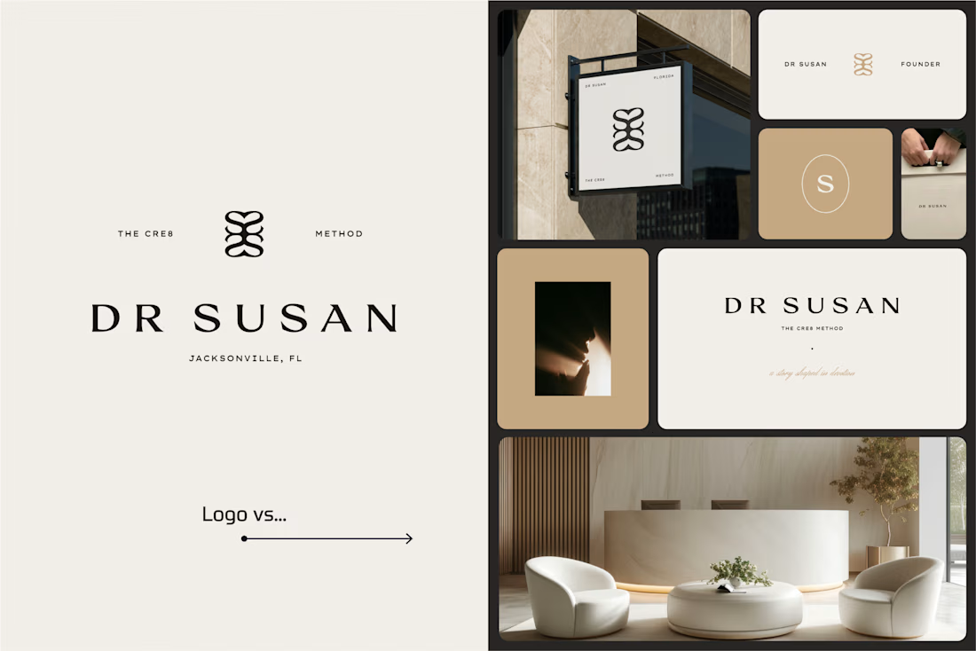
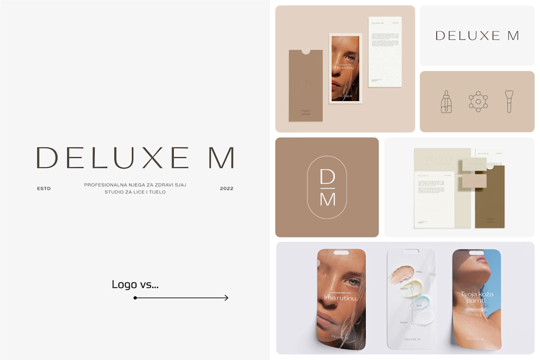
A logo is one thing. Giving it a whole personality is another. 👀
I picked a few of my branding projects to show what happens beyond the logo.
First, the logo on its own. Then, the full visual identity: colours, typography, graphic elements, patterns, packaging, and all the little details that make each brand feel like itself.
Because I don't want a logo to just look good sitting on a presentation slide. I want to see what it can become when it gets out into the real world.
Every project has a different story, personality, and visual direction. And that's probably my favourite part of brand design: figuring out how to turn one initial idea into a whole visual language.
Swipe through and meet the logos, then their bigger personalities. ;)
A logo is the starting point. The fun really begins after that.
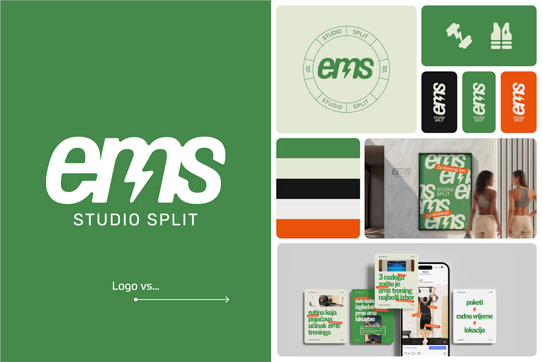

Clever use of the lightning bolt in the EMS logo!

Text on album covers is tacky? Whatever 🤌🏼 Vienna Starlight Boom 😒
Typography can ABSOLUTELY make an album cover.
During the pandemic, I got obsessed with album cover design. I'd spend hours looking at covers, researching the designers behind them, and trying to understand the decisions and creative processes that made them work.
It was one of those design rabbit holes I could never get tired of. 💀
I'm bringing that interest back with a new cover inspired by the music I love, including Neil Young's Harvest, Bandalos Chinos' Paranoia Pop and Uncle Acid & The Deadbeats' Vol. 1.
Looking at these alongside other great album covers, one thing stands out: typography CAN be the image!
I took inspiration and designed one as well!
What's an album cover where the typography is impossible to separate from the artwork? Show me your favorites.
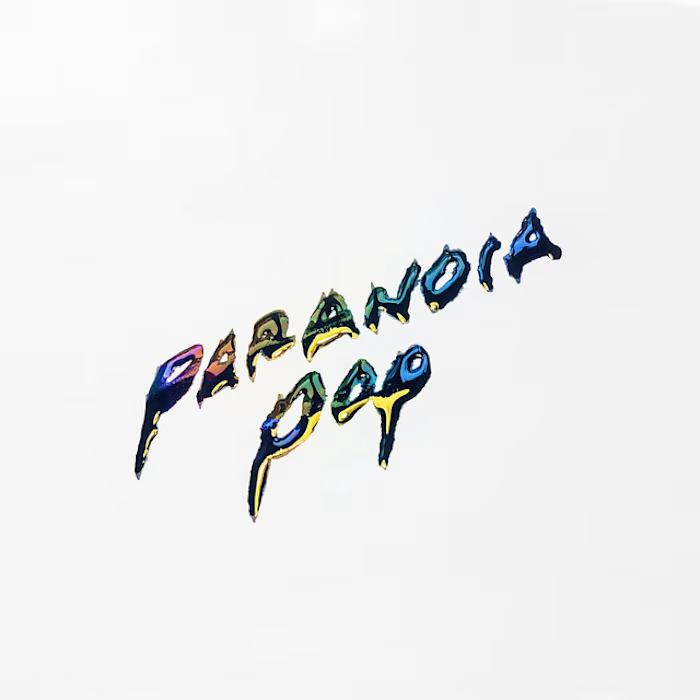
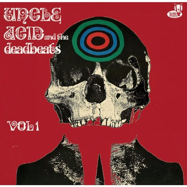
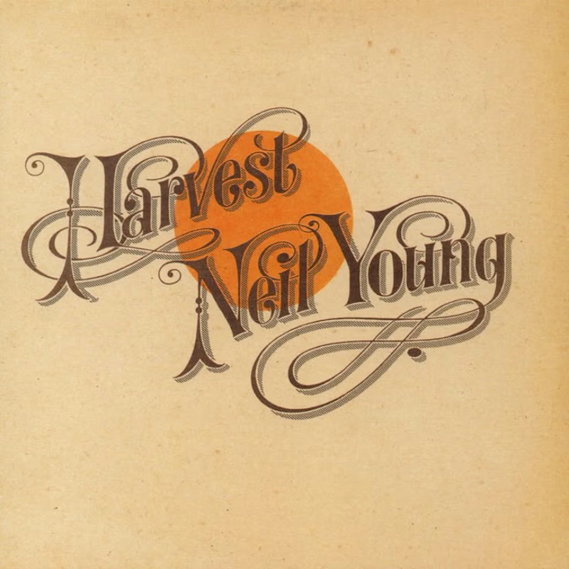

Reid Miles' Blue Note covers are my pick, where the cropped oversized lettering carries as much mood as any photo could. Your Paranoia Pop treatment has that quality too, the letterforms feel poured into the image rather than placed on it.