The network for creativity
Join 1.25M professional creatives like you
Connect with clients, get discovered, and run your business 100% commission-free
Creatives on Contra have earned over $150M and we are just getting started
Back to feedPost

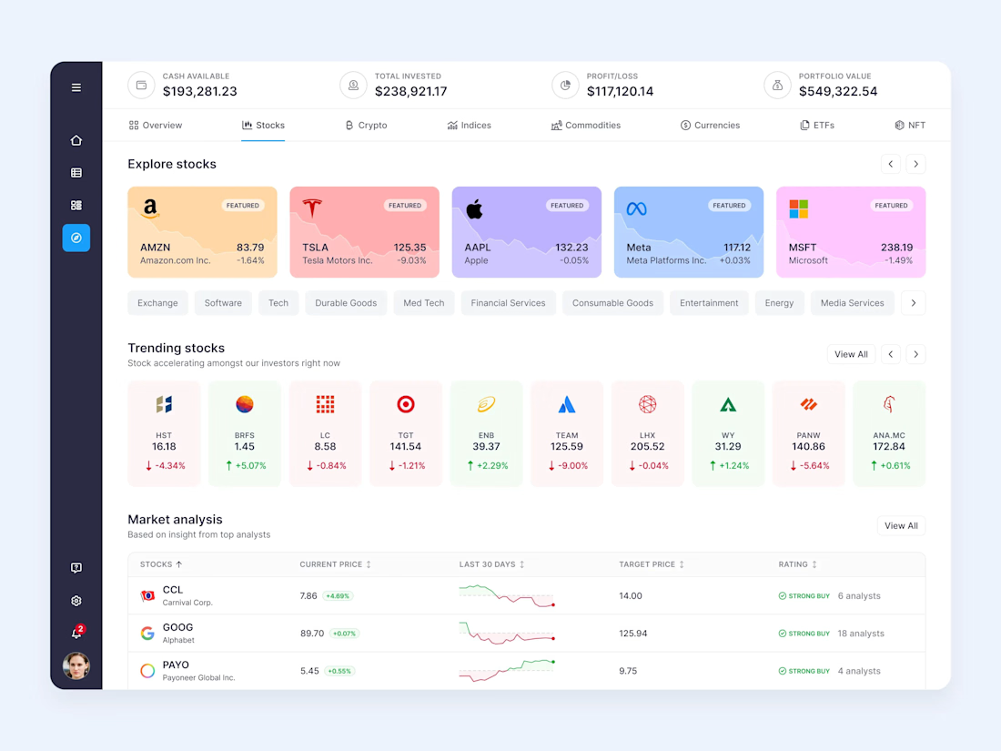
Copy trading platform design for investing like top investors.
The network for creativity
Join 1.25M professional creatives like you
Connect with clients, get discovered, and run your business 100% commission-free
Creatives on Contra have earned over $150M and we are just getting started



Related posts

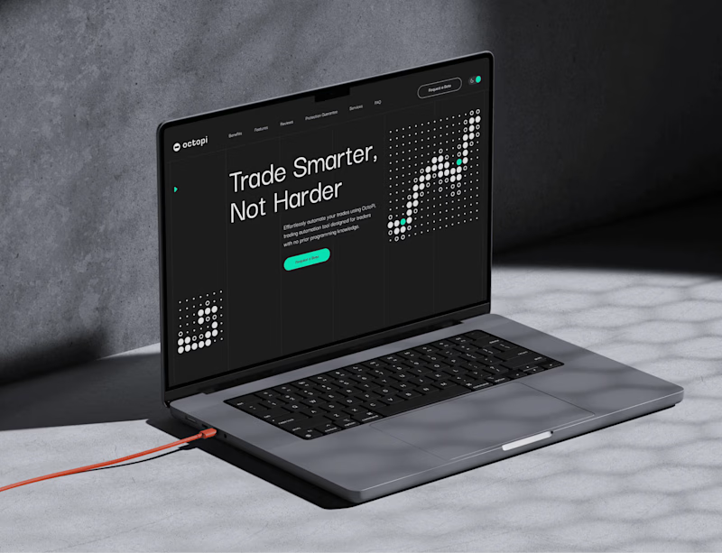
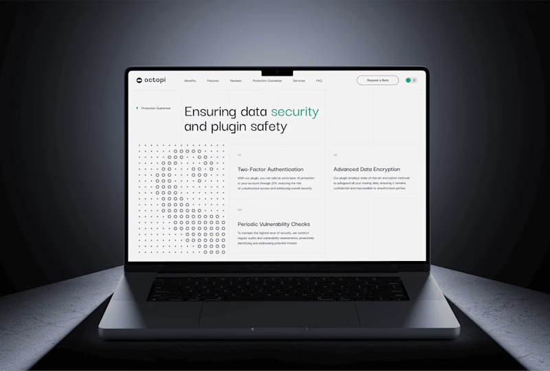
Dark mode is the default for trading tools. But is it the right choice for a website? 🤔
For Octopi, a no-code trading automation plugin for, we explored both directions:
🅰️ Dark: focused, pro-level, feels at home next to trading charts
🅱️ Light: clean, open, feels approachable for traders who don’t code
Which one would make you click “Get started”? 👇
3 votes
Ends in 21h

One fintech brand. Two different hero experiences. 🖤
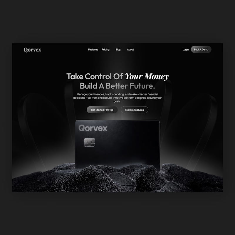
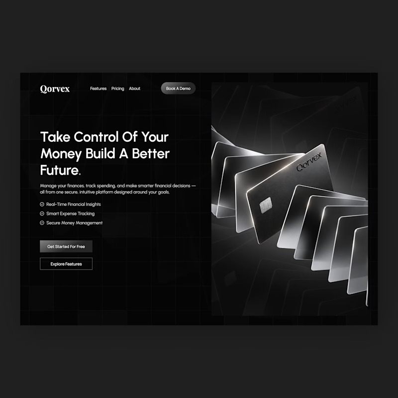
I designed two homepage hero concepts for Qorvex, a modern fintech platform, exploring two different ways to create a strong first impression.
Both concepts use a dark, premium visual direction with monochromatic tones, but each takes a different approach to presenting the brand.
Option 1 — Bold & Minimal
A centered hero layout with a strong headline, cinematic product visuals, and a clean, focused composition.
Option 2 — Modern & Structured
A split-screen layout with a bold headline, clear feature highlights, and a striking visual showcase of the fintech cards.
Which hero design would you choose for a premium fintech website?
Vote for Option 1 or Option 2 and tell me why in the comments. I'd love to hear your feedback!


4 votes
Ends in 16h

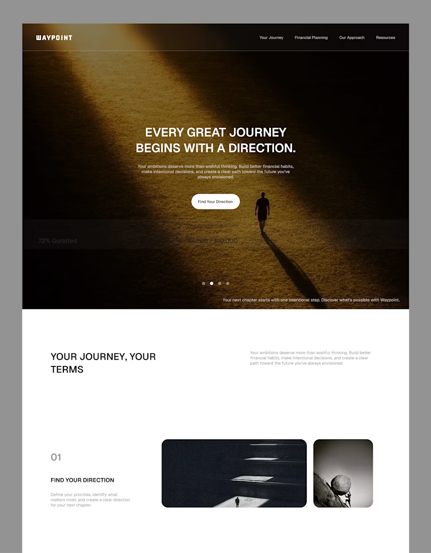
A hero section concept for WAYPOINT, a personal finance platform designed to help people make smarter financial decisions and build better money habits.
The goal was to create a clean, intuitive first impression that communicates the platform's purpose clearly without overwhelming users. I explored a simple visual direction, thoughtful layout, and clear messaging to make the experience feel approachable and easy to understand.
Good design isn't always about adding more. It's about making the important things easier to understand.
#UIDesign #WebDesign #Fintech #Framer #LandingPage #ProductDesign