The network for creativity
Join 1.25M professional creatives like you
Connect with clients, get discovered, and run your business 100% commission-free
Creatives on Contra have earned over $150M and we are just getting started
Back to feedPost

Users don’t compare your product to competitors — they compare it to their patience.
➡ Your product isn’t competing with one app.
➡ It’s competing with every fast, smooth experience users have ever had.
➡ If your flow feels slow, confusing, or heavy, users won’t wait.
Takeaways:
✅ Speed is part of UX
✅ Clarity is part of trust
✅ Every delay feels like disrespect
My Take:
⏳ Users don’t leave because they hate your product. They leave because they got tired.
#UserBehavior #ProductUX #UXStrategy #RetentionDesign #UIUX
The network for creativity
Join 1.25M professional creatives like you
Connect with clients, get discovered, and run your business 100% commission-free
Creatives on Contra have earned over $150M and we are just getting started



Related posts

Photographer Portfolio Website
"Capturing light, emotion, and the moments you never want to forget." That line set the tone, and the layout follows it.
The hero is one motion-blurred portrait washed in red. The photographer's name runs across the bottom in a condensed white face, so large the screen cuts it off. The photo keeps its soft focus, and the name still reads first.
Thin grid lines split the page into narrow columns, and the small copy sits justified inside them. The loose photo gets a strict structure to lean on.
A single round red button with an arrow sits right on the letters and marks where to go next.
Designed by the Hue & Machine team.
#WebDesign #Photography #PortfolioWebsite #EditorialDesign #Typography #UIDesign #ProductDesign #CreativeDirection #ResponsiveDesign #FigmaDesign


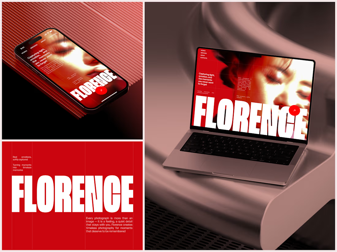

The heavy condensed white FLORENCE over the red portrait is bold, and keeping the same red across phone, laptop and type tile makes the case study read as one system. Did the red come from the photographer's own work, or was it your call?

A beautiful Shopify store is great. But does it make people want to shop?
Take a look at my latest e-commerce design project for Amora Renae, a luxury hair extension brand.
I wanted the experience to feel as premium as the products themselves.
From the bold pink hero section and elegant product collections to the detailed product pages and responsive layouts, every design decision was made to bring the brand's identity to life while keeping the shopping journey intuitive.
But here's where I need your honest opinion:
If you were the customer visiting this store for the first time, what would catch your attention first?
The homepage and overall visual identity 🎨
The product presentation and collections 🛍️
The product page experience
The mobile shopping experience 📱
And for the designers here, what would you improve?
I genuinely want to hear different perspectives. Let's talk design, user experience, and what makes an online store memorable.
#Shopify #EcommerceDesign #WebDesign #UIDesign #UXDesign


Love the creativity behind this. The visual identity feels consistent and well thought out.