The network for creativity
Join 1.25M professional creatives like you
Connect with clients, get discovered, and run your business 100% commission-free
Creatives on Contra have earned over $150M and we are just getting started
Back to feedPost

My Wisdom – Safety & Support Mobile App for Older Adults
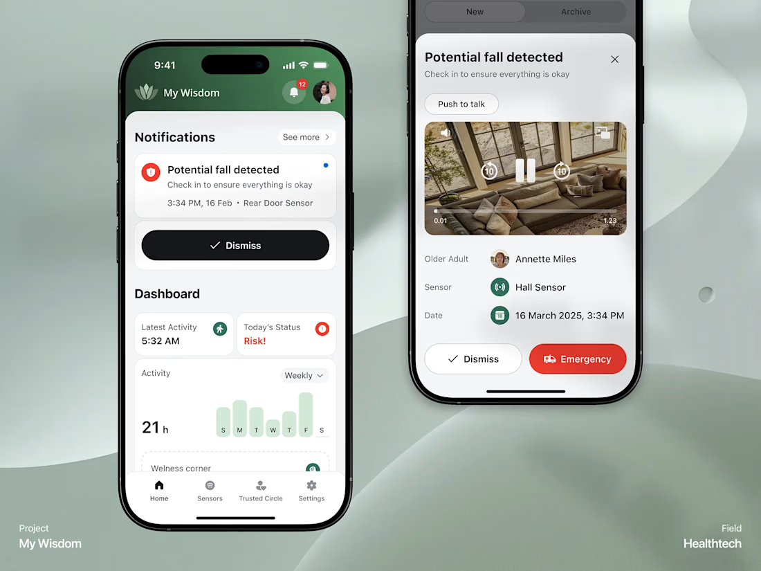
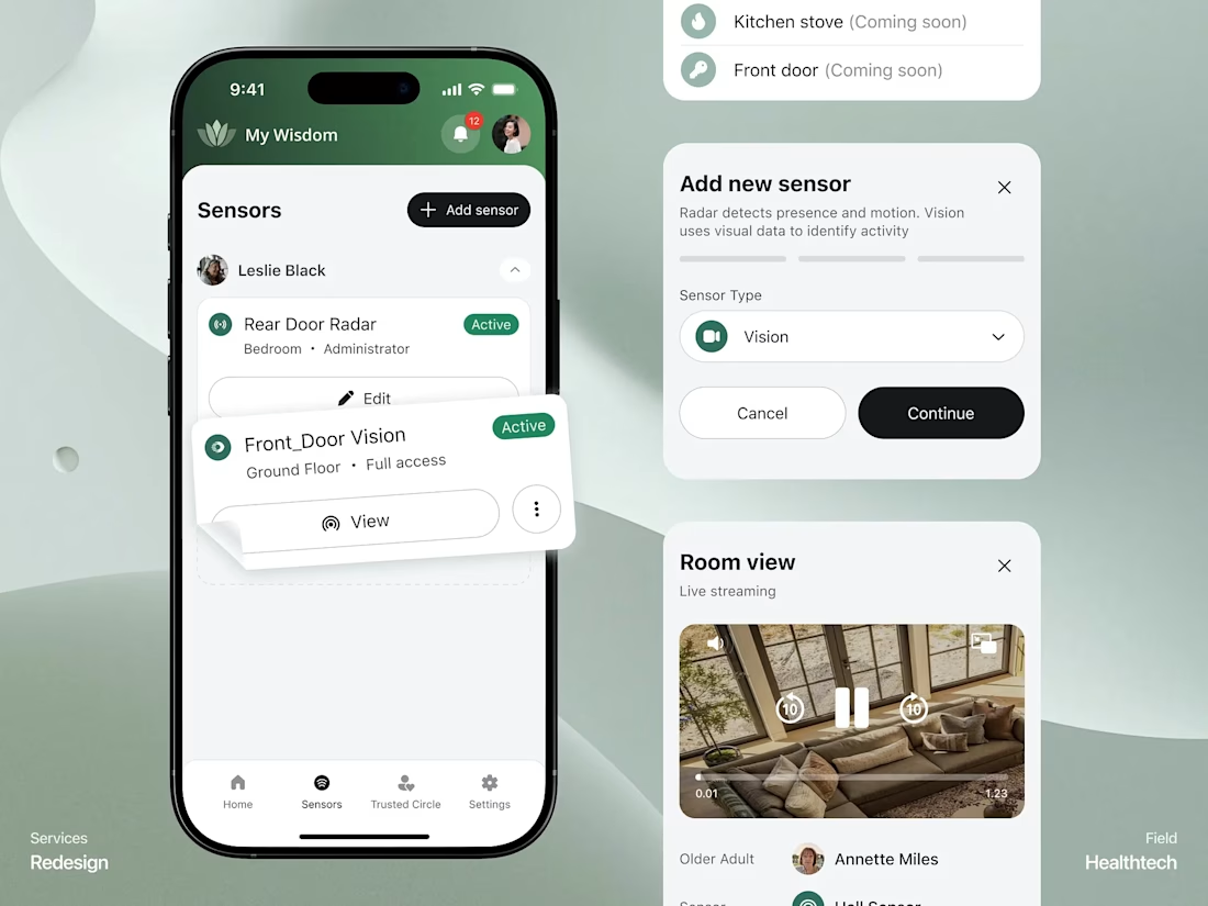
Designed and developed an end-to-end healthtech mobile application focused on senior safety, fall detection, and real-time monitoring. The app bridges families and caregivers through a secure 'Trusted Circle' and smart sensor integration.
Key Highlights:
Fall Detection & Emergency Alerts: Instant automated notifications with live video streaming capabilities and emergency triggers.
Trusted Circle Management: Seamlessly invite and manage caregivers, family members, and emergency contacts with customized sensor permissions.
Sensor Integration: Real-time tracking for room views, door radars, and activity logs.
Clean Healthtech UI: Modern, accessible dark-and-green aesthetic prioritizing readability and calm user experience.
Tech & Tools: UI/UX Design, Mobile App Development (Flutter/React Native), Real-time Notifications.


The network for creativity
Join 1.25M professional creatives like you
Connect with clients, get discovered, and run your business 100% commission-free
Creatives on Contra have earned over $150M and we are just getting started

Challenges
View all


Related posts


A look at the identity we designed for Vetti, a dog health monitoring brand.
There’s a lot of data behind a product like this but the person using it just wants to know their dog is okay.
That’s the balance in the design with a connected dot system that feels precise and warm colors and photography that keep it close to what people care about.
Also, an excellent excuse to spend far too long choosing dog photos.




Engaging website for a New York–based architecture and construction studio, balancing bold typography, immersive imagery and a minimal editorial layout.


